Demographics
The World’s 7.5 Billion People, in One Chart
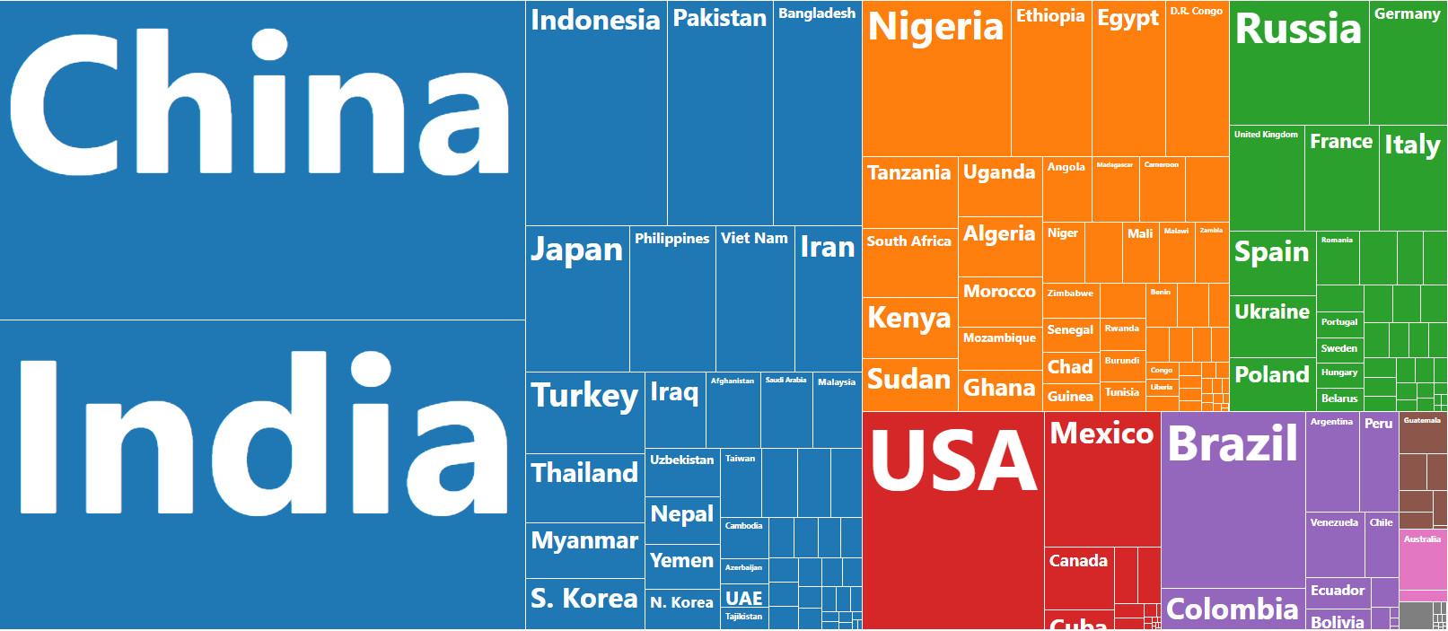
Which countries do people live in, globally?
It’s a very simple question, but it’s also hard to get an accurate sense of the answer by browsing through a lengthy table of country-level population data.
That’s because there are close to 200 countries spread around the globe, with populations ranging from near 1.4 billion (China or India) to countries a mere 0.001% of that size. How is it possible to do the mental math in interpreting such a wide range of data points simultaneously?
Visualizing the World’s Population
Today’s data visualization comes to us from PopulationPyramid.net, a fantastic resource for data on global population numbers.
It allows us to see the location of the world’s 7.5 billion people by resizing countries based on their populations and then coloring and organizing them by region.
This simple application of data visualization makes it more intuitive to comprehend where people live around the globe, as well as how different countries compare in size.
Regional Populations
The first thing you might notice on the graphic is the relative size of regions, with Asia taking up a whopping 60% of the visual space.
Here are those numbers by region broken down further:
| Rank | Region | Share of Global Population (%) | Population |
|---|---|---|---|
| #1 | Asia | 60% | 4.5 billion |
| #2 | Africa | 16% | 1.2 billion |
| #3 | Europe | 10% | 729 million |
| #4 | North America | 7% | 534 million |
| #5 | South America | 6% | 424 million |
| #6 | Central America | 1% | 47 million |
| #7 | Oceania | 1% | 42 million |
When you look at it this way, you can really see how the math breaks down.
About 75% of people reside in Asia or Africa. Meanwhile, the regions of Europe, North America, South America, and Oceania just total together to 25% of the mix.
The 10 Most Populous Countries
There are some countries that are clear standouts on the data visualization.
For example, China and India combine to 2.7 billion people, together accounting for 36% of the total global population.
Those heavyweights aside, there are other notable countries that take up significant amounts of real estate on the visualization as well:
| Rank | Country | Population (2017) | % of global total |
|---|---|---|---|
| #1 | 🇨🇳 China | 1,388,232,693 | 18.5% |
| #2 | 🇮🇳 India | 1,342,512,706 | 17.9% |
| #3 | 🇺🇸 United States | 326,474,013 | 4.3% |
| #4 | 🇮🇩 Indonesia | 263,510,146 | 3.5% |
| #5 | 🇧🇷 Brazil | 211,243,220 | 2.8% |
| #6 | 🇵🇰 Pakistan | 196,744,376 | 2.6% |
| #7 | 🇳🇬 Nigeria | 191,835,936 | 2.6% |
| #8 | 🇧🇩 Bangladesh | 164,827,718 | 2.2% |
| #9 | 🇷🇺 Russia | 143,375,006 | 1.9% |
| #10 | 🇲🇽 Mexico | 130,222,815 | 1.7% |
| Top 10 Total | 4,358,978,629 | 58.0% |
The United States, Indonesia, Brazil, and Pakistan rank between #3 and #6, and have about a billion people between them.
Nigeria, which is #7 on the list, has the world’s fastest growing megacity within its borders. Further, Bangladesh is also a noteworthy entry since it is one of the densest populations globally, with 1,138.9 people per square kilometer of land.
A Final Look at Global Population
This isn’t the first time we’ve shown you a data visualization that organizes the global population – here’s one we previously published that shows each country in a bubble chart:
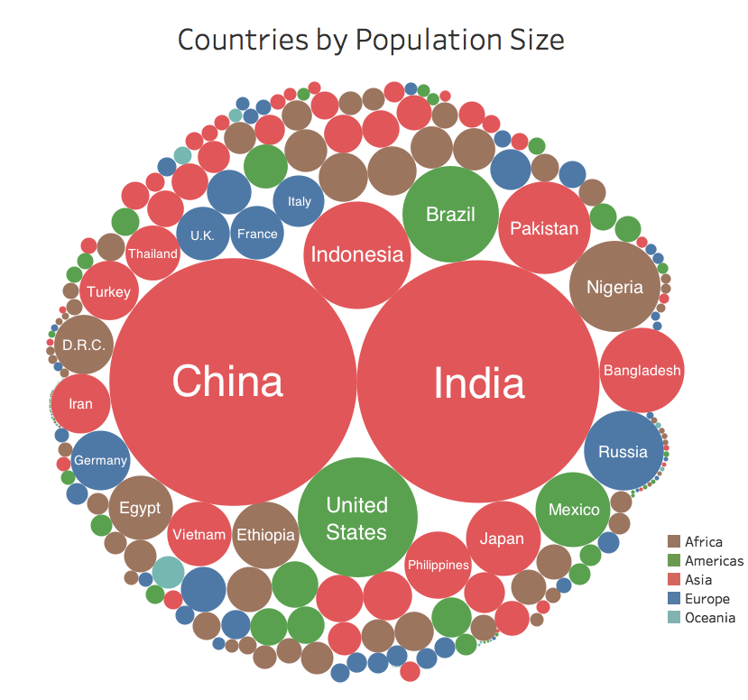
While this uses slightly older data, it is still interesting to see how data visualization can help us understand a complex and wide-ranging set of data that is relevant to everyday life.


Demographics
The Countries That Have Become Sadder Since 2010
Tracking Gallup survey data for more than a decade reveals some countries are witnessing big happiness declines, reflecting their shifting socio-economic conditions.


The Countries That Have Become Sadder Since 2010
This was originally posted on our Voronoi app. Download the app for free on iOS or Android and discover incredible data-driven charts from a variety of trusted sources.
Can happiness be quantified?
Some approaches that try to answer this question make a distinction between two differing components of happiness: a daily experience part, and a more general life evaluation (which includes how people think about their life as a whole).
The World Happiness Report—first launched in 2012—has been making a serious go at quantifying happiness, by examining Gallup poll data that asks respondents in nearly every country to evaluate their life on a 0–10 scale. From this they extrapolate a single “happiness score” out of 10 to compare how happy (or unhappy) countries are.
More than a decade later, the 2024 World Happiness Report continues the mission. Its latest findings also include how some countries have become sadder in the intervening years.
Which Countries Have Become Unhappier Since 2010?
Afghanistan is the unhappiest country in the world right now, and is also 60% unhappier than over a decade ago, indicating how much life has worsened since 2010.
In 2021, the Taliban officially returned to power in Afghanistan, after nearly two decades of American occupation in the country. The Islamic fundamentalist group has made life harder, especially for women, who are restricted from pursuing higher education, travel, and work.
On a broader scale, the Afghan economy has suffered post-Taliban takeover, with various consequent effects: mass unemployment, a drop in income, malnutrition, and a crumbling healthcare system.
| Rank | Country | Happiness Score Loss (2010–24) | 2024 Happiness Score (out of 10) |
|---|---|---|---|
| 1 | 🇦🇫 Afghanistan | -2.6 | 1.7 |
| 2 | 🇱🇧 Lebanon | -2.3 | 2.7 |
| 3 | 🇯🇴 Jordan | -1.5 | 4.2 |
| 4 | 🇻🇪 Venezuela | -1.3 | 5.6 |
| 5 | 🇲🇼 Malawi | -1.2 | 3.4 |
| 6 | 🇿🇲 Zambia | -1.2 | 3.5 |
| 7 | 🇧🇼 Botswana | -1.2 | 3.4 |
| 8 | 🇾🇪 Yemen | -1.0 | 3.6 |
| 9 | 🇪🇬 Egypt | -1.0 | 4.0 |
| 10 | 🇮🇳 India | -0.9 | 4.1 |
| 11 | 🇧🇩 Bangladesh | -0.9 | 3.9 |
| 12 | 🇨🇩 DRC | -0.7 | 3.3 |
| 13 | 🇹🇳 Tunisia | -0.7 | 4.4 |
| 14 | 🇨🇦 Canada | -0.6 | 6.9 |
| 15 | 🇺🇸 U.S. | -0.6 | 6.7 |
| 16 | 🇨🇴 Colombia | -0.5 | 5.7 |
| 17 | 🇵🇦 Panama | -0.5 | 6.4 |
| 18 | 🇵🇰 Pakistan | -0.5 | 4.7 |
| 19 | 🇿🇼 Zimbabwe | -0.5 | 3.3 |
| 20 | 🇮🇪 Ireland | -0.5 | 6.8 |
| N/A | 🌍 World | +0.1 | 5.5 |
Nine countries in total saw their happiness score drop by a full point or more, on the 0–10 scale.
Noticeably, many of them have seen years of social and economic upheaval. Lebanon, for example, has been grappling with decades of corruption, and a severe liquidity crisis since 2019 that has resulted in a banking system collapse, sending poverty levels skyrocketing.
In Jordan, unprecedented population growth—from refugees leaving Iraq and Syria—has aggravated unemployment rates. A somewhat abrupt change in the line of succession has also raised concerns about political stability in the country.

-

 Markets1 week ago
U.S. Debt Interest Payments Reach $1 Trillion
-

 Business2 weeks ago
Charted: Big Four Market Share by S&P 500 Audits
-

 Markets2 weeks ago
Ranked: The Most Valuable Housing Markets in America
-

 Money2 weeks ago
Which States Have the Highest Minimum Wage in America?
-

 AI2 weeks ago
Ranked: Semiconductor Companies by Industry Revenue Share
-

 Markets2 weeks ago
Ranked: The World’s Top Flight Routes, by Revenue
-

 Demographics2 weeks ago
Population Projections: The World’s 6 Largest Countries in 2075
-

 Markets2 weeks ago
The Top 10 States by Real GDP Growth in 2023