Energy
Visualizing U.S. Energy Consumption in One Chart
Visualizing U.S. Energy Consumption in One Chart
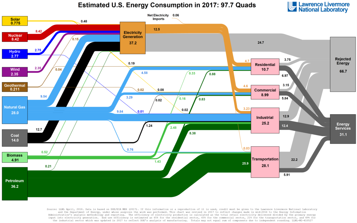
Every year, the Lawrence Livermore National Laboratory, a federal research facility funded by the Department of Energy and UC Berkeley, puts out a fascinating Sankey diagram that shows the fate of all energy that gets generated and consumed in the United States in a given year.
Today’s visualization is the summary of energy consumption for 2017, but you can see previous years going all the way back to 2010 on their website.
Dealing in Quads
The first thing you’ll notice about this Sankey is that it uses an unfamiliar unit of measurement: the quad.
Each quad is equal to a quadrillion BTUs, and it’s roughly comparable to the following:
- 8,007,000,000 gallons (US) of gasoline
- 293,071,000,000 kilowatt-hours (kWh)
- 36,000,000 tonnes of coal
- 970,434,000,000 cubic feet of natural gas
- 25,200,000 tonnes of oil
- 252,000,000 tonnes of TNT
- 13.3 tonnes of uranium-235
Put another way, a quad is a massive unit that only is useful in measuring something like national energy consumption – and in this case, the total amount of energy used by the country was 97.7 quadrillion BTUs.
Energy Wasted
On the diagram, one thing that is immediately noticeable is that a whopping 68% of all energy is actually rejected energy, or energy that gets wasted through various inefficiencies.
It’s quite eye-opening to look at this data sorted by sector:
| Sector | End-Use Efficiency | Rejected Energy (Quads) |
|---|---|---|
| Residential | 65% | 3.75 |
| Commercial | 65% | 3.15 |
| Industrial | 49% | 12.9 |
| Transportation | 21% | 22.2 |
The transportation sector used 28.1 quads of energy in 2017, about 28.8% of the total consumption. However, it wasted 22.2 quads of that energy with its poor efficiency rate, which made for more rejected energy than the other three sectors combined.
This wastage and inefficiency in the transportation sector provides an interesting lens from which to view the green energy revolution, and it also helps explain the vision that Elon Musk has for the future of Tesla.
A Ways to Go
The last time we posted a version of this visualization was for the 2015 edition of the diagram, and we noted that renewables had a ways to go as a factor in the whole energy mix.
Here are how things have changed over the last two years:
| Energy | 2015 (Quads) | 2017 (Quads) | 2-yr change |
|---|---|---|---|
| Petroleum | 35.4 | 36.2 | 2.3% |
| Natural Gas | 28.3 | 28.0 | -1.1% |
| Coal | 15.7 | 14.0 | -10.8% |
| Nuclear | 8.34 | 8.42 | 1.0% |
| Biomass | 4.72 | 4.91 | 4.0% |
| Hydro | 2.39 | 2.77 | 15.9% |
| Wind | 1.82 | 2.35 | 29.1% |
| Solar | 0.532 | 0.775 | 45.7% |
| Geothermal | 0.224 | 0.211 | -5.8% |
As you can see, solar and wind consumption are jumping considerably – but in absolute terms, our note from two years ago still remains true.
To make the desired impact, renewable energy still has a ways to go.


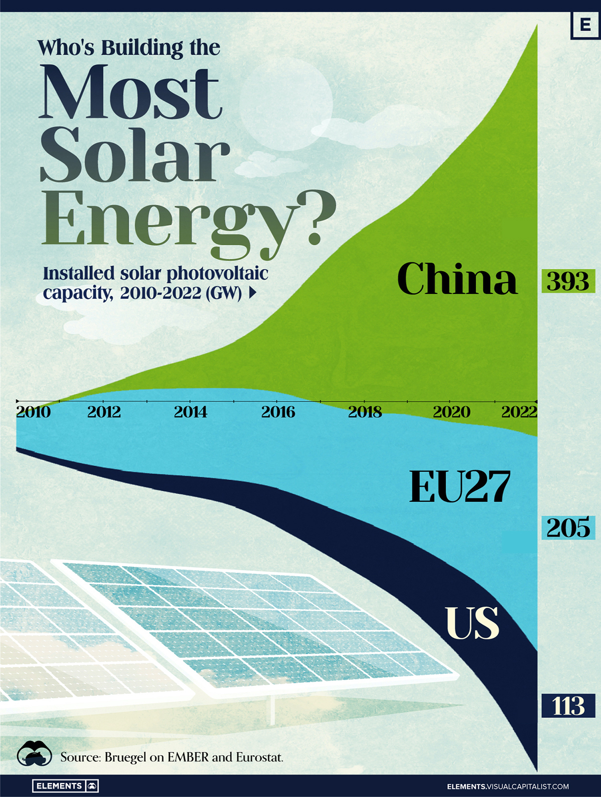
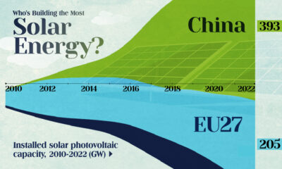
Who’s Building the Most Solar Energy?
This was originally posted on our Voronoi app. Download the app for free on iOS or Android and discover incredible data-driven charts from a variety of trusted sources.
In 2023, solar energy accounted for three-quarters of renewable capacity additions worldwide. Most of this growth occurred in Asia, the EU, and the U.S., continuing a trend observed over the past decade.
In this graphic, we illustrate the rise in installed solar photovoltaic (PV) capacity in China, the EU, and the U.S. between 2010 and 2022, measured in gigawatts (GW). Bruegel compiled the data..
Chinese Dominance
As of 2022, China’s total installed capacity stands at 393 GW, nearly double that of the EU’s 205 GW and surpassing the USA’s total of 113 GW by more than threefold in absolute terms.
| Installed solar capacity (GW) | China | EU27 | U.S. |
|---|---|---|---|
| 2022 | 393.0 | 205.5 | 113.0 |
| 2021 | 307.0 | 162.7 | 95.4 |
| 2020 | 254.0 | 136.9 | 76.4 |
| 2019 | 205.0 | 120.1 | 61.6 |
| 2018 | 175.3 | 104.0 | 52.0 |
| 2017 | 130.8 | 96.2 | 43.8 |
| 2016 | 77.8 | 91.5 | 35.4 |
| 2015 | 43.6 | 87.7 | 24.2 |
| 2014 | 28.4 | 83.6 | 18.1 |
| 2013 | 17.8 | 79.7 | 13.3 |
| 2012 | 6.7 | 71.1 | 8.6 |
| 2011 | 3.1 | 53.3 | 5.6 |
| 2010 | 1.0 | 30.6 | 3.4 |
Since 2017, China has shown a compound annual growth rate (CAGR) of approximately 25% in installed PV capacity, while the USA has seen a CAGR of 21%, and the EU of 16%.
Additionally, China dominates the production of solar power components, currently controlling around 80% of the world’s solar panel supply chain.
In 2022, China’s solar industry employed 2.76 million individuals, with manufacturing roles representing approximately 1.8 million and the remaining 918,000 jobs in construction, installation, and operations and maintenance.
The EU industry employed 648,000 individuals, while the U.S. reached 264,000 jobs.
According to the IEA, China accounts for almost 60% of new renewable capacity expected to become operational globally by 2028.
Despite the phasing out of national subsidies in 2020 and 2021, deployment of solar PV in China is accelerating. The country is expected to reach its national 2030 target for wind and solar PV installations in 2024, six years ahead of schedule.

-
 Demographics6 days ago
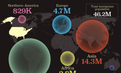
Mapped: U.S. Immigrants by Region
-

 United States2 weeks ago
Charted: What Southeast Asia Thinks About China & the U.S.
-

 United States2 weeks ago
The Evolution of U.S. Beer Logos
-

 Healthcare2 weeks ago
What Causes Preventable Child Deaths?
-
 Energy1 week ago
Who’s Building the Most Solar Energy?
-

 Markets1 week ago
Mapped: The Most Valuable Company in Each Southeast Asian Country
-

 Technology1 week ago
Mapped: The Number of AI Startups By Country
-
 Healthcare1 week ago
Life Expectancy by Region (1950-2050F)