Markets
Visualizing the Snowball of Government Debt
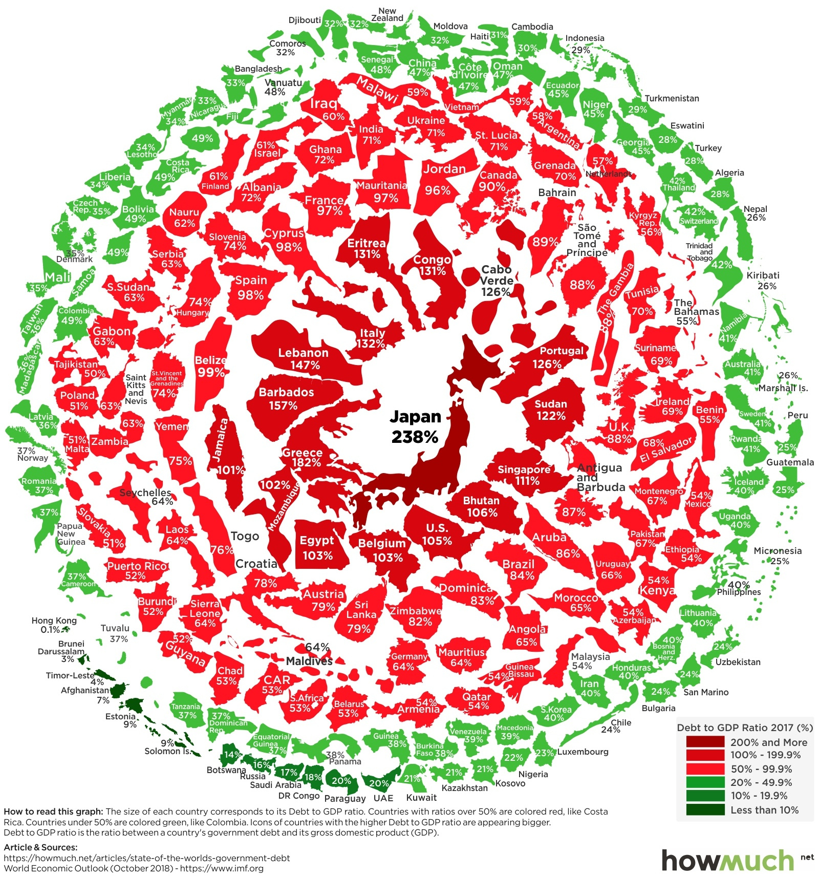
Visualizing the Snowball of Government Debt
Over the last five years, markets have pushed concerns about debt under the rug.
While economic growth and record-low interest rates have made it easy to service existing government debt, it’s also created a situation where government debt has grown in to over $63 trillion in absolute terms.
The global economic tide can change fast, and in the event of a recession or rapidly rising interest rates, debt levels could come back into the spotlight very quickly.
The Debt Snowball
Today’s visualization comes to us from HowMuch.net and it rolls the world’s countries into a “snowball” of government debt, colored and arranged by debt-to-GDP ratios. The data itself comes from the IMF’s most recent October 2018 update.
The structure of the visualization is apt, because debt can accumulate in an unsustainable way if governments are not proactive. This situation can create a vicious cycle, where mounting debt can start hampering growth, making the debt ultimately harder to pay off.
Here are the countries with the most debt on the books:
| Rank | Country | Debt-to-GDP Ratio (2017) |
|---|---|---|
| #1 | Japan | 237.6% |
| #2 | Greece | 181.8% |
| #3 | Lebanon | 146.8% |
| #4 | Italy | 131.8% |
| #5 | Portugal | 125.7% |
| #6 | Sudan | 121.6% |
| #7 | Singapore | 111.1% |
| #8 | United States | 105.2% |
| #9 | Belgium | 103.4% |
| #10 | Egypt | 103.0% |
Note: Small economies (GDP under $10 billion) are excluded in this table, such as Cabo Verde and Barbados
Japan and Greece are the most indebted countries in the world, with debt-to-GDP ratios of 237.6% and 181.8% respectively. Meanwhile, the United States sits in the #8 spot with a 105.2% ratio, and recent Treasury estimates putting the national debt at $22 trillion.
Light Snow
On the opposite spectrum, here are the 10 jurisdictions that have incurred less debt relative to the size of their economies:
| Rank | Country | Debt-to-GDP Ratio (2017) |
|---|---|---|
| #1 | Macao (SAR) | 0.0% |
| #2 | Hong Kong (SAR) | 0.1% |
| #3 | Brunei | 2.8% |
| #4 | Afghanistan | 7.0% |
| #5 | Estonia | 9.0% |
| #6 | Botswana | 14.0% |
| #7 | Russia | 15.5% |
| #8 | Saudi Arabia | 17.2% |
| #9 | DRC | 18.1% |
| #10 | Paraguay | 19.5% |
Note: Small economies (GDP under $10 billion) are excluded in this table, such as Timor-Leste and Solomon Islands
Macao and Hong Kong – both special administrative regions (SARs) in China – have virtually zero debt on the books, while the official country with the lowest debt is Brunei (2.8%).


Markets
U.S. Debt Interest Payments Reach $1 Trillion
U.S. debt interest payments have surged past the $1 trillion dollar mark, amid high interest rates and an ever-expanding debt burden.


U.S. Debt Interest Payments Reach $1 Trillion
This was originally posted on our Voronoi app. Download the app for free on iOS or Android and discover incredible data-driven charts from a variety of trusted sources.
The cost of paying for America’s national debt crossed the $1 trillion dollar mark in 2023, driven by high interest rates and a record $34 trillion mountain of debt.
Over the last decade, U.S. debt interest payments have more than doubled amid vast government spending during the pandemic crisis. As debt payments continue to soar, the Congressional Budget Office (CBO) reported that debt servicing costs surpassed defense spending for the first time ever this year.
This graphic shows the sharp rise in U.S. debt payments, based on data from the Federal Reserve.
A $1 Trillion Interest Bill, and Growing
Below, we show how U.S. debt interest payments have risen at a faster pace than at another time in modern history:
| Date | Interest Payments | U.S. National Debt |
|---|---|---|
| 2023 | $1.0T | $34.0T |
| 2022 | $830B | $31.4T |
| 2021 | $612B | $29.6T |
| 2020 | $518B | $27.7T |
| 2019 | $564B | $23.2T |
| 2018 | $571B | $22.0T |
| 2017 | $493B | $20.5T |
| 2016 | $460B | $20.0T |
| 2015 | $435B | $18.9T |
| 2014 | $442B | $18.1T |
| 2013 | $425B | $17.2T |
| 2012 | $417B | $16.4T |
| 2011 | $433B | $15.2T |
| 2010 | $400B | $14.0T |
| 2009 | $354B | $12.3T |
| 2008 | $380B | $10.7T |
| 2007 | $414B | $9.2T |
| 2006 | $387B | $8.7T |
| 2005 | $355B | $8.2T |
| 2004 | $318B | $7.6T |
| 2003 | $294B | $7.0T |
| 2002 | $298B | $6.4T |
| 2001 | $318B | $5.9T |
| 2000 | $353B | $5.7T |
| 1999 | $353B | $5.8T |
| 1998 | $360B | $5.6T |
| 1997 | $368B | $5.5T |
| 1996 | $362B | $5.3T |
| 1995 | $357B | $5.0T |
| 1994 | $334B | $4.8T |
| 1993 | $311B | $4.5T |
| 1992 | $306B | $4.2T |
| 1991 | $308B | $3.8T |
| 1990 | $298B | $3.4T |
| 1989 | $275B | $3.0T |
| 1988 | $254B | $2.7T |
| 1987 | $240B | $2.4T |
| 1986 | $225B | $2.2T |
| 1985 | $219B | $1.9T |
| 1984 | $205B | $1.7T |
| 1983 | $176B | $1.4T |
| 1982 | $157B | $1.2T |
| 1981 | $142B | $1.0T |
| 1980 | $113B | $930.2B |
| 1979 | $96B | $845.1B |
| 1978 | $84B | $789.2B |
| 1977 | $69B | $718.9B |
| 1976 | $61B | $653.5B |
| 1975 | $55B | $576.6B |
| 1974 | $50B | $492.7B |
| 1973 | $45B | $469.1B |
| 1972 | $39B | $448.5B |
| 1971 | $36B | $424.1B |
| 1970 | $35B | $389.2B |
| 1969 | $30B | $368.2B |
| 1968 | $25B | $358.0B |
| 1967 | $23B | $344.7B |
| 1966 | $21B | $329.3B |
Interest payments represent seasonally adjusted annual rate at the end of Q4.
At current rates, the U.S. national debt is growing by a remarkable $1 trillion about every 100 days, equal to roughly $3.6 trillion per year.
As the national debt has ballooned, debt payments even exceeded Medicaid outlays in 2023—one of the government’s largest expenditures. On average, the U.S. spent more than $2 billion per day on interest costs last year. Going further, the U.S. government is projected to spend a historic $12.4 trillion on interest payments over the next decade, averaging about $37,100 per American.
Exacerbating matters is that the U.S. is running a steep deficit, which stood at $1.1 trillion for the first six months of fiscal 2024. This has accelerated due to the 43% increase in debt servicing costs along with a $31 billion dollar increase in defense spending from a year earlier. Additionally, a $30 billion increase in funding for the Federal Deposit Insurance Corporation in light of the regional banking crisis last year was a major contributor to the deficit increase.
Overall, the CBO forecasts that roughly 75% of the federal deficit’s increase will be due to interest costs by 2034.

-

 Markets1 week ago
Ranked: The Largest U.S. Corporations by Number of Employees
-

 Green3 weeks ago
Ranked: Top Countries by Total Forest Loss Since 2001
-

 Money2 weeks ago
Where Does One U.S. Tax Dollar Go?
-

 Automotive2 weeks ago
Almost Every EV Stock is Down After Q1 2024
-

 AI2 weeks ago
The Stock Performance of U.S. Chipmakers So Far in 2024
-

 Markets2 weeks ago
Charted: Big Four Market Share by S&P 500 Audits
-

 Real Estate2 weeks ago
Ranked: The Most Valuable Housing Markets in America
-

 Money2 weeks ago
Which States Have the Highest Minimum Wage in America?