Misc
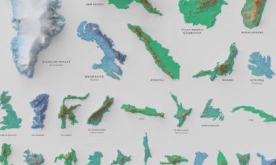
Visualizing the Depth of the Great Lakes
View the full-resolution version of this infographic
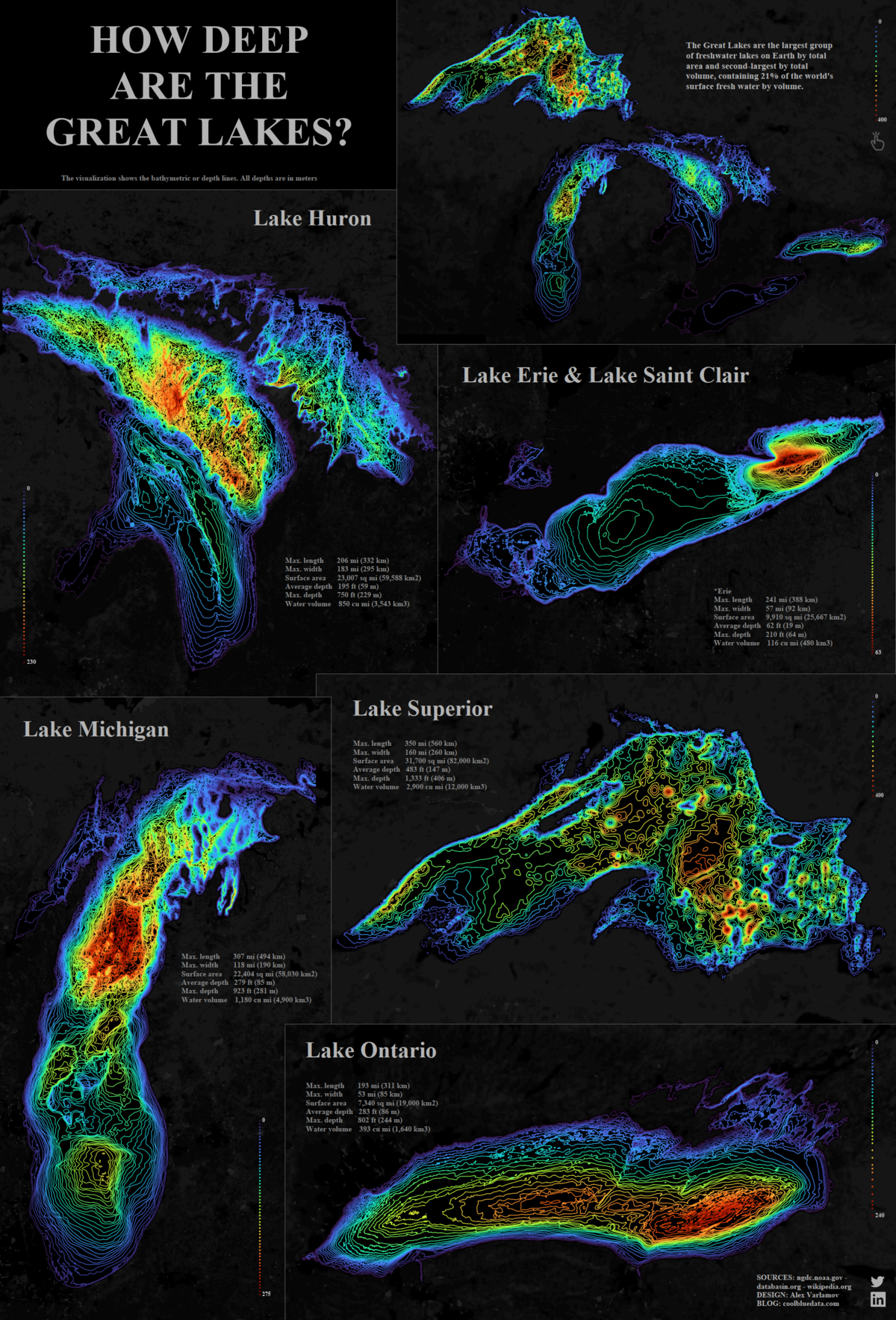
Visualized: The Depth of The Great Lakes
Click here to view the interactive version of the visualization on Tableau.
As the seasons change, it’s natural to want to enjoy the outdoors to the fullest. The Great Lakes, a distinct geographical region sandwiched between the U.S. and Canada, provides immense opportunity for millions of tourists to do just that every year.
But did you know that altogether the Great Lakes contain 21% of the world’s surface freshwater by volume—or 84% of the surface freshwater in North America?
This bathymetric visualization, created by Alex Varlamov, helps put the sheer size and depth of all five of the Great Lakes into perspective.
What is Bathymetry?
Bathymetry is the study of the underwater depth of ocean or lake floors, a geographical science that falls under the wider umbrella of hydrography.
In essence, it is the underwater equivalent of topography. Contour lines help to represent and study the physical features of bodies of water, from oceans to lakes.
Most bathymetric studies are conducted via sonar systems, transmitting pulses that ‘ping’ off the ocean and lake floor, uncovering what lies below.
The Depth of the Great Lakes, Compared
High on the list of the world’s largest lakes, the five Great Lakes altogether account for over 244,700 km² (94,250 mi²) in total surface area. That’s bigger than the entire United Kingdom.
Lake Superior emerges, well, superior in terms of total surface area, water volume, and both average and maximum depth.
| Surface area | Water volume | Average depth | Maximum depth | |
|---|---|---|---|---|
| Lake Ontario | 19,000 km² (7,340 mi²) | 1,640 km³ (393 mi³) | 86 m (283 ft) | 245 m (804 ft) |
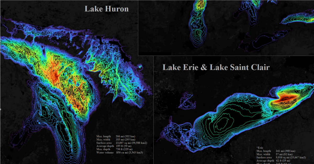
| Lake Erie | 25,700 km² (9,910 mi²) | 480 km³ (116 mi³) | 19 m (62 ft) | 64 m (210 ft) |
| Lake Michigan | 58,000 km² (22,300 mi²) | 4,900 km³ (1,180 mi³) | 85 m (279 ft) | 282 m (925 ft) |
| Lake Huron | 60,000 km² (23,000 mi²) | 3,500 km³ (850 mi³) | 59 m (195 ft) | 228 m (748 ft) |
| Lake Superior | 82,000 km² (31,700 mi²) | 12,000 km³ (2,900 mi³) | 147 m (483 ft) | 406 m (1,333 ft) |
Lake Erie is by far the shallowest of the lakes, with an average depth of just 19 meters (62 ft). That means on average, Lake Superior is about eight times deeper.
With that in mind, one drawback of the visualization is that it doesn’t provide an accurate view of how deep these lakes are in relation to one another.
For that, check out this additional visualization also created by Alex Varlamov, which is scaled to the same 20 meter step—in this view, Lake Erie practically disappears.
More than Meets the Eye
The Great Lakes are not only notable for their form, but also their function—they’re a crucial waterway contributing to the economy of the area, supporting over 50 million jobs and contributing $6 trillion to gross domestic product (GDP).
Together, the five Great Lakes feed into the Atlantic Ocean—and when we expand the scope to compare these lakes to vast oceans, trenches, and drill holes, the depth of the Great Lakes barely scratches the surface.


Misc
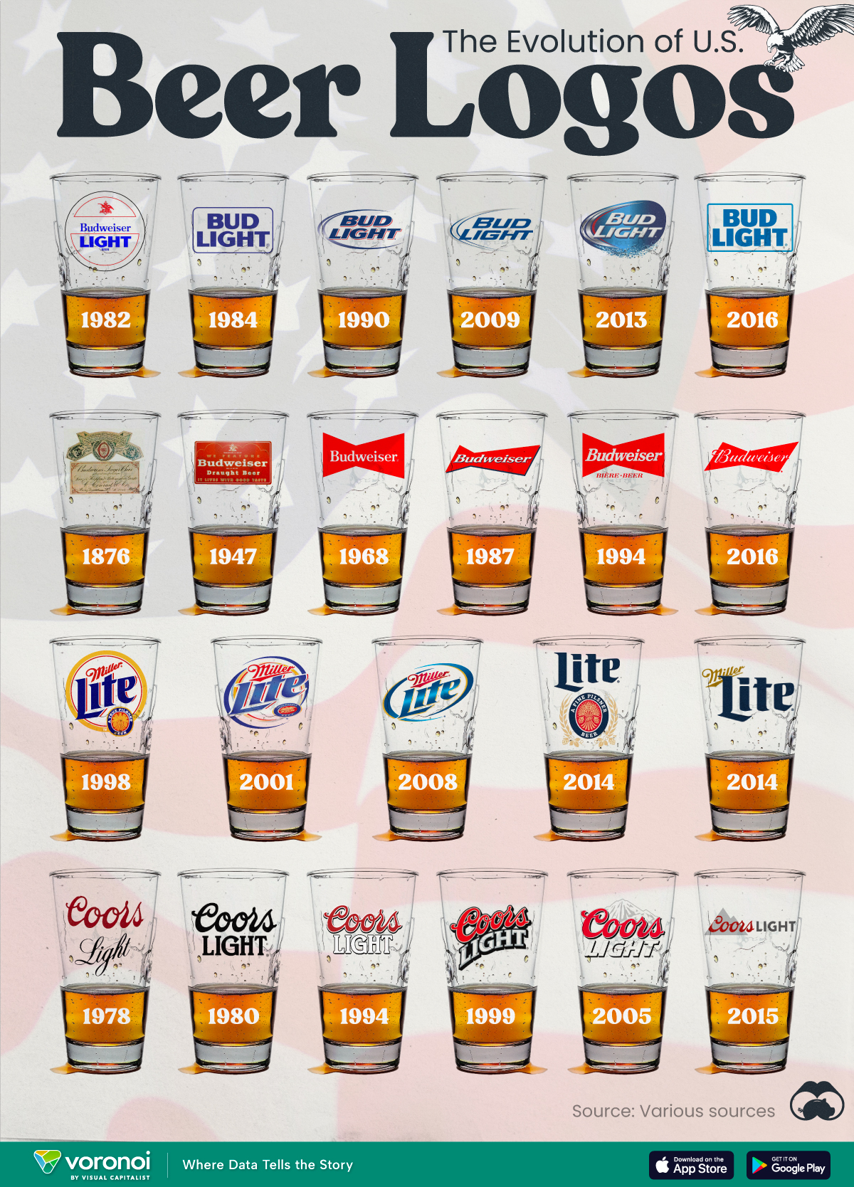
The Evolution of U.S. Beer Logos
In this graphic, we analyze the evolution of popular U.S. beer logos like Budweiser, Coors Light, Bud Light, and more.

The Evolution of U.S. Beer Logos
This was originally posted on our Voronoi app. Download the app for free on iOS or Android and discover incredible data-driven charts from a variety of trusted sources.
Despite selling a popular product, beer companies have to be creative to stand out in a competitive market.
In this graphic, we analyze the evolution of some U.S. beer logos based on various sources. We chose brands based on a mixture of criteria, including popularity (based on YouGov surveys), availability of logo assets, and those with interesting developments.
Bud Light Back to the ’80s
Despite recent backlash and calls for a boycott after sending a commemorative can to transgender influencer Dylan Mulvaney, Bud Light remains one of America’s best-selling beers.
The brand of light beer, owned by the Anheuser-Busch company, has switched from its more circular logo with italic letters adopted in the 1990s back to the Bud Light badge of the 1980s. It is composed of heavy uppercase lettering, written in two levels in a shade of blue with the inscription placed on a solid white background and enclosed in a thin rectangular frame.
Miller Lite Goes Old School
After following a similar approach to Bud Light’s branding throughout the 2000s, Miller Lite decided to undergo a major rebranding in 2014.
The company returned to its 1970s roots, once again combining a white can with its original blue, gold, and red logo. The redesign was largely considered a success, given that Miller Lite sales immediately increased following the change.
A Symbol of American Brewing
The oldest brand on our U.S. beer list, the Budweiser logo, has undergone more than 15 changes over the years.
The design of two connected triangles represents a red bow tie, as a symbol of American brewing.
The colors of the Budweiser logo include a vibrant red, which helps the logo stand out and be easily recognizable from a distance. Studies also suggest that the color red stimulates appetite. Meanwhile, the white inscription symbolizes purity and cleanliness.
Curious to learn more about the beer market? Check out this graphic about global beer consumption.

-

 Markets6 days ago
Visualized: Interest Rate Forecasts for Advanced Economies
-

 Markets2 weeks ago
Economic Growth Forecasts for G7 and BRICS Countries in 2024
-

 Wealth2 weeks ago
Charted: Which City Has the Most Billionaires in 2024?
-

 Technology2 weeks ago
All of the Grants Given by the U.S. CHIPS Act
-

 Green2 weeks ago
The Carbon Footprint of Major Travel Methods
-

 United States1 week ago
Visualizing the Most Common Pets in the U.S.
-

 Culture1 week ago
The World’s Top Media Franchises by All-Time Revenue
-

 voronoi1 week ago
Best Visualizations of April on the Voronoi App