Markets
Visualized: Ranking the Goods Most Traded Between the U.S. and China
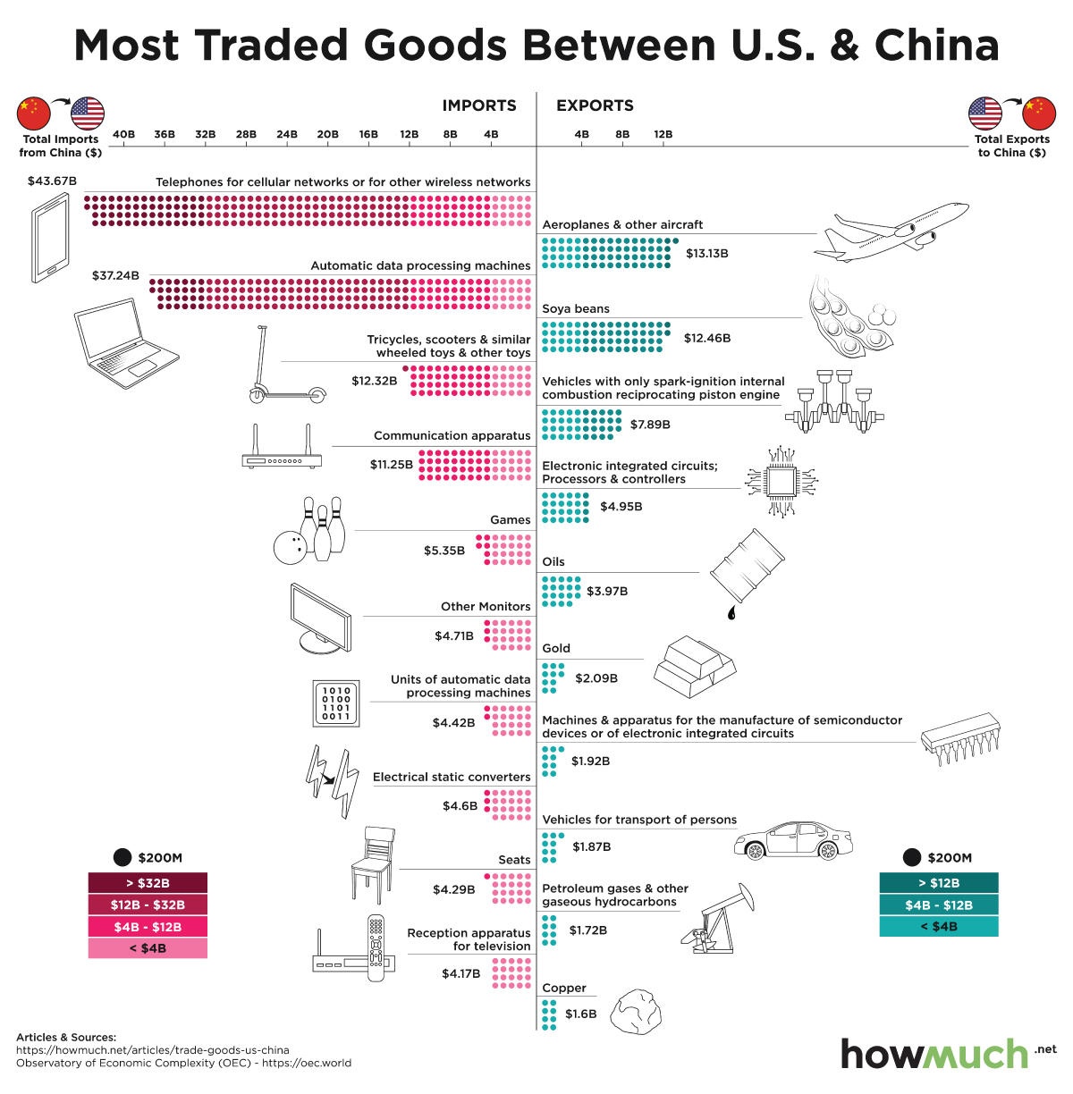
The Most Traded Goods Between the U.S. and China
From a young age, many of us were taught that sharing is caring.
Many countries have also followed this simple principle, in the interest of growth and prosperity, when doing business on a global scale.
Today’s infographic from HowMuch.net charts the top imports and exports between the U.S. and China, pulled from the Observatory of Economic Complexity’s (OEC) global market data for 2017.
Which items do you find most surprising?
Give and Take: The Trade Relationship of the U.S. and China
Two of the world’s largest superpowers today, the U.S. and China have typically had a long-standing trade relationship going back decades.
The table below shows the top 10 exports the U.S. sent to China in 2017, along with the proportion of each item in the total export value of $132 billion. The top 10 items account for 39% of total exports to China.
The Top 10 Exports from the U.S. to China (2017)
| Items | Value (US$B) | % of Total Exports |
|---|---|---|
| Aeroplanes and other aircraft | $13.1 | 9.9% |
| Soya beans | $12.5 | 9.4% |
| Vehicles with only spark-ignition internal combustion reciprocating piston engine | $7.9 | 6.0% |
| Electronic integrated circuits; Processors and controllers | $4.9 | 3.7% |
| Oils | $4.0 | 3.0% |
| Gold | $2.1 | 1.6% |
| Machines and apparatus for the manufacture of semiconductor devices or of electronic integrated circuits | $1.9 | 1.5% |
| Vehicles for transport of persons | $1.9 | 1.4% |
| Petroleum gases and other gaseous hydrocarbons | $1.7 | 1.3% |
| Copper | $1.6 | 1.2% |
While the majority of these are highly specialized, manufactured products─such as airplanes, integrated circuits, and semiconductors─the U.S. still relies on exporting many basic commodities such as gold, copper, and soya beans.
Below is the list of the top 10 imported products from China, and the percent that each product accounts of the total $444 billion in 2017. These top 10 items make up 30% of all products imported from China.
The Top 10 Imports from China to the U.S. (2017)
| Items | Value (US$B) | % of Total Imports |
|---|---|---|
| Telephones for cellular networks or for other wireless networks | $43.7 | 9.8% |
| Automatic data processing machines | $37.2 | 8.4% |
| Trycicles, scooters and similar wheeled toys & other toys | $12.3 | 2.8% |
| Communication apparatus | $11.3 | 2.5% |
| Games; articles for funfair | $5.4 | 1.2% |
| Other Monitors | $4.7 | 1.1% |
| Units of automatic data processing machines | $4.4 | 1.0% |
| Electrical static converters | $4.6 | 1.0% |
| Seats | $4.3 | 1.0% |
| Reception apparatus for television | $4.2 | 0.9% |
China is best known for its electronics and technology-focused products─with electronics products accounting for two-thirds of the top 10 Chinese imports. In 2017, China also dominated all electronics imports into the U.S., claiming over 60% of the market.
But how has the recent trade war impacted the imports and exports between the U.S. and China?
The U.S.-China Trade War Continues
At one point, China was the United States’ top trading partner in terms of the total value of imports and exports. Since the trade war began in 2018, China has fallen to third place.
For example, soybean exports to China in 2019 are predicted to only reach a third of numbers seen in 2018, and the price of this commodity has been nearly cut in half.
In the first nine months of 2019 alone, the U.S. saw a 13.5% drop in imported products from China, due to actual and threatened increased tariffs. In addition, U.S. exports to China dropped by 15.5%─a significant loss of $53 billion.
The Future of U.S.-China Trade
To date, the U.S. has enacted tariffs on over $550 billion worth of imported products from China. In response to the U.S. tariffs, China has added tariffs to $185 billion worth of exported goods from the United States.
With the 2020 U.S. presidential election looming on the horizon, threats of increased tariffs seem to dominate headlines internationally. If these trends continue, many U.S. businesses—both at home and abroad in China—could find their bottom lines threatened by rising trade costs.


Markets
U.S. Debt Interest Payments Reach $1 Trillion
U.S. debt interest payments have surged past the $1 trillion dollar mark, amid high interest rates and an ever-expanding debt burden.


U.S. Debt Interest Payments Reach $1 Trillion
This was originally posted on our Voronoi app. Download the app for free on iOS or Android and discover incredible data-driven charts from a variety of trusted sources.
The cost of paying for America’s national debt crossed the $1 trillion dollar mark in 2023, driven by high interest rates and a record $34 trillion mountain of debt.
Over the last decade, U.S. debt interest payments have more than doubled amid vast government spending during the pandemic crisis. As debt payments continue to soar, the Congressional Budget Office (CBO) reported that debt servicing costs surpassed defense spending for the first time ever this year.
This graphic shows the sharp rise in U.S. debt payments, based on data from the Federal Reserve.
A $1 Trillion Interest Bill, and Growing
Below, we show how U.S. debt interest payments have risen at a faster pace than at another time in modern history:
| Date | Interest Payments | U.S. National Debt |
|---|---|---|
| 2023 | $1.0T | $34.0T |
| 2022 | $830B | $31.4T |
| 2021 | $612B | $29.6T |
| 2020 | $518B | $27.7T |
| 2019 | $564B | $23.2T |
| 2018 | $571B | $22.0T |
| 2017 | $493B | $20.5T |
| 2016 | $460B | $20.0T |
| 2015 | $435B | $18.9T |
| 2014 | $442B | $18.1T |
| 2013 | $425B | $17.2T |
| 2012 | $417B | $16.4T |
| 2011 | $433B | $15.2T |
| 2010 | $400B | $14.0T |
| 2009 | $354B | $12.3T |
| 2008 | $380B | $10.7T |
| 2007 | $414B | $9.2T |
| 2006 | $387B | $8.7T |
| 2005 | $355B | $8.2T |
| 2004 | $318B | $7.6T |
| 2003 | $294B | $7.0T |
| 2002 | $298B | $6.4T |
| 2001 | $318B | $5.9T |
| 2000 | $353B | $5.7T |
| 1999 | $353B | $5.8T |
| 1998 | $360B | $5.6T |
| 1997 | $368B | $5.5T |
| 1996 | $362B | $5.3T |
| 1995 | $357B | $5.0T |
| 1994 | $334B | $4.8T |
| 1993 | $311B | $4.5T |
| 1992 | $306B | $4.2T |
| 1991 | $308B | $3.8T |
| 1990 | $298B | $3.4T |
| 1989 | $275B | $3.0T |
| 1988 | $254B | $2.7T |
| 1987 | $240B | $2.4T |
| 1986 | $225B | $2.2T |
| 1985 | $219B | $1.9T |
| 1984 | $205B | $1.7T |
| 1983 | $176B | $1.4T |
| 1982 | $157B | $1.2T |
| 1981 | $142B | $1.0T |
| 1980 | $113B | $930.2B |
| 1979 | $96B | $845.1B |
| 1978 | $84B | $789.2B |
| 1977 | $69B | $718.9B |
| 1976 | $61B | $653.5B |
| 1975 | $55B | $576.6B |
| 1974 | $50B | $492.7B |
| 1973 | $45B | $469.1B |
| 1972 | $39B | $448.5B |
| 1971 | $36B | $424.1B |
| 1970 | $35B | $389.2B |
| 1969 | $30B | $368.2B |
| 1968 | $25B | $358.0B |
| 1967 | $23B | $344.7B |
| 1966 | $21B | $329.3B |
Interest payments represent seasonally adjusted annual rate at the end of Q4.
At current rates, the U.S. national debt is growing by a remarkable $1 trillion about every 100 days, equal to roughly $3.6 trillion per year.
As the national debt has ballooned, debt payments even exceeded Medicaid outlays in 2023—one of the government’s largest expenditures. On average, the U.S. spent more than $2 billion per day on interest costs last year. Going further, the U.S. government is projected to spend a historic $12.4 trillion on interest payments over the next decade, averaging about $37,100 per American.
Exacerbating matters is that the U.S. is running a steep deficit, which stood at $1.1 trillion for the first six months of fiscal 2024. This has accelerated due to the 43% increase in debt servicing costs along with a $31 billion dollar increase in defense spending from a year earlier. Additionally, a $30 billion increase in funding for the Federal Deposit Insurance Corporation in light of the regional banking crisis last year was a major contributor to the deficit increase.
Overall, the CBO forecasts that roughly 75% of the federal deficit’s increase will be due to interest costs by 2034.

-

 Green1 week ago
Ranked: The Countries With the Most Air Pollution in 2023
-

 Automotive2 weeks ago
Almost Every EV Stock is Down After Q1 2024
-

 AI2 weeks ago
The Stock Performance of U.S. Chipmakers So Far in 2024
-

 Markets2 weeks ago
Charted: Big Four Market Share by S&P 500 Audits
-

 Real Estate2 weeks ago
Ranked: The Most Valuable Housing Markets in America
-

 Money2 weeks ago
Which States Have the Highest Minimum Wage in America?
-

 AI2 weeks ago
Ranked: Semiconductor Companies by Industry Revenue Share
-

 Travel2 weeks ago
Ranked: The World’s Top Flight Routes, by Revenue