Markets
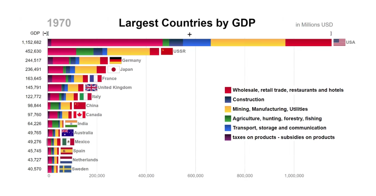
Top Countries by GDP and Economic Components (1970-2017)
Countries by GDP and Economic Components (1970-2017)
While looking at the top countries by GDP is a useful big picture measure, it can also be informative to look at the components that make up an economy as well.
Examining a country’s economic building blocks can tell us a lot about what stage of development the country is in, and where competitive advantages may exist.
Analyzing GDP by Sector
Today’s “horse race” bar chart, by Number Story, is an entertaining historical look at the ranking of top countries by GDP, including the parts that make up the whole.
Here is the latest data as of 2018, as well as the largest sector according to data from the United Nations’ industry classification database:
| Rank | Country | GDP (2018) | Top Sector (% of total) | 2nd Largest Sector (% of total) |
|---|---|---|---|---|
| 1 | 🇺🇸 United States | $20.6T | Other (55%) | Mining/Manufacturing/Utilities (15%) |
| 2 | 🇨🇳 China | $13.6T | Other (36%) | Mining/Manufacturing/Utilities (33%) |
| 3 | 🇯🇵 Japan | $4.9T | Other (43%) | Mining/Manufacturing/Utilities (23%) |
| 4 | 🇩🇪 Germany | $3.6T | Other (48%) | Mining/Manufacturing/Utilities (25%) |
| 5 | 🇬🇧 UK | $2.5T | Other (55%) | Retail/Restaurant/Hotels (14%) |
| 6 | 🇮🇳 India | $2.5T | Other (36%) | Mining/Manufacturing/Utilities (22%) |
| 7 | 🇫🇷 France | $2.5T | Other (56%) | Mining/Manufacturing/Utilities (13%) |
| 8 | 🇮🇹 Italy | $1.9T | Other (49%) | Mining/Manufacturing/Utilities (20%) |
| 9 | 🇧🇷 Brazil | $1.6T | Other (50%) | Mining/Manufacturing/Utilities (16%) |
| 10 | 🇨🇦 Canada | $1.6T | Other (52%) | Mining/Manufacturing/Utilities (18%) |
| 11 | 🇰🇷 South Korea | $1.6T | Other (42%) | Mining/Manufacturing/Utilities (31%) |
| 12 | 🇷🇺 Russia | $1.5T | Other (36%) | Mining/Manufacturing/Utilities (28%) |
| 13 | 🇦🇺 Australia | $1.4T | Other (53%) | Mining/Manufacturing/Utilities (17%) |
| 14 | 🇪🇸 Spain | $1.3T | Other (47%) | Retail/Restaurant/Hotels (19%) |
| 15 | 🇲🇽 Mexico | $1.2T | Other (34%) | Mining/Manufacturing/Utilities (24%) |
Why are “Other Activities” so dominant in this breakdown?
It’s because of the way GDP that components are classified as data in the UN industry classification system, which is laid out below:
- Agriculture, hunting, forestry, fishing (ISIC A-B)
- Mining, manufacturing, utilities (ISIC C-E)
- Construction (ISIC F)
- Wholesale, retail trade, restaurants and hotels (ISIC G-H)
- Transport, storage and communication (ISIC I)
- Other activities, such as finance, healthcare, real estate, and tech (ISIC J-P)
Although agriculture, construction, or manufacturing have been a bedrock for economies in the past, developed countries skew towards adding economic value in different ways today.
Given that finance, government spending (healthcare, education, defense, etc.) and technology — all important modern industries — are included in “Other”, this makes the possibly outdated classification the biggest (and least useful) category to examine here.
Nevertheless, there is still information we can glean from this animated breakdown of GDP, spanning a period of almost 50 years.
A More Granular Look at GDP
In the past, we’ve shown you high level visualizations that break down the world’s $86 trillion GDP by country, or even projections on the largest countries by GDP in 2030 in PPP terms.
However, the animated bar chart shows something more granular that is compelling in its own right. By observing the evolution of countries’ economic components over time, some interesting observations emerge that would normally be lost in the big picture.
Japan’s Manufacturing Boom
At points during Japan’s heyday of growth during the 1980’s, manufacturing comprised nearly 30% of economic activity. By the mid-90s, this single segment of Japan’s economy was so valuable that, on its own, it would’ve placed fifth in the global ranking.
America Leading the Pack
While other countries switch positions, reordering as economies boom and bust, the U.S. has handily remained in top position.
Japan was the country that narrowed the gap between the first and second spot the most, though the country’s Lost Decade in the 1990s cut that ascension short.
During the years between 1970 and 2017, the United States was at its most dominant in 2006 when its GDP was triple the size of Japan’s. Of course, in recent years China has narrowed the gap considerably.
A Star Rising in the East
As one would expect, the building blocks of China’s economy looked very different in the 1970s than today.
The communist systems of the USSR and China are both easy to spot in the visualization. Agriculture played an outsized role, and industries like finance, real estate, and retail were understated compared to the profiles of countries that operated under a capitalist system.
In 1980, as the first Special Economic Zones were being created, three-quarters of China’s economy was based on agriculture, resource extraction, and manufacturing. Even as recently as the early ’90s, China wasn’t in the top 10 despite being the world’s most populous country.
Of course, that situation changed drastically over the next two decades. By the dawn of the 21st century, China ranked fifth in the world, and a decade later, China surpassed Japan to become the second largest economy globally.


Markets
U.S. Debt Interest Payments Reach $1 Trillion
U.S. debt interest payments have surged past the $1 trillion dollar mark, amid high interest rates and an ever-expanding debt burden.


U.S. Debt Interest Payments Reach $1 Trillion
This was originally posted on our Voronoi app. Download the app for free on iOS or Android and discover incredible data-driven charts from a variety of trusted sources.
The cost of paying for America’s national debt crossed the $1 trillion dollar mark in 2023, driven by high interest rates and a record $34 trillion mountain of debt.
Over the last decade, U.S. debt interest payments have more than doubled amid vast government spending during the pandemic crisis. As debt payments continue to soar, the Congressional Budget Office (CBO) reported that debt servicing costs surpassed defense spending for the first time ever this year.
This graphic shows the sharp rise in U.S. debt payments, based on data from the Federal Reserve.
A $1 Trillion Interest Bill, and Growing
Below, we show how U.S. debt interest payments have risen at a faster pace than at another time in modern history:
| Date | Interest Payments | U.S. National Debt |
|---|---|---|
| 2023 | $1.0T | $34.0T |
| 2022 | $830B | $31.4T |
| 2021 | $612B | $29.6T |
| 2020 | $518B | $27.7T |
| 2019 | $564B | $23.2T |
| 2018 | $571B | $22.0T |
| 2017 | $493B | $20.5T |
| 2016 | $460B | $20.0T |
| 2015 | $435B | $18.9T |
| 2014 | $442B | $18.1T |
| 2013 | $425B | $17.2T |
| 2012 | $417B | $16.4T |
| 2011 | $433B | $15.2T |
| 2010 | $400B | $14.0T |
| 2009 | $354B | $12.3T |
| 2008 | $380B | $10.7T |
| 2007 | $414B | $9.2T |
| 2006 | $387B | $8.7T |
| 2005 | $355B | $8.2T |
| 2004 | $318B | $7.6T |
| 2003 | $294B | $7.0T |
| 2002 | $298B | $6.4T |
| 2001 | $318B | $5.9T |
| 2000 | $353B | $5.7T |
| 1999 | $353B | $5.8T |
| 1998 | $360B | $5.6T |
| 1997 | $368B | $5.5T |
| 1996 | $362B | $5.3T |
| 1995 | $357B | $5.0T |
| 1994 | $334B | $4.8T |
| 1993 | $311B | $4.5T |
| 1992 | $306B | $4.2T |
| 1991 | $308B | $3.8T |
| 1990 | $298B | $3.4T |
| 1989 | $275B | $3.0T |
| 1988 | $254B | $2.7T |
| 1987 | $240B | $2.4T |
| 1986 | $225B | $2.2T |
| 1985 | $219B | $1.9T |
| 1984 | $205B | $1.7T |
| 1983 | $176B | $1.4T |
| 1982 | $157B | $1.2T |
| 1981 | $142B | $1.0T |
| 1980 | $113B | $930.2B |
| 1979 | $96B | $845.1B |
| 1978 | $84B | $789.2B |
| 1977 | $69B | $718.9B |
| 1976 | $61B | $653.5B |
| 1975 | $55B | $576.6B |
| 1974 | $50B | $492.7B |
| 1973 | $45B | $469.1B |
| 1972 | $39B | $448.5B |
| 1971 | $36B | $424.1B |
| 1970 | $35B | $389.2B |
| 1969 | $30B | $368.2B |
| 1968 | $25B | $358.0B |
| 1967 | $23B | $344.7B |
| 1966 | $21B | $329.3B |
Interest payments represent seasonally adjusted annual rate at the end of Q4.
At current rates, the U.S. national debt is growing by a remarkable $1 trillion about every 100 days, equal to roughly $3.6 trillion per year.
As the national debt has ballooned, debt payments even exceeded Medicaid outlays in 2023—one of the government’s largest expenditures. On average, the U.S. spent more than $2 billion per day on interest costs last year. Going further, the U.S. government is projected to spend a historic $12.4 trillion on interest payments over the next decade, averaging about $37,100 per American.
Exacerbating matters is that the U.S. is running a steep deficit, which stood at $1.1 trillion for the first six months of fiscal 2024. This has accelerated due to the 43% increase in debt servicing costs along with a $31 billion dollar increase in defense spending from a year earlier. Additionally, a $30 billion increase in funding for the Federal Deposit Insurance Corporation in light of the regional banking crisis last year was a major contributor to the deficit increase.
Overall, the CBO forecasts that roughly 75% of the federal deficit’s increase will be due to interest costs by 2034.

-

 Markets1 week ago
Ranked: The Largest U.S. Corporations by Number of Employees
-

 Green3 weeks ago
Ranked: Top Countries by Total Forest Loss Since 2001
-

 Money2 weeks ago
Where Does One U.S. Tax Dollar Go?
-

 Automotive2 weeks ago
Almost Every EV Stock is Down After Q1 2024
-

 AI2 weeks ago
The Stock Performance of U.S. Chipmakers So Far in 2024
-

 Markets2 weeks ago
Charted: Big Four Market Share by S&P 500 Audits
-

 Real Estate2 weeks ago
Ranked: The Most Valuable Housing Markets in America
-

 Money2 weeks ago
Which States Have the Highest Minimum Wage in America?