Misc
This Clever Map is a Window into 19th Century New York City
The early 19th century was a time of great change for New York, which had already cemented its status as America’s largest city.
The opening of the Erie Canal helped turn the city into a shipping powerhouse, and there was a building boom on the horizon. Cholera epidemics, fires, and riots swept through the city at various points.
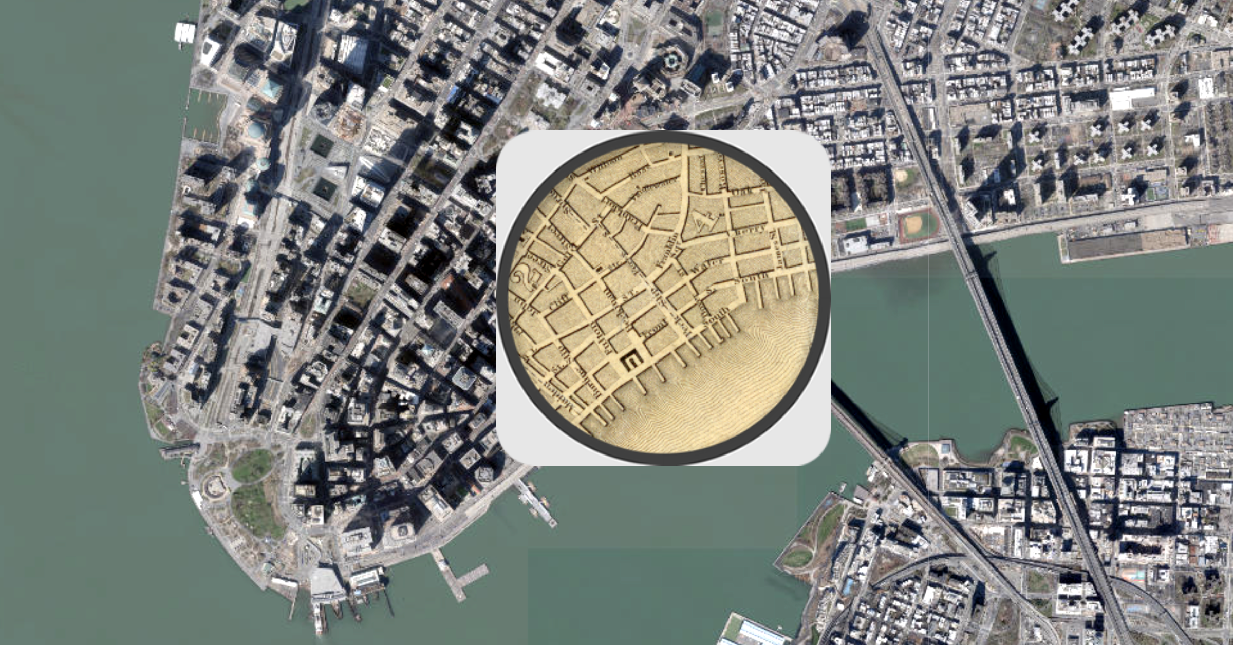
This fascinating interactive map, from Esri, is a snapshot of New York City during the tumultuous time (1836 to be exact), overlaid on the modern-day satellite map.
Getting the Lay of the Land
The base map used above is the stunning “Topographical Map Of The City and County Of New–York, and the adjacent Country”, published by the prodigious mapmaker, Joseph Colton.
For easy viewing, the map’s legend is below:
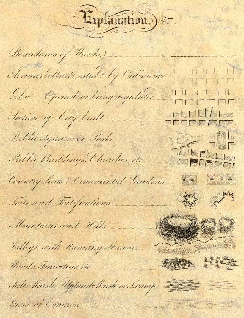
This map includes all the usual features, such as roads and prominent buildings, but it also has some clever secondary information built in as well. For one, shading indicates ares that were more built-up at the time. There are also a number of visual techniques to indicate topographical features as well. After all, NYC wasn’t as extensive as it is today, and much of the land depicted in the map is still undeveloped.
The full map is well worth exploring as well, as there are a number of beautiful illustrations throughout.
Tool tip: Click the X on the info bar to hide it. (Mobile: Click the map, then the magnifying glass.)
The Big Picture: New York City in 1836
At this point in time, development in Lower Manhattan extended until about 14th Street, where buildings began to give way to open spaces. The city’s grid pattern was beginning to take shape, following the Commissioners’ Plan laid out in 1811. At the time, New York was anticipating massive growth, and the straightforward grid pattern was an efficient way to prepare the city for rapid expansion.
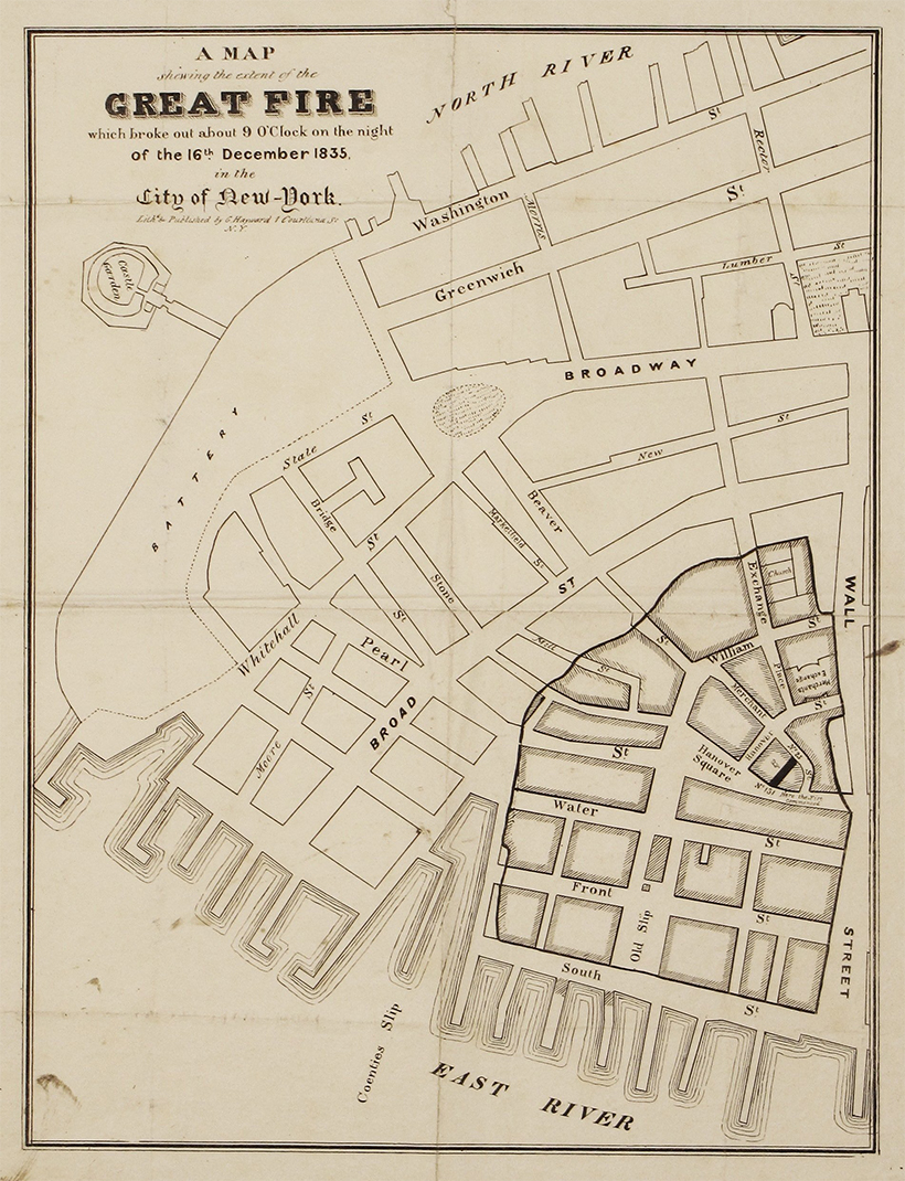
In the 1800s, fire was an ever-present danger for city dwellers. In fact, a major fire tore through Lower Manhattan a year prior to when this map was published.
Points of Interest
There are a number of points worth visiting on this map.
Transit Begins to Take Shape
In the 1830s, New York City’s first railroad line—horse powered for its first few years—connected Prince Street to the Harlem River, accelerating the city’s expansion northward from Lower Manhattan. This route is still recognizable today as the Harlem Line.
Evolving Shorelines
One very obvious difference between the two maps is how much land has been reclaimed along shorelines in the area. Battery Park City, on the west side of downtown, and the Brooklyn Navy Yard are two prominent examples of infill. Randall’s Island, located near the top of Manhattan, is also an interesting place to observe changes in topography. Randall’s Island is actually made up of three islands that were eventually conjoined in the 1960s.
This interactive map is a great place to explore changes to NYC’s shoreline over time.
Taming the Landscape
Midtown Manhattan is worth zooming into for a couple of reasons. First, the outline of Central Park is visible, although the park would officially be approved until almost 20 years later.
As well, this topographical map clearly shows the numerous outcroppings spread across the island. Manhattan was far from flat in the 1800s, and it took a tremendous amount of effort—starting with gunpowder, pickaxes, and horse-drawn carts—to level the land.
Looking at these historical maps is a reminder that the New York City we know today is the product of hundreds of years of human effort, and that cities continue to evolve over time.


Misc
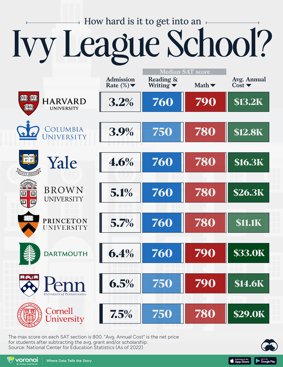
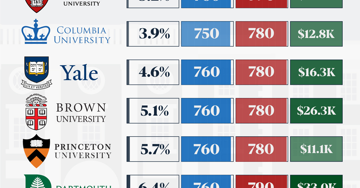
How Hard Is It to Get Into an Ivy League School?
We detail the admission rates and average annual cost for Ivy League schools, as well as the median SAT scores required to be accepted.
How Hard Is It to Get Into an Ivy League School?
This was originally posted on our Voronoi app. Download the app for free on iOS or Android and discover incredible data-driven charts from a variety of trusted sources.
Ivy League institutions are renowned worldwide for their academic excellence and long-standing traditions. But how hard is it to get into one of the top universities in the U.S.?
In this graphic, we detail the admission rates and average annual cost for Ivy League schools, as well as the median SAT scores required to be accepted. The data comes from the National Center for Education Statistics and was compiled by 24/7 Wall St.
Note that “average annual cost” represents the net price a student pays after subtracting the average value of grants and/or scholarships received.
Harvard is the Most Selective
The SAT is a standardized test commonly used for college admissions in the United States. It’s taken by high school juniors and seniors to assess their readiness for college-level academic work.
When comparing SAT scores, Harvard and Dartmouth are among the most challenging universities to gain admission to. The median SAT scores for their students are 760 for reading and writing and 790 for math. Still, Harvard has half the admission rate (3.2%) compared to Dartmouth (6.4%).
| School | Admission rate (%) | SAT Score: Reading & Writing | SAT Score: Math | Avg Annual Cost* |
|---|---|---|---|---|
| Harvard University | 3.2 | 760 | 790 | $13,259 |
| Columbia University | 3.9 | 750 | 780 | $12,836 |
| Yale University | 4.6 | 760 | 780 | $16,341 |
| Brown University | 5.1 | 760 | 780 | $26,308 |
| Princeton University | 5.7 | 760 | 780 | $11,080 |
| Dartmouth College | 6.4 | 760 | 790 | $33,023 |
| University of Pennsylvania | 6.5 | 750 | 790 | $14,851 |
| Cornell University | 7.5 | 750 | 780 | $29,011 |
*Costs after receiving federal financial aid.
Additionally, Dartmouth has the highest average annual cost at $33,000. Princeton has the lowest at $11,100.
While student debt has surged in the United States in recent years, hitting $1.73 trillion in 2023, the worth of obtaining a degree from any of the schools listed surpasses mere academics. This is evidenced by the substantial incomes earned by former students.
Harvard grads, for example, have the highest average starting salary in the country, at $91,700.

-

 Real Estate2 weeks ago
Visualizing America’s Shortage of Affordable Homes
-

 Technology1 week ago
Ranked: Semiconductor Companies by Industry Revenue Share
-

 Money1 week ago
Which States Have the Highest Minimum Wage in America?
-

 Real Estate1 week ago
Ranked: The Most Valuable Housing Markets in America
-

 Business2 weeks ago
Charted: Big Four Market Share by S&P 500 Audits
-

 AI2 weeks ago
The Stock Performance of U.S. Chipmakers So Far in 2024
-

 Misc2 weeks ago
Almost Every EV Stock is Down After Q1 2024
-

 Money2 weeks ago
Where Does One U.S. Tax Dollar Go?