Misc
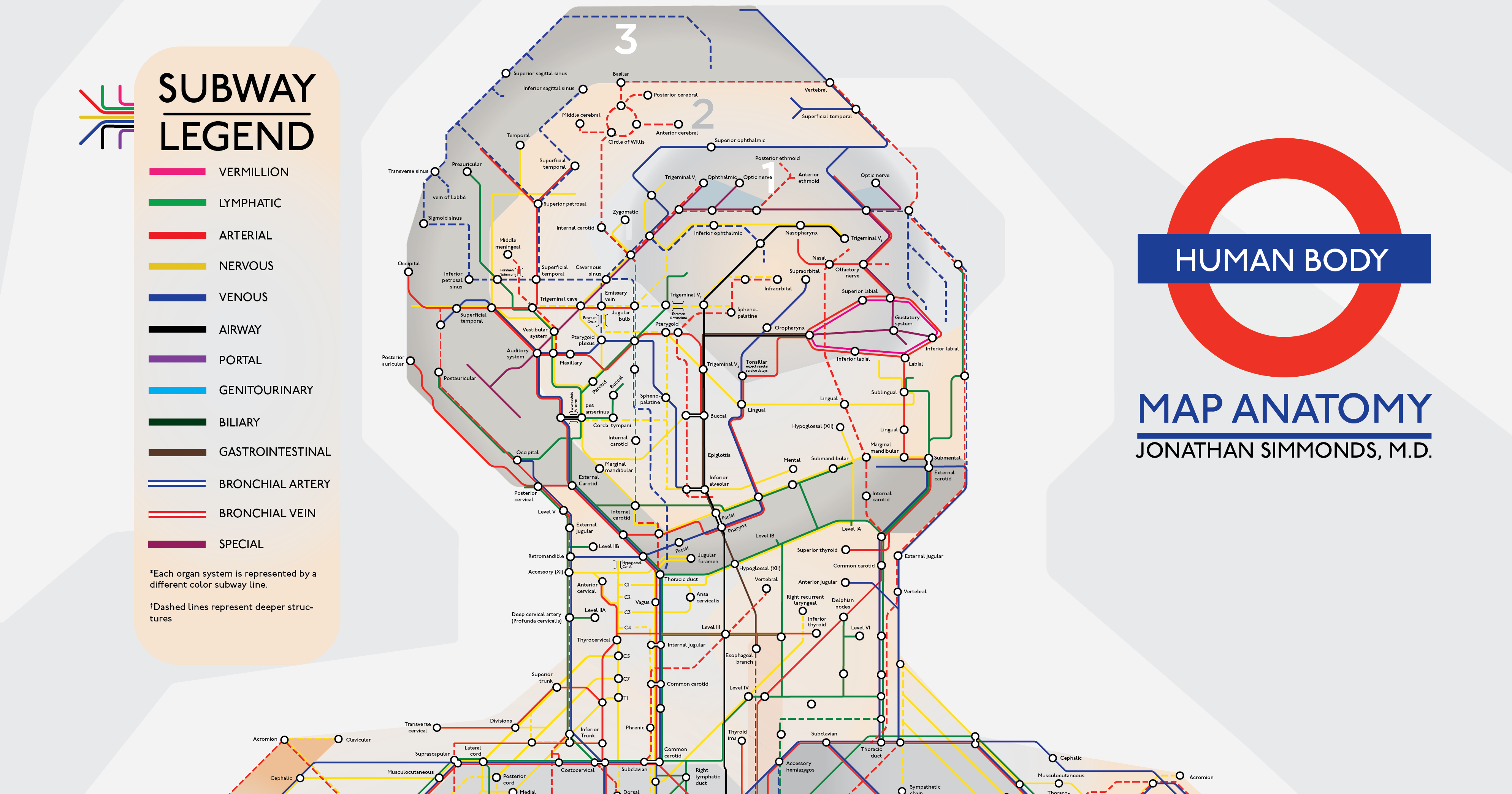
An Illustrated Subway Map of Human Anatomy
What comes to mind when you think about your body?
Most people might imagine an intricate network of blood vessels or the complex neural circuits of the brain. Or we might picture diagrams from the iconic medical textbook, Gray’s Anatomy.
Today’s visualization puts a unique spin on all of these ideas – interpreting human anatomy in the style of London’s transit system. Created by Jonathan Simmonds M.D., a resident physician at Tufts Medical Center, it’s a simple yet beautifully intuitive demonstration of how efficiently our bodies work.
View a high resolution version of this graphic.

Make sure to view the full resolution version of this intricate visualization.
From Point A to Point Z
Right away, we can see that each system is broken down into a few major colored ‘lines’. Here are a few:
- Vermillion system (Pink line)
This covers one of the smallest surface areas, namely the boundary around the mouth from the cupid’s bow to the bottom lip. - Airway system (Black line)
This represents the sections from the nose and mouth, down the windpipe and into the lungs. The system also works with bronchial arteries and veins – the striped blue and red lines respectively. - Nervous system (Yellow line)
This starts from the temporal lobe of the brain, and reaches all the way to the body’s extremities, such as the fingertips and feet. - Portal system (Purple line)
Approximately 75% of blood flowing from the liver passes through portal veins, which are one of two sets of veins connected to the liver. - Special system (Magenta line)
This includes organs responsible for four of the five traditional senses – sight, hearing, smell, and taste – as well the reproductive organs.
While dashed lines represent deeper structures, sections with ‘transfers’ show where different organ systems intersect. The head is also helpfully categorized into three ‘zones’.
Of course, it’s not as straightforward as starting in one place and ending up on the opposite end – as with city transit systems, there are multiple routes that can be taken. If you’re still daunted by where to start with this map of human anatomy, there’s a helpful “You Are Here” at the heart.
To counter common biases in the medical field, Dr. Simmonds has noted that he will soon update the illustration to include racialized and female versions.
An Enduring Symbol
From a broader design perspective, this anatomical subway map draws inspiration from the famous London Underground design.
When engineering draftsman Harry Beck debuted this map back in the 1930s, it caused quite a stir. Many argued that it wasn’t geographically accurate, and that its scale was wildly skewed.
But that didn’t matter to most commuters. Beck’s map offered something that no one else did – it combined all the different lines into one pocket-sized diagram.
Beck’s map was revolutionary in its simplicity.
– Sam Mullins, London Transport Museum Director
As a result, the Tube’s linear, color-coded aesthetic is arguably the most recognizable transit map in the world today. Many major cities hopped on board with the timeless new look, such as Sydney and Paris.
This iconic subway map design has been used as a visual reference for everything from Ancient Roman roads to the Milky Way. That’s what makes it such a good application for the most complex network of all – the human body.


Misc
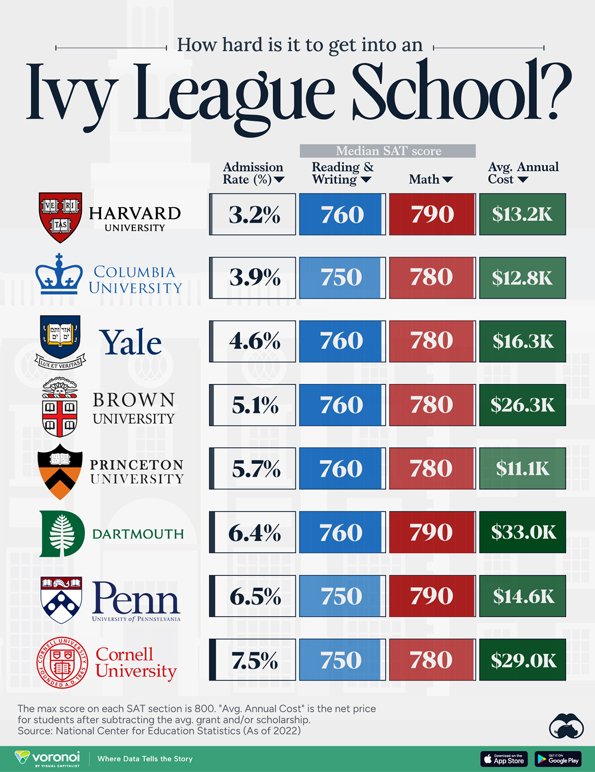
How Hard Is It to Get Into an Ivy League School?
We detail the admission rates and average annual cost for Ivy League schools, as well as the median SAT scores required to be accepted.
How Hard Is It to Get Into an Ivy League School?
This was originally posted on our Voronoi app. Download the app for free on iOS or Android and discover incredible data-driven charts from a variety of trusted sources.
Ivy League institutions are renowned worldwide for their academic excellence and long-standing traditions. But how hard is it to get into one of the top universities in the U.S.?
In this graphic, we detail the admission rates and average annual cost for Ivy League schools, as well as the median SAT scores required to be accepted. The data comes from the National Center for Education Statistics and was compiled by 24/7 Wall St.
Note that “average annual cost” represents the net price a student pays after subtracting the average value of grants and/or scholarships received.
Harvard is the Most Selective
The SAT is a standardized test commonly used for college admissions in the United States. It’s taken by high school juniors and seniors to assess their readiness for college-level academic work.
When comparing SAT scores, Harvard and Dartmouth are among the most challenging universities to gain admission to. The median SAT scores for their students are 760 for reading and writing and 790 for math. Still, Harvard has half the admission rate (3.2%) compared to Dartmouth (6.4%).
| School | Admission rate (%) | SAT Score: Reading & Writing | SAT Score: Math | Avg Annual Cost* |
|---|---|---|---|---|
| Harvard University | 3.2 | 760 | 790 | $13,259 |
| Columbia University | 3.9 | 750 | 780 | $12,836 |
| Yale University | 4.6 | 760 | 780 | $16,341 |
| Brown University | 5.1 | 760 | 780 | $26,308 |
| Princeton University | 5.7 | 760 | 780 | $11,080 |
| Dartmouth College | 6.4 | 760 | 790 | $33,023 |
| University of Pennsylvania | 6.5 | 750 | 790 | $14,851 |
| Cornell University | 7.5 | 750 | 780 | $29,011 |
*Costs after receiving federal financial aid.
Additionally, Dartmouth has the highest average annual cost at $33,000. Princeton has the lowest at $11,100.
While student debt has surged in the United States in recent years, hitting $1.73 trillion in 2023, the worth of obtaining a degree from any of the schools listed surpasses mere academics. This is evidenced by the substantial incomes earned by former students.
Harvard grads, for example, have the highest average starting salary in the country, at $91,700.

-

 Maps2 weeks ago
Mapped: Average Wages Across Europe
-

 Money1 week ago
Which States Have the Highest Minimum Wage in America?
-

 Real Estate1 week ago
Ranked: The Most Valuable Housing Markets in America
-

 Markets1 week ago
Charted: Big Four Market Share by S&P 500 Audits
-

 AI1 week ago
The Stock Performance of U.S. Chipmakers So Far in 2024
-

 Automotive2 weeks ago
Almost Every EV Stock is Down After Q1 2024
-

 Money2 weeks ago
Where Does One U.S. Tax Dollar Go?
-

 Green2 weeks ago
Ranked: Top Countries by Total Forest Loss Since 2001