Markets
Ranked: Which Economies Are the Most Competitive?
Ranked: Which Economies Are the Most Competitive?
What makes a country successful from an economic perspective? Many think of this in terms of GDP per capita—but in a rapidly changing world, our definitions of progress have evolved to encompass much more.
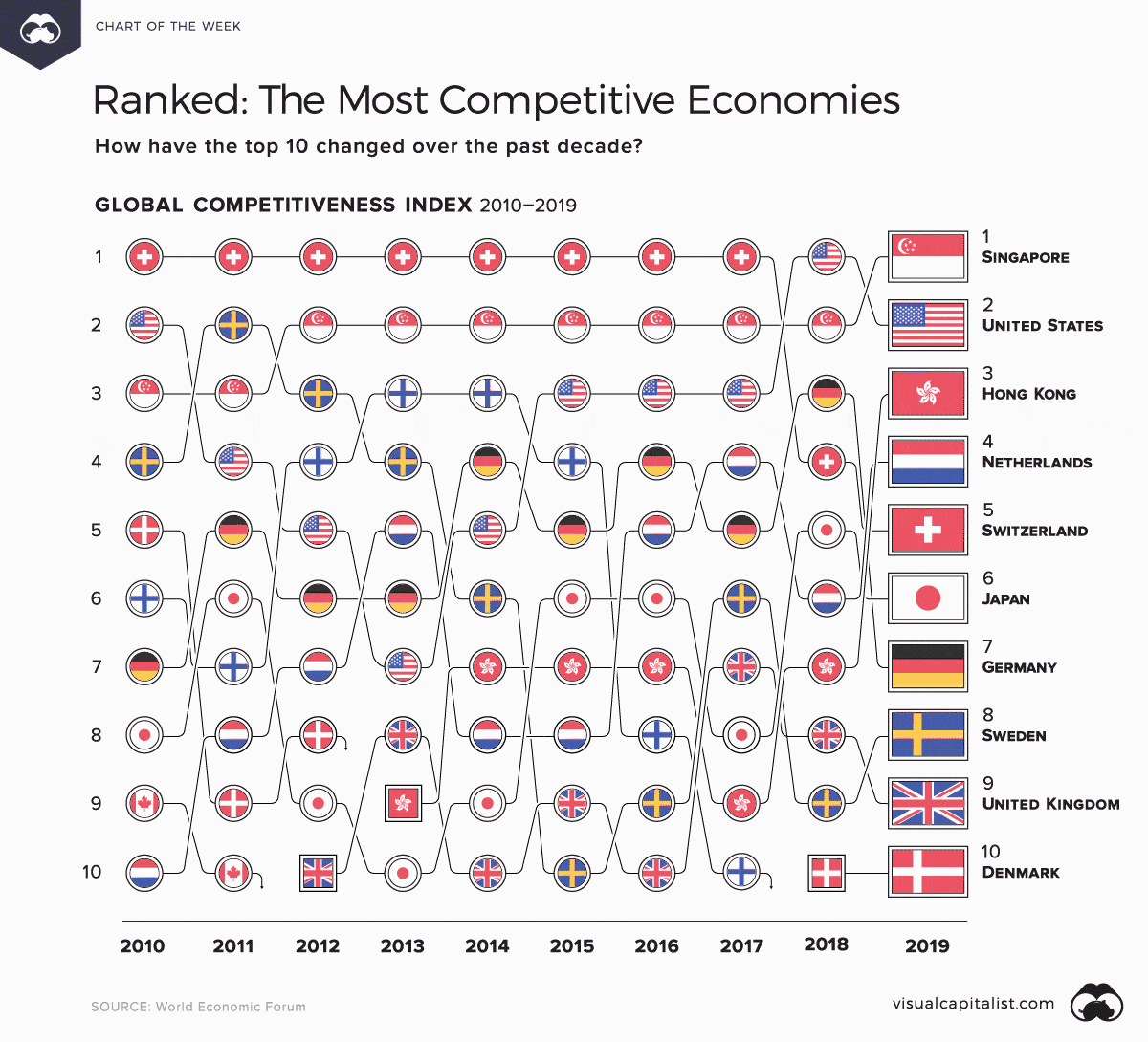
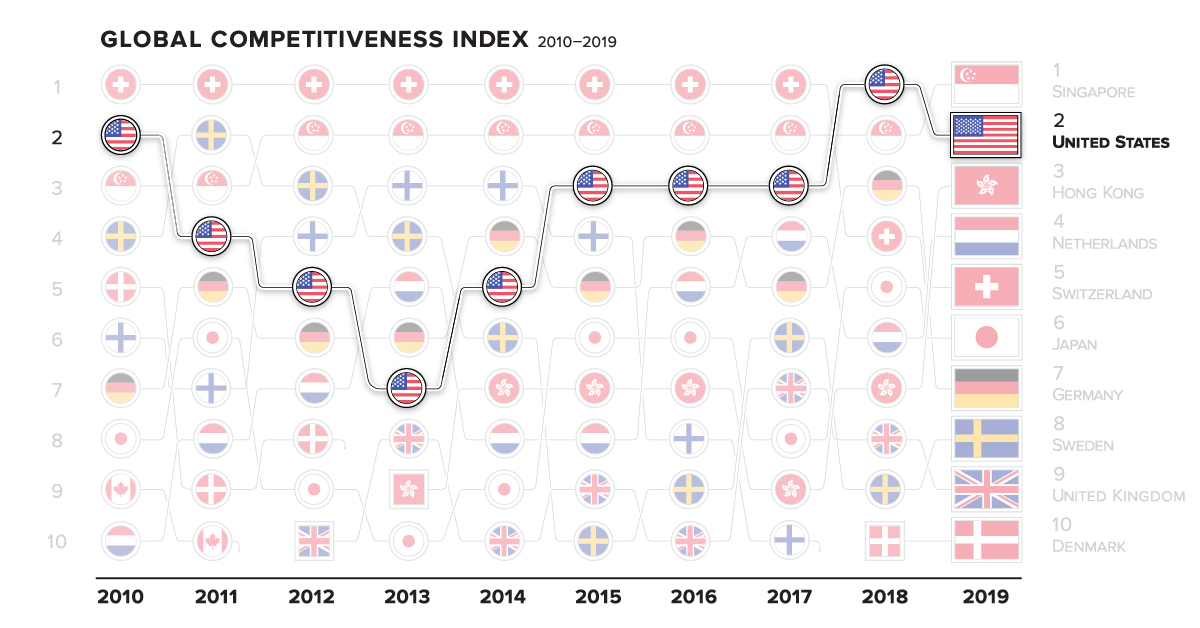
This animated Chart of the Week visualizes 10 years of global competitiveness, according to the World Economic Forum, and tracks how rankings have changed in this time.
How Do You Measure Competition?
The WEF’s annual Global Competitiveness Report defines the concept of ‘competitiveness’ as an economy’s productivity—and the institutions, policies, and factors which shape this.
This year’s edition unpacks the national competitiveness of 141 countries, using the newly-introduced Global Competitiveness Index (GCI) 4.0 which looks at four key metrics:
- Enabling Environment
Includes: Institutions, Infrastructure, ICT Adoption*, Macroeconomic Activity
*Refers to information and communications technology - Human Capital
Includes: Health, Skills - Markets
Includes: Product Market, Labor Market, Financial System, Market Size - Innovation Ecosystem
Includes: Business Dynamics, Innovation Capability
Each country’s overall competitiveness score is an average of these 12 main pillars of productivity. With that out of the way, let’s dive into the countries which emerge triumphant.
The Most Competitive: Movers and Shakers
The world’s top countries excel in many fields—but there can only be one #1. In 2019, Singapore wins the coveted “most competitive economy” title, with a 84.8 score on the GCI.
The nation’s developed infrastructure, health, labor market, and financial system have all propelled it forward—swapping with the U.S. (83.7) for the top spot. However, more can be done, as the report notes Singapore still lacks press freedom and demonstrates a low commitment to sustainability.
How have the current scores of the most competitive economies improved or fallen behind, compared to 2018?
| Rank | Economy | 2019 Score | 2018 Score | 2018-2019 Change |
|---|---|---|---|---|
| #1 | 🇸🇬 Singapore | 84.8 | 83.5 | +1.3 |
| #2 | 🇺🇸 United States | 83.7 | 85.6 | -2 |
| #3 | 🇭🇰 Hong Kong | 83.1 | 82.3 | +0.9 |
| #4 | 🇳🇱 Netherlands | 82.4 | 82.4 | 0 |
| #5 | 🇨🇭 Switzerland | 82.3 | 82.6 | -0.3 |
| #6 | 🇯🇵 Japan | 82.3 | 82.5 | -0.2 |
| #7 | 🇩🇪 Germany | 81.8 | 82.8 | -1 |
| #8 | 🇸🇪 Sweden | 81.2 | 81.7 | -0.4 |
| #9 | 🇬🇧 United Kingdom | 81.2 | 82 | -0.8 |
| #10 | 🇩🇰 Denmark | 81.2 | 80.6 | +0.6 |
Finland (80.2) and Canada (79.6) are notable exits from this top 10 list over the years. Meanwhile, Denmark (81.2) disappeared from the rankings for five years, but managed to climb back up in 2018.
Regional Competitiveness: Highs and Lows
Another perspective on the most competitive economies is to look at how countries fare within regions, and how these regions compete among each other.
Middle East and North Africa (MENA) has the widest gap in competitiveness scores—Israel (76.7) scores over double that of poorest-performing Yemen (35.5). Interestingly, the MENA region showed the most progress, growing its median score by 2.77% between 2018-2019.
The narrowest gap is actually in South Asia, with just a single-digit difference between India (61.4) and Nepal (51.6). However, the region also grew the slowest, with only 0.08% increase in median score over a year.
| Region | Best Performer | 2019 Score | Worst Performer | 2019 Score | Regional Gap |
|---|---|---|---|---|---|
| Europe and North America | 🇺🇸 United States | 83.7 | 🇧🇦 Bosnia & Herzegovina | 54.7 | 29 |
| Latin America and the Caribbean | 🇨🇱 Chile | 70.5 | 🇭🇹 Haiti | 36.3 | 34.2 |
| East Asia and Pacific | 🇸🇬 Singapore | 84.8 | 🇱🇦 Laos | 50.1 | 34.7 |
| South Asia | 🇮🇳 India | 61.4 | 🇳🇵 Nepal | 51.6 | 9.8 |
| Eurasia | 🇷🇺 Russia | 66.7 | 🇹🇯 Tajikistan | 52.4 | 14.3 |
| Middle East and North Africa | 🇮🇱 Israel | 76.7 | 🇾🇪 Yemen | 35.5 | 41.2 |
| Sub-Saharan Africa | 🇲🇺 Mauritius | 64.3 | 🇹🇩 Chad | 35.1 | 29.2 |
Across all regions, the WEF found that East Asia’s 73.9 median score was the highest. Europe and North America were not far behind with a 70.9 median score. This is consistent with the fact that the most competitive economies have all come from these regions in the past decade.
As all these countries race towards the frontier—an ideal state where productivity growth is not constrained—the report notes that competitiveness “does not imply a zero-sum game”. Instead, any and all countries are capable of improving their productivity according to the GCI measures.


Markets
U.S. Debt Interest Payments Reach $1 Trillion
U.S. debt interest payments have surged past the $1 trillion dollar mark, amid high interest rates and an ever-expanding debt burden.


U.S. Debt Interest Payments Reach $1 Trillion
This was originally posted on our Voronoi app. Download the app for free on iOS or Android and discover incredible data-driven charts from a variety of trusted sources.
The cost of paying for America’s national debt crossed the $1 trillion dollar mark in 2023, driven by high interest rates and a record $34 trillion mountain of debt.
Over the last decade, U.S. debt interest payments have more than doubled amid vast government spending during the pandemic crisis. As debt payments continue to soar, the Congressional Budget Office (CBO) reported that debt servicing costs surpassed defense spending for the first time ever this year.
This graphic shows the sharp rise in U.S. debt payments, based on data from the Federal Reserve.
A $1 Trillion Interest Bill, and Growing
Below, we show how U.S. debt interest payments have risen at a faster pace than at another time in modern history:
| Date | Interest Payments | U.S. National Debt |
|---|---|---|
| 2023 | $1.0T | $34.0T |
| 2022 | $830B | $31.4T |
| 2021 | $612B | $29.6T |
| 2020 | $518B | $27.7T |
| 2019 | $564B | $23.2T |
| 2018 | $571B | $22.0T |
| 2017 | $493B | $20.5T |
| 2016 | $460B | $20.0T |
| 2015 | $435B | $18.9T |
| 2014 | $442B | $18.1T |
| 2013 | $425B | $17.2T |
| 2012 | $417B | $16.4T |
| 2011 | $433B | $15.2T |
| 2010 | $400B | $14.0T |
| 2009 | $354B | $12.3T |
| 2008 | $380B | $10.7T |
| 2007 | $414B | $9.2T |
| 2006 | $387B | $8.7T |
| 2005 | $355B | $8.2T |
| 2004 | $318B | $7.6T |
| 2003 | $294B | $7.0T |
| 2002 | $298B | $6.4T |
| 2001 | $318B | $5.9T |
| 2000 | $353B | $5.7T |
| 1999 | $353B | $5.8T |
| 1998 | $360B | $5.6T |
| 1997 | $368B | $5.5T |
| 1996 | $362B | $5.3T |
| 1995 | $357B | $5.0T |
| 1994 | $334B | $4.8T |
| 1993 | $311B | $4.5T |
| 1992 | $306B | $4.2T |
| 1991 | $308B | $3.8T |
| 1990 | $298B | $3.4T |
| 1989 | $275B | $3.0T |
| 1988 | $254B | $2.7T |
| 1987 | $240B | $2.4T |
| 1986 | $225B | $2.2T |
| 1985 | $219B | $1.9T |
| 1984 | $205B | $1.7T |
| 1983 | $176B | $1.4T |
| 1982 | $157B | $1.2T |
| 1981 | $142B | $1.0T |
| 1980 | $113B | $930.2B |
| 1979 | $96B | $845.1B |
| 1978 | $84B | $789.2B |
| 1977 | $69B | $718.9B |
| 1976 | $61B | $653.5B |
| 1975 | $55B | $576.6B |
| 1974 | $50B | $492.7B |
| 1973 | $45B | $469.1B |
| 1972 | $39B | $448.5B |
| 1971 | $36B | $424.1B |
| 1970 | $35B | $389.2B |
| 1969 | $30B | $368.2B |
| 1968 | $25B | $358.0B |
| 1967 | $23B | $344.7B |
| 1966 | $21B | $329.3B |
Interest payments represent seasonally adjusted annual rate at the end of Q4.
At current rates, the U.S. national debt is growing by a remarkable $1 trillion about every 100 days, equal to roughly $3.6 trillion per year.
As the national debt has ballooned, debt payments even exceeded Medicaid outlays in 2023—one of the government’s largest expenditures. On average, the U.S. spent more than $2 billion per day on interest costs last year. Going further, the U.S. government is projected to spend a historic $12.4 trillion on interest payments over the next decade, averaging about $37,100 per American.
Exacerbating matters is that the U.S. is running a steep deficit, which stood at $1.1 trillion for the first six months of fiscal 2024. This has accelerated due to the 43% increase in debt servicing costs along with a $31 billion dollar increase in defense spending from a year earlier. Additionally, a $30 billion increase in funding for the Federal Deposit Insurance Corporation in light of the regional banking crisis last year was a major contributor to the deficit increase.
Overall, the CBO forecasts that roughly 75% of the federal deficit’s increase will be due to interest costs by 2034.

-

 Real Estate2 weeks ago
Visualizing America’s Shortage of Affordable Homes
-

 Technology1 week ago
Ranked: Semiconductor Companies by Industry Revenue Share
-

 Money1 week ago
Which States Have the Highest Minimum Wage in America?
-

 Real Estate1 week ago
Ranked: The Most Valuable Housing Markets in America
-

 Business2 weeks ago
Charted: Big Four Market Share by S&P 500 Audits
-

 AI2 weeks ago
The Stock Performance of U.S. Chipmakers So Far in 2024
-

 Misc2 weeks ago
Almost Every EV Stock is Down After Q1 2024
-

 Money2 weeks ago
Where Does One U.S. Tax Dollar Go?