Demographics
Mapped: The Population of China and India in Perspective
![]() See this visualization first on the Voronoi app.
See this visualization first on the Voronoi app.
The Population of China and India in Perspective
This was originally posted on our Voronoi app. Download the app for free on iOS or Android and discover incredible data-driven charts from a variety of trusted sources.
China and India, the world’s two most populous countries, each boast populations exceeding 1.4 billion people.
To put this into perspective, we visualized populations of China and India beside other leading countries and regions. All figures are for 2023, and were accessed via Worldometer.
Data and Key Takeaways
All of the data we used to create this graphic is listed in the table below.
| Country / Region | Population (2023) |
|---|---|
| 🌍 Africa | 1,460,481,772 |
| 🇮🇳 India | 1,428,627,663 |
| 🇨🇳 China | 1,425,671,352 |
| 🌎 Latin America & the Caribbean | 664,997,121 |
| 🇪🇺🇬🇧 EU plus UK | 516,659,018 |
| 🇺🇸 U.S. | 339,996,563 |
| 🇮🇩 Indonesia | 277,534,122 |
From these figures, we can see that the entire population of Africa (currently the fastest growing region in the world) barely surpasses that of China and India.
The populations of China and India are each more than double the size of Latin America and the Caribbean, and nearly triple that of the European Union (including the UK).
Fast Facts on Global Population
Here are some important figures to know regarding the world’s population:
- China accounts for 17.7% of the world’s population, while India represents a slightly larger 17.8% share.
- Africa is the fastest growing region in the world, with annual growth of about 2.4%.
- Europe is the only region in the world that is shrinking, at about -0.17% annually.
Learn More About Demographics from Visual Capitalist
If you enjoy graphics like these, be sure to check out Population Projections: The World’s 6 Largest Countries in 2075.
It reveals a startling contrast between the trajectories of China and India, with the latter peaking at 1.7 billion in the mid-2060s.
Wealth
Charted: U.S. Wealth by Generation
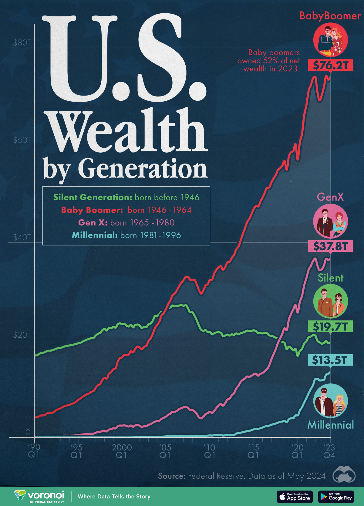
This graphic illustrates the distribution of wealth in the United States from 1990 to 2023 by generation, from Millennials to Boomers.

Charted: U.S. Wealth by Generation
This was originally posted on our Voronoi app. Download the app for free on iOS or Android and discover incredible data-driven charts from a variety of trusted sources.
In 2023, American Baby Boomers owned 52% of the country’s net wealth despite comprising only 20% of the population.
Based on Federal Reserve data, this graphic illustrates the distribution of wealth in the United States from 1990 to 2023 by generation.
Generations are defined by birth year:
- Silent Generation (born before 1946)
- Baby Boomers (born 1946-1964)
- Gen Xers (born 1965-1980)
- Millennials (born 1981-1996)
Baby Boomers Own Over Half of the Wealth
Baby Boomers are often considered one of the luckier generations in terms of timing.
Most did not experience wars and benefited from strong economic growth driven by falling interest rates, a roaring stock market, global monetary expansion, and high earnings. Consequently, this group’s wealth grew from $4.5 trillion in 1990 to $76.2 trillion in 2023.
Wealth by Generation (USD, Trillions)
| Year | Silent | Baby Boom | Gen X | Millennial |
|---|---|---|---|---|
| 1990 | 17.3T | 4.5T | 0.2T | 0 |
| 1995 | 19.9T | 8.6T | 0.6T | 0 |
| 2000 | 22.8T | 17.0T | 2.2T | 0 |
| 2005 | 27.1T | 29.2T | 5.2T | 0.3T |
| 2010 | 21.6T | 34.4T | 6.0T | 0.5T |
| 2015 | 21.4T | 48.4T | 13.0T | 1.9T |
| 2020 | 19.3T | 66.2T | 31.3T | 7.2T |
| 2023 | 19.7T | 76.2T | 37.8T | 13.5T |
Meanwhile, Gen X’s share of American wealth rose from 15% in 2013 to 26% in 2023. In contrast, with most of the cohort over 80 years old, the Silent Generation saw its share of the national wealth total drop from 79% in 1990 to 13% in 2024.
Contrary to their ‘broke generation’ label, millennials have defied expectations. They saw their wealth reach historic highs after the COVID-19 pandemic, amassing more wealth by their 40s than previous generations. In a significant leap, millennials’ share of wealth in America increased from a modest 1.4% to a promising 9.2% between 1990 and 2023.
If you enjoyed this post, be sure to check out this graphic, which shows the retirement savings that Americans currently hold.
-

 Markets1 week ago
Charted: Stock Buybacks by the Magnificent Seven
-

 Maps1 week ago
Mapped: 15 Countries with the Highest Smoking Rates
-

 Sports1 week ago
Ranked: Which NHL Team Takes Home the Most Revenue?
-

 Maps1 week ago
Mapped: Highest and Lowest Doctor Density Around the World
-

 Money1 week ago
Ranked: The World’s Top 10 Billionaires in 2024
-

 Stocks1 week ago
All of the World’s Trillion-Dollar Companies in One Chart
-

 Markets1 week ago
The Growth of $100 Invested in Jim Simons’ Medallion Fund
-

 Stocks1 week ago
Charted: Four Decades of U.S. Tech IPOs


