Money
Mapped: The 3 Billion People Who Can’t Afford a Healthy Diet
VC+ members get access to our World at 8 Billion Report.
Gain access to this exclusive new report and webinar by becoming a VC+ member.
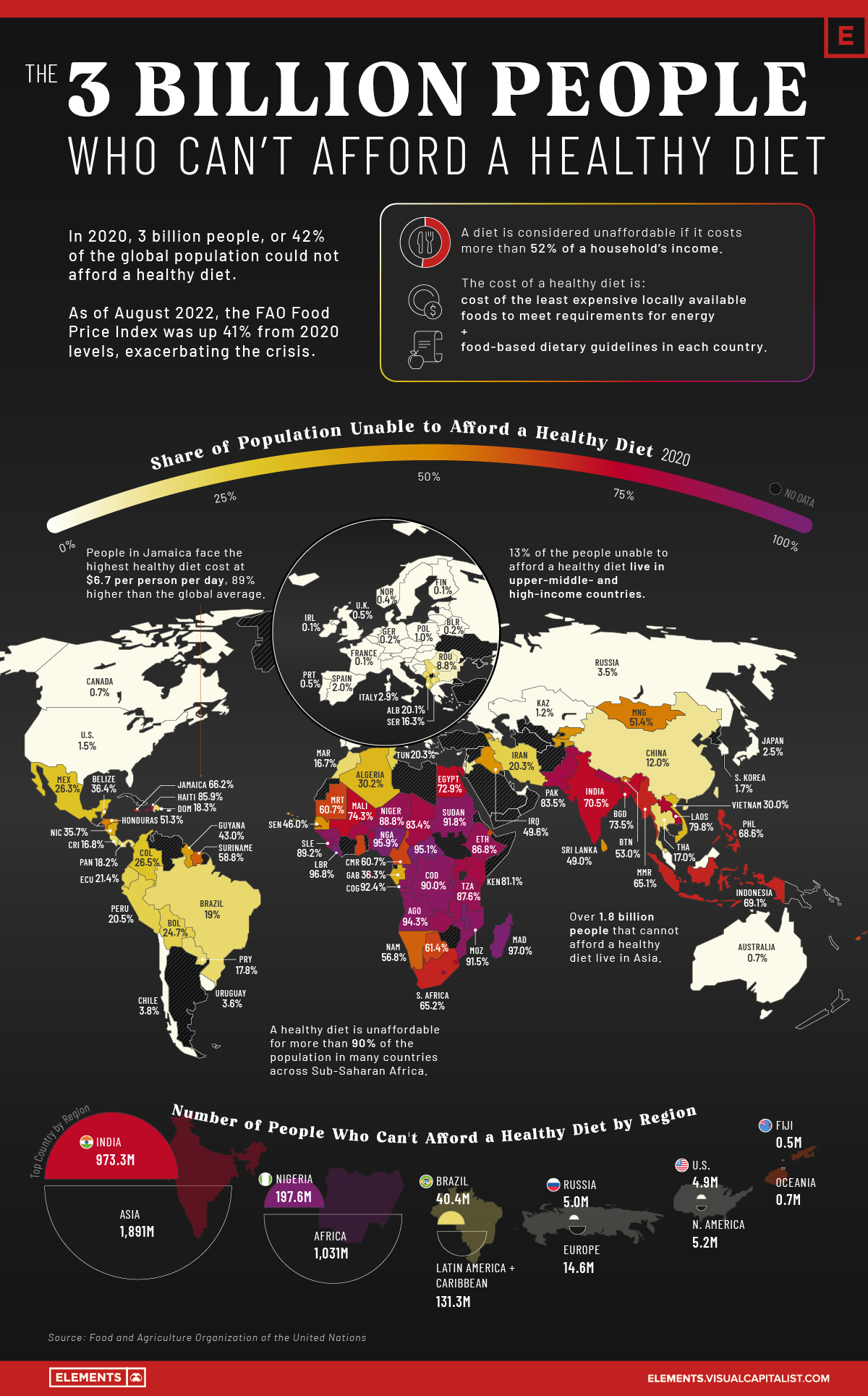
The 3 Billion People Who Can’t Afford a Healthy Diet
While they aren’t often the focus of news media, hunger and undernourishment are problems plaguing millions of people every day.
According to the UN Food and Agriculture Organization (FAO), more than 3 billion people could not afford a healthy diet in 2020, an additional 112 million more people than in 2019. The increase was partly because of rising food prices, with the average cost of a healthy diet rising by 3.3% from 2019 levels.
As of August 2022, the FAO food price index was up 40.6% from average 2020 levels. Unless income levels increased by a similar magnitude, the healthy diet crisis is likely to have worsened, especially in low-income countries experiencing rampant food inflation.
Using data from the FAO, the above infographic maps the share of people unable to afford a healthy diet in 138 different countries as of 2020 (latest available data).
The Cost and Affordability of a Healthy Diet
According to the FAO, a healthy diet is one that meets daily energy needs as well as requirements within the food and dietary guidelines created by the country.
The (un)affordability is measured by comparing the cost of a healthy diet to income levels in the country. If the cost exceeds 52% of an average household’s income, the diet is deemed unaffordable.
Here’s a look at the share of populations unable to afford a healthy diet, and the cost of such a diet around the world:
| Country | Percent of population unable to afford a healthy diet | Cost of Healthy Diet (USD per Person per Day) |
|---|---|---|
| Burundi 🇧🇮 | 97.2% | $2.9 |
| Madagascar 🇲🇬 | 97.0% | $3.2 |
| Liberia 🇱🇷 | 96.8% | $3.9 |
| Malawi 🇲🇼 | 96.6% | $3.1 |
| Nigeria 🇳🇬 | 95.9% | $4.1 |
| Central African Republic 🇨🇫 | 95.1% | $3.6 |
| Guinea 🇬🇳 | 94.9% | $4.1 |
| Angola 🇦🇴 | 94.3% | $4.5 |
| Congo 🇨🇬 | 92.4% | $3.4 |
| Sudan 🇸🇩 | 91.8% | $4.3 |
| Mozambique 🇲🇿 | 91.5% | $3.2 |
| Democratic Republic of Congo 🇨🇩 | 90.0% | $2.1 |
| Sierra Leone 🇸🇱 | 89.2% | $2.9 |
| Niger 🇳🇪 | 88.8% | $2.9 |
| Zambia 🇿🇲 | 88.0% | $3.3 |
| Tanzania 🇹🇿 | 87.6% | $2.7 |
| Guinea-Bissau 🇬🇼 | 87.2% | $3.5 |
| Ethiopia 🇪🇹 | 86.8% | $3.4 |
| Rwanda 🇷🇼 | 86.3% | $2.7 |
| Haiti 🇭🇹 | 85.9% | $4.5 |
| Sao Tome and Principe 🇸🇹 | 84.7% | $3.6 |
| Nepal 🇳🇵 | 84.0% | $4.4 |
| Lesotho 🇱🇸 | 83.5% | $4.3 |
| Pakistan 🇵🇰 | 83.5% | $3.7 |
| Chad 🇹🇩 | 83.4% | $2.8 |
| Benin 🇧🇯 | 82.9% | $3.7 |
| Uganda 🇺🇬 | 82.2% | $2.7 |
| Kenya 🇰🇪 | 81.1% | $3.0 |
| Burkina Faso 🇧🇫 | 80.1% | $3.3 |
| Laos 🇱🇦 | 79.8% | $4.1 |
| Mali 🇲🇱 | 74.3% | $3.1 |
| Bangladesh 🇧🇩 | 73.5% | $3.1 |
| Egypt 🇪🇬 | 72.9% | $3.4 |
| Eswatini 🇸🇿 | 71.8% | $3.4 |
| India 🇮🇳 | 70.5% | $3.0 |
| Indonesia 🇮🇩 | 69.1% | $4.5 |
| Philippines 🇵🇭 | 68.6% | $4.1 |
| Jamaica 🇯🇲 | 66.2% | $6.7 |
| South Africa 🇿🇦 | 65.2% | $4.3 |
| Myanmar 🇲🇲 | 65.1% | $4.2 |
| Gambia 🇬🇲 | 64.0% | $3.1 |
| Djibouti 🇩🇯 | 63.9% | $3.1 |
| Botswana 🇧🇼 | 61.4% | $3.7 |
| Ghana 🇬🇭 | 61.2% | $4.0 |
| Cameroon 🇨🇲 | 60.7% | $2.8 |
| Mauritania 🇲🇷 | 60.7% | $3.7 |
| Fiji 🇫🇯 | 60.4% | $3.9 |
| Suriname 🇸🇷 | 58.8% | $5.7 |
| Namibia 🇳🇦 | 56.8% | $3.5 |
| Bhutan 🇧🇹 | 53.0% | $5.0 |
| Mongolia 🇲🇳 | 51.4% | $5.1 |
| Honduras 🇭🇳 | 51.3% | $3.5 |
| Iraq 🇮🇶 | 49.6% | $3.5 |
| Kyrgyzstan 🇰🇬 | 49.6% | $3.2 |
| Sri Lanka 🇱🇰 | 49.0% | $3.9 |
| Senegal 🇸🇳 | 46.0% | $2.3 |
| Guyana 🇬🇾 | 43.0% | $4.9 |
| Armenia 🇦🇲 | 42.9% | $3.2 |
| Tajikistan 🇹🇯 | 42.1% | $3.5 |
| Cabo Verde 🇨🇻 | 38.1% | $3.6 |
| Belize 🇧🇿 | 36.4% | $2.1 |
| Gabon 🇬🇦 | 36.3% | $3.6 |
| Nicaragua 🇳🇮 | 35.7% | $3.3 |
| Algeria 🇩🇿 | 30.2% | $3.8 |
| Vietnam 🇻🇳 | 30.0% | $4.1 |
| Colombia 🇨🇴 | 26.5% | $3.1 |
| Mexico 🇲🇽 | 26.3% | $3.3 |
| Bolivia 🇧🇴 | 24.7% | $3.8 |
| Palestine 🇵🇸 | 23.1% | $3.4 |
| Ecuador 🇪🇨 | 21.4% | $2.9 |
| Saint Lucia 🇱🇨 | 20.6% | $3.6 |
| Peru 🇵🇪 | 20.5% | $3.3 |
| Iran 🇮🇷 | 20.3% | $3.6 |
| Tunisia 🇹🇳 | 20.3% | $3.6 |
| Albania 🇦🇱 | 20.1% | $4.2 |
| Brazil 🇧🇷 | 19.0% | $3.1 |
| Dominican Republic 🇩🇴 | 18.3% | $3.9 |
| Panama 🇵🇦 | 18.2% | $4.5 |
| North Macedonia 🇲🇰 | 18.0% | $3.4 |
| Paraguay 🇵🇾 | 17.8% | $3.5 |
| Montenegro 🇲🇪 | 17.5% | $3.5 |
| Thailand 🇹🇭 | 17.0% | $4.3 |
| Costa Rica 🇨🇷 | 16.8% | $4.1 |
| Morocco 🇲🇦 | 16.7% | $2.8 |
| Serbia 🇷🇸 | 16.3% | $4.2 |
| Jordan 🇯🇴 | 14.9% | $3.6 |
| Mauritius 🇲🇺 | 13.5% | $3.6 |
| China 🇨🇳 | 12.0% | $3.0 |
| Trinidad and Tobago 🇹🇹 | 11.6% | $4.2 |
| Romania 🇷🇴 | 8.8% | $3.2 |
| Bulgaria 🇧🇬 | 8.5% | $4.1 |
| Seychelles 🇸🇨 | 6.8% | $3.8 |
| Moldova 🇲🇩 | 6.7% | $2.8 |
| Chile 🇨🇱 | 3.8% | $3.4 |
| Croatia 🇭🇷 | 3.8% | $4.3 |
| Bosnia and Herzegovina 🇧🇦 | 3.7% | $4.0 |
| Uruguay 🇺🇾 | 3.6% | $3.4 |
| Russia 🇷🇺 | 3.5% | $3.4 |
| Greece 🇬🇷 | 3.2% | $3.1 |
| Italy 🇮🇹 | 2.9% | $3.1 |
| Japan 🇯🇵 | 2.5% | $5.8 |
| Hungary 🇭🇺 | 2.0% | $3.5 |
| Spain 🇪🇸 | 2.0% | $2.8 |
| Malaysia 🇲🇾 | 1.9% | $3.5 |
| Latvia 🇱🇻 | 1.8% | $3.2 |
| South Korea 🇰🇷 | 1.7% | $5.2 |
| United States 🇺🇸 | 1.5% | $3.4 |
| Maldives 🇲🇻 | 1.4% | $3.9 |
| Estonia 🇪🇪 | 1.3% | $3.3 |
| Kazakhstan 🇰🇿 | 1.2% | $2.7 |
| Lithuania 🇱🇹 | 1.2% | $3.1 |
| Slovakia 🇸🇰 | 1.2% | $3.2 |
| Israel 🇮🇱 | 1.0% | $2.5 |
| Poland 🇵🇱 | 1.0% | $3.2 |
| Austria 🇦🇹 | 0.8% | $3.0 |
| Australia 🇦🇺 | 0.7% | $2.6 |
| Canada 🇨🇦 | 0.7% | $3.0 |
| Malta 🇲🇹 | 0.7% | $3.8 |
| Sweden 🇸🇪 | 0.6% | $3.3 |
| Portugal 🇵🇹 | 0.5% | $2.7 |
| United Kingdom 🇬🇧 | 0.5% | $1.9 |
| Denmark 🇩🇰 | 0.4% | $2.5 |
| Norway 🇳🇴 | 0.4% | $3.5 |
| Cyprus 🇨🇾 | 0.3% | $3.0 |
| Belarus 🇧🇾 | 0.2% | $3.3 |
| Belgium 🇧🇪 | 0.2% | $3.1 |
| Czechia | 0.2% | $3.0 |
| Germany 🇩🇪 | 0.2% | $3.0 |
| Netherlands 🇳🇱 | 0.2% | $3.0 |
| Finland 🇫🇮 | 0.1% | $2.7 |
| France 🇫🇷 | 0.1% | $3.2 |
| Ireland 🇮🇪 | 0.1% | $2.2 |
| Luxembourg 🇱🇺 | 0.1% | $2.7 |
| Slovenia 🇸🇮 | 0.1% | $3.1 |
| Azerbaijan 🇦🇿 | 0.0% | $2.5 |
| Iceland 🇮🇸 | 0.0% | $2.4 |
| Switzerland 🇨🇭 | 0.0% | $2.7 |
| United Arab Emirates 🇦🇪 | 0.0% | $3.1 |
| World 🌎 | 42.0% | $3.5 |
In 52 countries, more than half of the population cannot afford a healthy diet. The majority of these are in Africa, with the rest located across Asia, Oceania, and the Americas.
By contrast, in four countries—Azerbaijan, Iceland, Switzerland, and the UAE—everyone is able to afford a healthy diet. The picture is similar for most European and developed high-income countries, where more than 95% of the population can afford a healthy diet.
When the percentages are translated into numbers, Asia contains the most number of people unable to afford a healthy diet at 1.89 billion, of which 973 million people are in India alone. Another 1 billion people are in Africa, with around 151 million people in the Americas and Oceania.
While hunger is a worldwide concern, it is particularly acute in African countries, which cover all of the top 20 spots in the above table.
Africa’s Deepening Food Crisis
In many countries across sub-Saharan Africa, more than 90% of the population cannot afford a healthy diet.
Sub-Saharan Africa is particularly susceptible to extreme climate events and the resulting volatility in food prices. Roughly one-third of the world’s droughts occur in the region, and some sub-Saharan countries are also heavily reliant on imports for food.
Russia’s invasion of Ukraine has deepened the crisis, with many African countries importing over 50% of their wheat from the two countries in conflict. The rising food prices from this supply chain disruption have resulted in double-digit food inflation in many African nations, which means that more people are likely to be unable to afford healthy diets.
The Horn of Africa region at the Eastern tip of Africa is particularly in turmoil. All the countries in the region are reliant on wheat from Russia and Ukraine, with Eritrea (100%) and Somalia (>90%) high up in the import dependency chart. Additionally, the region is facing its worst drought in 40 years alongside ongoing political conflicts. As a result, 22 million people are at risk of starvation.
Population Growth and Food Insecurity
In November of 2022, the global population is projected to surpass 8 billion people, and many of the fastest growing countries are also food-insecure.
By 2050, the global population is likely to increase by 35%, and to meet the growing demand for food, crop production will need to double. Given that agriculture is one of the biggest contributors to greenhouse gas emissions, this increase in crop production will also need to be environmentally sustainable.
As the impacts of climate change intensify and food demand increases, reducing food waste, building climate-resilient agricultural infrastructure, and improving agricultural productivity will all play a key role in reducing the levels of food insecurity sustainably.


Money
How Debt-to-GDP Ratios Have Changed Since 2000
See how much the debt-to-GDP ratios of advanced economies have grown (or shrank) since the year 2000.


How Debt-to-GDP Ratios Have Changed Since 2000
This was originally posted on our Voronoi app. Download the app for free on Apple or Android and discover incredible data-driven charts from a variety of trusted sources.
Government debt levels have grown in most parts of the world since the 2008 financial crisis, and even more so after the COVID-19 pandemic.
To gain perspective on this long-term trend, we’ve visualized the debt-to-GDP ratios of advanced economies, as of 2000 and 2024 (estimated). All figures were sourced from the IMF’s World Economic Outlook.
Data and Highlights
The data we used to create this graphic is listed in the table below. “Government gross debt” consists of all liabilities that require payment(s) of interest and/or principal in the future.
| Country | 2000 (%) | 2024 (%) | Change (pp) |
|---|---|---|---|
| 🇯🇵 Japan | 135.6 | 251.9 | +116.3 |
| 🇸🇬 Singapore | 82.3 | 168.3 | +86.0 |
| 🇺🇸 United States | 55.6 | 126.9 | +71.3 |
| 🇬🇧 United Kingdom | 36.6 | 105.9 | +69.3 |
| 🇬🇷 Greece | 104.9 | 160.2 | +55.3 |
| 🇫🇷 France | 58.9 | 110.5 | +51.6 |
| 🇵🇹 Portugal | 54.2 | 104.0 | +49.8 |
| 🇪🇸 Spain | 57.8 | 104.7 | +46.9 |
| 🇸🇮 Slovenia | 25.9 | 66.5 | +40.6 |
| 🇫🇮 Finland | 42.4 | 76.5 | +34.1 |
| 🇭🇷 Croatia | 35.4 | 61.8 | +26.4 |
| 🇨🇦 Canada | 80.4 | 103.3 | +22.9 |
| 🇨🇾 Cyprus | 56.0 | 70.9 | +14.9 |
| 🇦🇹 Austria | 65.7 | 74.0 | +8.3 |
| 🇸🇰 Slovak Republic | 50.5 | 56.5 | +6.0 |
| 🇩🇪 Germany | 59.3 | 64.0 | +4.7 |
| 🇧🇪 Belgium | 109.6 | 106.8 | -2.8 |
| 🇮🇱 Israel | 77.4 | 56.8 | -20.6 |
| 🇮🇸 Iceland | 75.8 | 54.6 | -21.2 |
The debt-to-GDP ratio indicates how much a country owes compared to the size of its economy, reflecting its ability to manage and repay debts. Percentage point (pp) changes shown above indicate the increase or decrease of these ratios.
Countries with the Biggest Increases
Japan (+116 pp), Singapore (+86 pp), and the U.S. (+71 pp) have grown their debt as a percentage of GDP the most since the year 2000.
All three of these countries have stable, well-developed economies, so it’s unlikely that any of them will default on their growing debts. With that said, higher government debt leads to increased interest payments, which in turn can diminish available funds for future government budgets.
This is a rising issue in the U.S., where annual interest payments on the national debt have surpassed $1 trillion for the first time ever.
Only 3 Countries Saw Declines
Among this list of advanced economies, Belgium (-2.8 pp), Iceland (-21.2 pp), and Israel (-20.6 pp) were the only countries that decreased their debt-to-GDP ratio since the year 2000.
According to Fitch Ratings, Iceland’s debt ratio has decreased due to strong GDP growth and the use of its cash deposits to pay down upcoming maturities.
See More Debt Graphics from Visual Capitalist
Curious to see which countries have the most government debt in dollars? Check out this graphic that breaks down $97 trillion in debt as of 2023.

-

 Real Estate2 weeks ago
Visualizing America’s Shortage of Affordable Homes
-

 Technology1 week ago
Ranked: Semiconductor Companies by Industry Revenue Share
-

 Money1 week ago
Which States Have the Highest Minimum Wage in America?
-

 Real Estate1 week ago
Ranked: The Most Valuable Housing Markets in America
-

 Business2 weeks ago
Charted: Big Four Market Share by S&P 500 Audits
-

 AI2 weeks ago
The Stock Performance of U.S. Chipmakers So Far in 2024
-

 Misc2 weeks ago
Almost Every EV Stock is Down After Q1 2024
-

 Money2 weeks ago
Where Does One U.S. Tax Dollar Go?