Misc
Map: All of the World’s Borders by Age
View the full resolution version of this map.
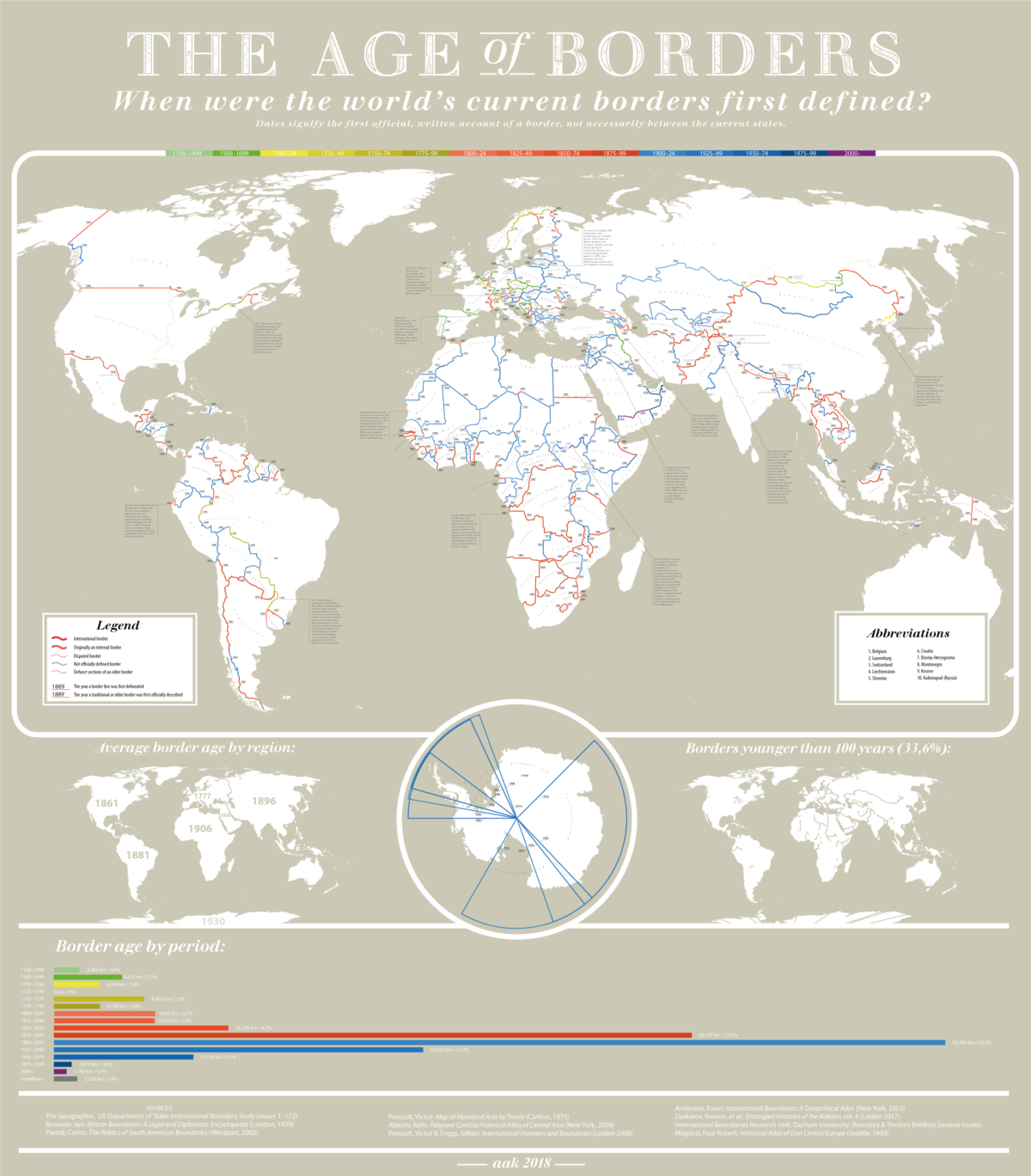
All of the World’s Borders by Age
To view the full resolution version of this massive map, click here.
Defined borders are a relatively new concept in many parts of the world. In fact, until the latter half of the 20th century, most of the world was still wide open territory with loosely or completely undefined borders.
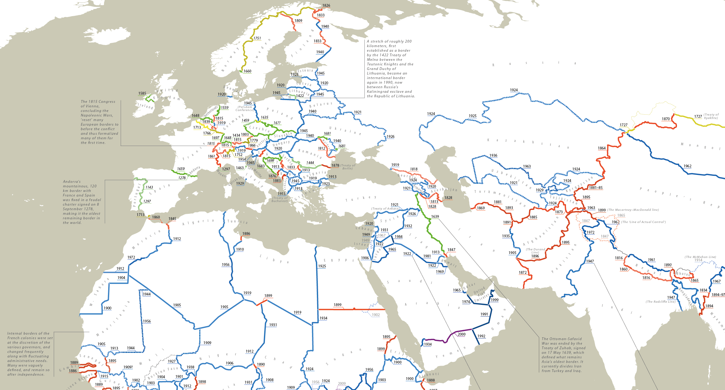
On the European continent, however, jurisdiction over territory has been a fact of life for thousands of years. In some cases, they’ve left a paper trail. In other cases, there are more concrete remnants. For example, over 3,000 miles (5,000 km) of simple frontier fortifications – known as limes – marked the edges of the Roman Empire at its greatest extent in the 2nd century.
Over time, as territorial jurisdiction changed hands through war, marriage, and other arrangements, the map has been redrawn countless times. The video below demonstrates just how dramatically many of Europe’s dividing lines have shifted (even as recently as the 1990s).
Even today, borders are far from set in stone. Belgium and the Netherlands recently swapped land in order to simplify an overly complex piece of their border along a river. Also, India and Bangladesh worked together to solve a notoriously complicated situation involving enclaves within enclaves.
The Difficulty in Date Stamping Dividing Lines
Creating a map that shows the age of all the world’s borders seems like an impossible feat, but Reddit user, PisseGuri82, was up to the challenge. PisseGuri82, acknowledging the extreme complexity of the undertaking, outlined some caveats to consider:
– The map looks at the date a border was officially set to its current form (excluding minute changes).
– The dates are derived from publicly available border treaties and documents.
– Exact dates are difficult to pin down as ratification, surveying, and physical marking can take place over a number of years.
These issues aside, the final product is a fascinating look at how we’ve divided the world up into nations. Here are some highlights from the map:
Static Spain
In contrast to the patchwork of territories left in the wake of the Holy Roman Empire, the southwest part of Europe has remained remarkably static. The border dividing Spain and Andorra, weaving its way through the rocky Pyrenees mountain range, has remained unchanged since 1278, when a feudal charter solidified Andorra’s geography. The Portugal–Spain border has been in place since 1297.
War and Pieces
Many of the oldest borders in the world were established by treaties following a war. One particularly noteworthy example is the border between Iraq and Turkey, which was established by the Treaty of Zuhab (1639) following the sack of Baghdad by the Ottoman Empire.
The Legacy of the “Scramble for Africa”
It’s remarkable to note that a full third of the world’s borders are less than 100 years old. This is especially apparent in Africa, where many existing borders still resemble those haphazardly set by colonial powers around the turn of the 20th century. The average border on the continent is only 111 years old.
We have been giving away mountains and rivers and lakes to each other, only hindered by the small impediment that we never knew exactly where the mountains and rivers and lakes were.
-Lord Salisbury, British PM in 1890
In 1964, independent African states chose to maintain colonial borders, primarily to prevent widespread conflict over territory. Though colonial divisions were maintained in theory, only about one third of Africa’s 51,000 miles (83,000 km) of land borders are demarcated – an issue that continues to cause headaches today. For example, South Sudan has numerous border conflicts with neighbors; a situation that is complicated by the presence of natural resources.
A recent study pointed out that the likelihood of conflict in Africa is approximately 40% higher in areas where “partitioned ethnicities reside, as compared to homelands of ethnicities that have not been separated by national borders”.
Ice Slices
There are seven sovereign states with pie-slice-shaped territorial claims in Antarctica. It’s worth noting that the claims have been recognized only between the countries making claims. There is currently a treaty in place that preserves freedom of scientific investigation and bans military activity on the continent.
Saudi Arabia’s Lines in the Sand
Saudi Arabia’s oldest border section – shared with Kuwait – is a remnant of the Uqair Convention circa 1922, but most of its international borders were established in the latter part of the 20th century. The Yemen–Saudi border was only officially demarcated in the year 2000, and a 1,100 miles (1,800 km) border fence soon followed.
Where will lines Shift next?
Where there is a war and upheaval, border changes often follow. Syria’s descent into chaos and the annexation of Crimea are two situations which could result in new international borders. Breakaway states – an independent Catalan state, for example – are always a possibility as well.
For now, the most likely changes to borders will continue be minor adjustments to fix lawless gaps between nations. These corrections are rarely easy to negotiate, but irregularities, like the one that led to founding of Liberland, can cause even bigger headaches for governments and local officials.


VC+
VC+: Get Our Key Takeaways From the IMF’s World Economic Outlook
A sneak preview of the exclusive VC+ Special Dispatch—your shortcut to understanding IMF’s World Economic Outlook report.

Have you read IMF’s latest World Economic Outlook yet? At a daunting 202 pages, we don’t blame you if it’s still on your to-do list.
But don’t worry, you don’t need to read the whole April release, because we’ve already done the hard work for you.
To save you time and effort, the Visual Capitalist team has compiled a visual analysis of everything you need to know from the report—and our upcoming VC+ Special Dispatch will be available exclusively to VC+ members on Thursday, April 25th.
If you’re not already subscribed to VC+, make sure you sign up now to receive the full analysis of the IMF report, and more (we release similar deep dives every week).
For now, here’s what VC+ members can expect to receive.
Your Shortcut to Understanding IMF’s World Economic Outlook
With long and short-term growth prospects declining for many countries around the world, this Special Dispatch offers a visual analysis of the key figures and takeaways from the IMF’s report including:
- The global decline in economic growth forecasts
- Real GDP growth and inflation forecasts for major nations in 2024
- When interest rate cuts will happen and interest rate forecasts
- How debt-to-GDP ratios have changed since 2000
- And much more!

Get the Full Breakdown in the Next VC+ Special Dispatch
VC+ members will receive the full Special Dispatch on Thursday, April 25th.
Make sure you join VC+ now to receive exclusive charts and the full analysis of key takeaways from IMF’s World Economic Outlook.
Don’t miss out. Become a VC+ member today.
What You Get When You Become a VC+ Member
VC+ is Visual Capitalist’s premium subscription. As a member, you’ll get the following:
- Special Dispatches: Deep dive visual briefings on crucial reports and global trends
- Markets This Month: A snappy summary of the state of the markets and what to look out for
- The Trendline: Weekly curation of the best visualizations from across the globe
- Global Forecast Series: Our flagship annual report that covers everything you need to know related to the economy, markets, geopolitics, and the latest tech trends
- VC+ Archive: Hundreds of previously released VC+ briefings and reports that you’ve been missing out on, all in one dedicated hub
You can get all of the above, and more, by joining VC+ today.

-

 Maps1 week ago
The Largest Earthquakes in the New York Area (1970-2024)
-

 Money2 weeks ago
Where Does One U.S. Tax Dollar Go?
-

 Automotive2 weeks ago
Almost Every EV Stock is Down After Q1 2024
-

 AI2 weeks ago
The Stock Performance of U.S. Chipmakers So Far in 2024
-

 Markets2 weeks ago
Charted: Big Four Market Share by S&P 500 Audits
-

 Real Estate2 weeks ago
Ranked: The Most Valuable Housing Markets in America
-

 Money2 weeks ago
Which States Have the Highest Minimum Wage in America?
-

 AI2 weeks ago
Ranked: Semiconductor Companies by Industry Revenue Share