Markets
Here’s How Much the Top CEOs of S&P 500 Companies Get Paid
How Much the Top CEOs of S&P 500 Companies Get Paid
How much do the CEOs from some of the world’s most important companies get paid, and do these top CEOs deliver commensurate returns to shareholders?
Today’s infographic comes to us from HowMuch.net and it visualizes data on S&P 500 companies to see if there is any relationship between CEO pay and stock performance.
For Richer or Poorer
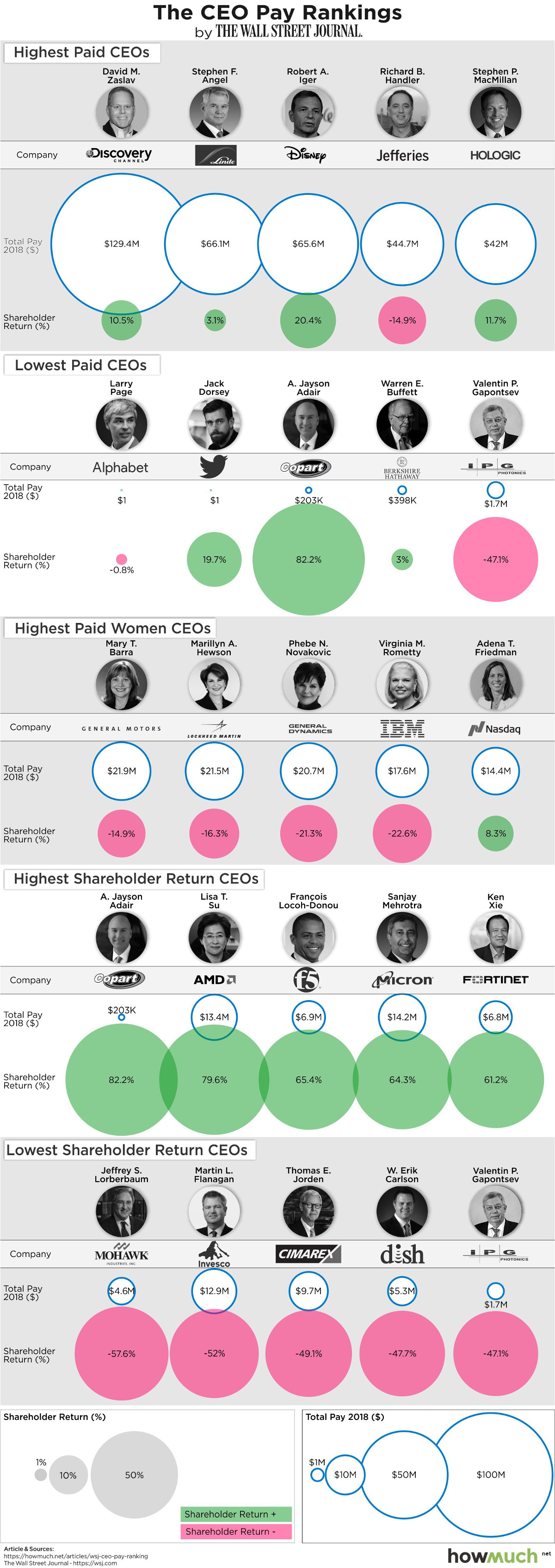
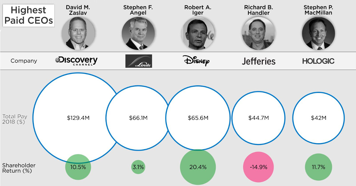
To begin, let’s look at the highest and lowest paid CEOs on the S&P 500, and their associated performance levels. Data here comes from a report by the Wall Street Journal.
Below are the five CEOs with the most pay in 2018:
| Rank | CEO | Company | Pay (2018) | Shareholder Return |
|---|---|---|---|---|
| #1 | David Zaslav | Discovery, Inc. | $129.4 million | 10.5% |
| #2 | Stephen Angel | Linde | $66.1 million | 3.1% |
| #3 | Bob Iger | Disney | $65.6 million | 20.4% |
| #4 | Richard Handler | Jefferies | $44.7 million | -14.9% |
| #5 | Stephen MacMillan | Hologic | $42.0 million | 11.7% |
Last year, David Zaslav led top CEOs by taking home $129.4 million from Discovery, Inc., the parent company of various TV properties such as the Discovery Channel, Animal Planet, HGTV, Food Network, and other non-fiction focused programming. He delivered a 10.4% shareholder return, when the S&P 500 itself finished in negative territory in 2018.
Of the mix of highest-paid CEOs, Bob Iger of Disney may be able to claim the biggest impact. He helped close a $71.3 billion acquisition of 21st Century Fox, while also leading Disney’s efforts to launch a streaming service to compete with Netflix. The market rewarded Disney with a 20.4% shareholder return, while Iger received a paycheck of $65.6 million.
Now, let’s look at the lowest paid CEOs in 2018:
| Rank | CEO | Company | Pay (2018) | Shareholder Return |
|---|---|---|---|---|
| #1 | Larry Page | Alphabet | $1 | -0.8% |
| #2 | Jack Dorsey | $1 | 19.7% | |
| #3 | A. Jayson Adair | Copart | $203,000 | 82.2% |
| #4 | Warren Buffett | Berkshire Hathaway | $398,000 | 3.0% |
| #5 | Valentin Gapontsev | IPG Photonics | $1.7 million | -47.1% |
On the list of lowest paid CEOs, we see two tech titans (Larry Page and Jack Dorsey) that have each opted for $1 salaries. Of course, they are both billionaires that own large amounts of shares in their respective companies, so they are not particularly worried about annual paychecks.
Also appearing here is Warren Buffett, who is technically paid $100,000 per year by Berkshire Hathaway plus an amount of “other compensation” that fluctuates annually. While this is indeed a modest salary, the Warren Buffett Empire is anything but modest in size – and the legendary value investor currently holds a net worth of $84.3 billion.
Finally, it’s worth noting that while J. Jayson Adair of Copart was one of the lowest paid CEOs at $203,000 in 2018, the company had the best return on the S&P 500 at 82.2%. Today, the company’s stock price still sits near all-time highs.
Maxing Returns
Finally, let’s take a peek at the CEOs that received the highest shareholder returns, and if they seem to correlate with compensation at all.
| Rank | CEO | Company | Pay (2018) | Shareholder Return |
|---|---|---|---|---|
| #1 | A. Jayson Adair | Copart | $203,000 | 82.2% |
| #2 | Lisa Su | AMD | $13.4 million | 79.6% |
| #3 | François Locoh-Donou | F5 Networks | $6.9 million | 65.4% |
| #4 | Sanjay Mehrotra | Micron Technology | $14.2 million | 64.3% |
| #5 | Ken Xie | Fortinet | $6.8 million | 61.2% |
Interestingly, three of highest performing CEOs – in terms of shareholder returns – actually took home smaller amounts than the median S&P 500 annual paycheck of $12.4 million. This includes the aforementioned A. Jayson Adair, who raked in only $203,000 in 2018.
That said, there is a good counterpoint to this as well.
Of the five CEOs who had the worst returns, four of them made less than the median value of $12.4 million, while one remaining CEO took home slightly more. In other words, both the best and worst performing CEOs skew towards lower-than-average pay to some degree.


Markets
U.S. Debt Interest Payments Reach $1 Trillion
U.S. debt interest payments have surged past the $1 trillion dollar mark, amid high interest rates and an ever-expanding debt burden.


U.S. Debt Interest Payments Reach $1 Trillion
This was originally posted on our Voronoi app. Download the app for free on iOS or Android and discover incredible data-driven charts from a variety of trusted sources.
The cost of paying for America’s national debt crossed the $1 trillion dollar mark in 2023, driven by high interest rates and a record $34 trillion mountain of debt.
Over the last decade, U.S. debt interest payments have more than doubled amid vast government spending during the pandemic crisis. As debt payments continue to soar, the Congressional Budget Office (CBO) reported that debt servicing costs surpassed defense spending for the first time ever this year.
This graphic shows the sharp rise in U.S. debt payments, based on data from the Federal Reserve.
A $1 Trillion Interest Bill, and Growing
Below, we show how U.S. debt interest payments have risen at a faster pace than at another time in modern history:
| Date | Interest Payments | U.S. National Debt |
|---|---|---|
| 2023 | $1.0T | $34.0T |
| 2022 | $830B | $31.4T |
| 2021 | $612B | $29.6T |
| 2020 | $518B | $27.7T |
| 2019 | $564B | $23.2T |
| 2018 | $571B | $22.0T |
| 2017 | $493B | $20.5T |
| 2016 | $460B | $20.0T |
| 2015 | $435B | $18.9T |
| 2014 | $442B | $18.1T |
| 2013 | $425B | $17.2T |
| 2012 | $417B | $16.4T |
| 2011 | $433B | $15.2T |
| 2010 | $400B | $14.0T |
| 2009 | $354B | $12.3T |
| 2008 | $380B | $10.7T |
| 2007 | $414B | $9.2T |
| 2006 | $387B | $8.7T |
| 2005 | $355B | $8.2T |
| 2004 | $318B | $7.6T |
| 2003 | $294B | $7.0T |
| 2002 | $298B | $6.4T |
| 2001 | $318B | $5.9T |
| 2000 | $353B | $5.7T |
| 1999 | $353B | $5.8T |
| 1998 | $360B | $5.6T |
| 1997 | $368B | $5.5T |
| 1996 | $362B | $5.3T |
| 1995 | $357B | $5.0T |
| 1994 | $334B | $4.8T |
| 1993 | $311B | $4.5T |
| 1992 | $306B | $4.2T |
| 1991 | $308B | $3.8T |
| 1990 | $298B | $3.4T |
| 1989 | $275B | $3.0T |
| 1988 | $254B | $2.7T |
| 1987 | $240B | $2.4T |
| 1986 | $225B | $2.2T |
| 1985 | $219B | $1.9T |
| 1984 | $205B | $1.7T |
| 1983 | $176B | $1.4T |
| 1982 | $157B | $1.2T |
| 1981 | $142B | $1.0T |
| 1980 | $113B | $930.2B |
| 1979 | $96B | $845.1B |
| 1978 | $84B | $789.2B |
| 1977 | $69B | $718.9B |
| 1976 | $61B | $653.5B |
| 1975 | $55B | $576.6B |
| 1974 | $50B | $492.7B |
| 1973 | $45B | $469.1B |
| 1972 | $39B | $448.5B |
| 1971 | $36B | $424.1B |
| 1970 | $35B | $389.2B |
| 1969 | $30B | $368.2B |
| 1968 | $25B | $358.0B |
| 1967 | $23B | $344.7B |
| 1966 | $21B | $329.3B |
Interest payments represent seasonally adjusted annual rate at the end of Q4.
At current rates, the U.S. national debt is growing by a remarkable $1 trillion about every 100 days, equal to roughly $3.6 trillion per year.
As the national debt has ballooned, debt payments even exceeded Medicaid outlays in 2023—one of the government’s largest expenditures. On average, the U.S. spent more than $2 billion per day on interest costs last year. Going further, the U.S. government is projected to spend a historic $12.4 trillion on interest payments over the next decade, averaging about $37,100 per American.
Exacerbating matters is that the U.S. is running a steep deficit, which stood at $1.1 trillion for the first six months of fiscal 2024. This has accelerated due to the 43% increase in debt servicing costs along with a $31 billion dollar increase in defense spending from a year earlier. Additionally, a $30 billion increase in funding for the Federal Deposit Insurance Corporation in light of the regional banking crisis last year was a major contributor to the deficit increase.
Overall, the CBO forecasts that roughly 75% of the federal deficit’s increase will be due to interest costs by 2034.

-

 Markets1 week ago
Ranked: The Largest U.S. Corporations by Number of Employees
-

 Green3 weeks ago
Ranked: Top Countries by Total Forest Loss Since 2001
-

 Money2 weeks ago
Where Does One U.S. Tax Dollar Go?
-

 Misc2 weeks ago
Almost Every EV Stock is Down After Q1 2024
-

 AI2 weeks ago
The Stock Performance of U.S. Chipmakers So Far in 2024
-

 Business2 weeks ago
Charted: Big Four Market Share by S&P 500 Audits
-

 Real Estate2 weeks ago
Ranked: The Most Valuable Housing Markets in America
-

 Money2 weeks ago
Which States Have the Highest Minimum Wage in America?