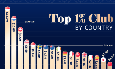
Money
How Americans Make and Spend Their Money
How do you spend your hard-earned money?
Whether you are extremely frugal, or you’re known to indulge in the finer things in life, how you allocate your spending is partially a function of how much cash you have coming in the door.
Simply put, the more income a household generates, the higher the portion that can be spent on items other than the usual necessities (housing, food, clothing, etc), and the more that can be saved or invested for the future.
Earning and Spending, by Income Group
Today’s visuals come to us from Engaging Data, and they use Sankey diagrams to display data from the Bureau of Labor Statistics (BLS) that helps to paint a picture of how different household income groups make and spend their money.
We’ll show you three charts below for the following income groups:
- The Average American
- The Lowest Income Quintile (Bottom 20%)
- The Highest Income Quintile (Highest 20%)
Let’s start by taking a look at the flows of the average American household:
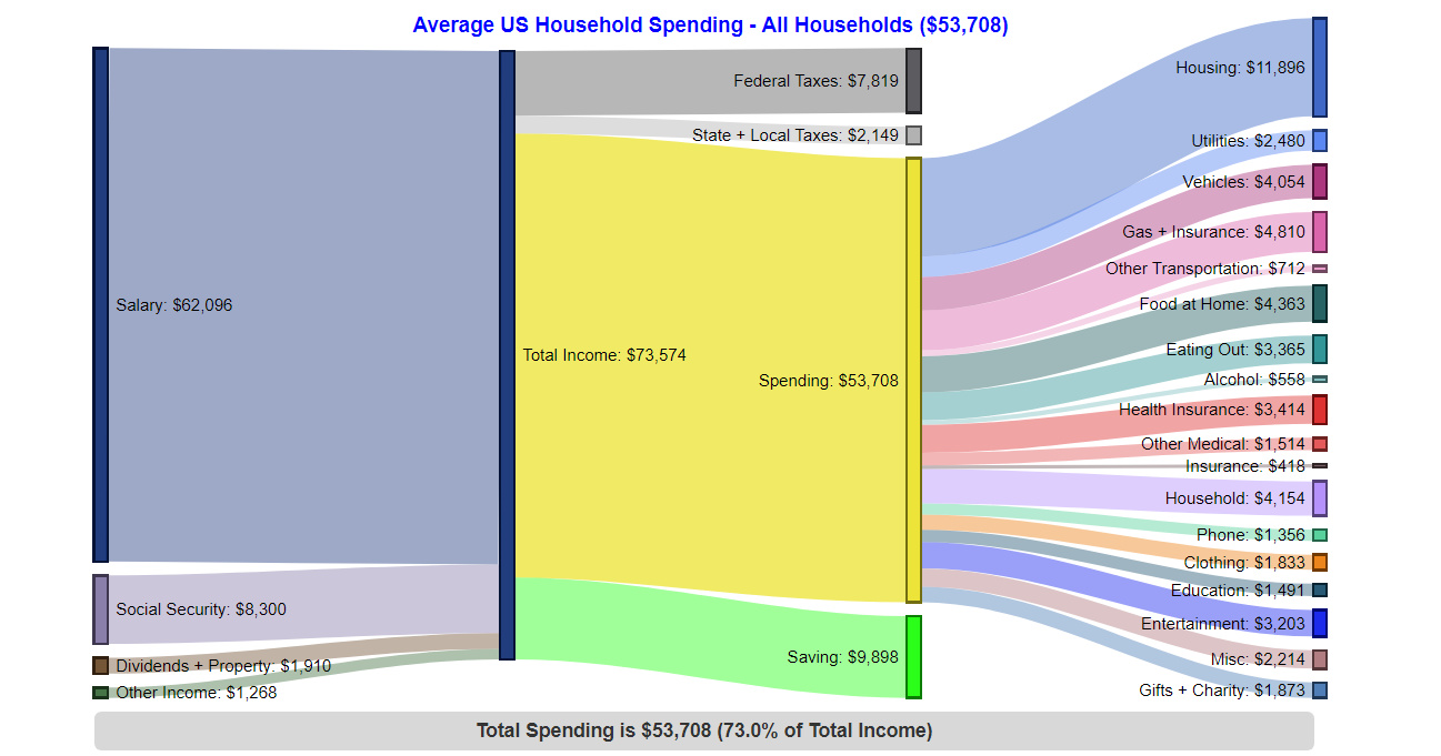
The Average American Household – $53,708 in spending (73% of total income)
The average U.S. household has 2.5 people (1.3 income earners, 0.6 children, and 0.4 seniors)
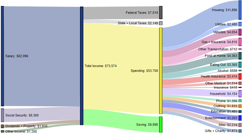
As you can see above the average household generates $73,574 of total inflows, with 84.4% of that coming from salary, and smaller portions coming from social security (11.3%), dividends and property (2.6%), and other income (1.7%).
In terms of money going out, the highest allocation goes to housing (22.1% of spending), while gas and insurance (9.0%), household (7.7%), and vehicles (7.5%) make up the next largest categories.
Interestingly, the average U.S. household also says it is saving just short of $10,000 per year.
The Bottom 20% – $25,525 in spending (100% of total income)
These contain an average of 1.6 people (0.5 income earners, 0.3 children, and 0.4 seniors)
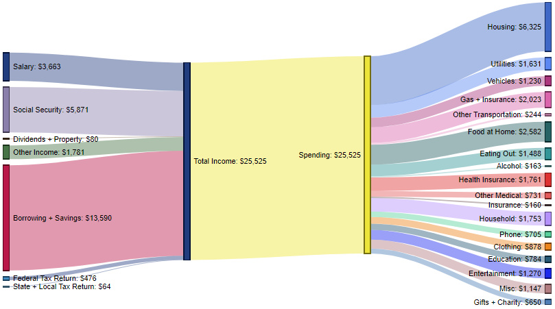
How do the inflows and outflows of the average American household compare to the lowest income quintile?
Here, the top-level statistic tells much of the story, as the poorest income group in America must spend 100% of money coming in to make ends meet. Further, cash comes in from many different sources, showing that there are fewer dependable sources of income for families to rely on.
For expenditures, this group spends the most on housing (24.8% of spending), while other top costs of living include food at home (10.1%), gas and insurance (7.9%), health insurance (6.9%), and household costs (6.9%).
The Highest 20% – $99,639 in spending (53% of total income)
These contain an average of 3.1 people (2.1 income earners, 0.8 children, and 0.2 seniors)
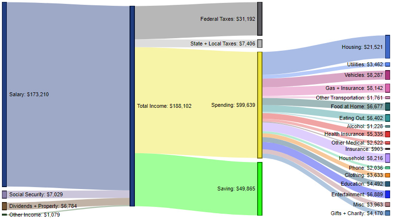
The wealthiest household segment brings in $188,102 in total income on average, with salaries (92.1%) being the top source of inflows.
This group spends just over half of its income, with top expenses being housing (21.6%), vehicles (8.3%), household costs (8.2%), gas and insurance (8.2%), and entertainment (6.9%).
The highest quintile pays just short of $40,000 in federal, state, and local taxes per year, and is also able to contribute roughly $50,000 to savings each year.
Spending Over Time
For a fascinating look at how household spending has changed over time, don’t forget to check out our previous post that charts 75 years of data on how Americans spend money.


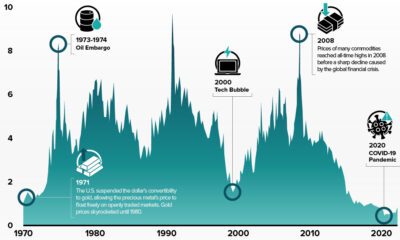

Money
How Debt-to-GDP Ratios Have Changed Since 2000
See how much the debt-to-GDP ratios of advanced economies have grown (or shrank) since the year 2000.


How Debt-to-GDP Ratios Have Changed Since 2000
This was originally posted on our Voronoi app. Download the app for free on Apple or Android and discover incredible data-driven charts from a variety of trusted sources.
Government debt levels have grown in most parts of the world since the 2008 financial crisis, and even more so after the COVID-19 pandemic.
To gain perspective on this long-term trend, we’ve visualized the debt-to-GDP ratios of advanced economies, as of 2000 and 2024 (estimated). All figures were sourced from the IMF’s World Economic Outlook.
Data and Highlights
The data we used to create this graphic is listed in the table below. “Government gross debt” consists of all liabilities that require payment(s) of interest and/or principal in the future.
| Country | 2000 (%) | 2024 (%) | Change (pp) |
|---|---|---|---|
| 🇯🇵 Japan | 135.6 | 251.9 | +116.3 |
| 🇸🇬 Singapore | 82.3 | 168.3 | +86.0 |
| 🇺🇸 United States | 55.6 | 126.9 | +71.3 |
| 🇬🇧 United Kingdom | 36.6 | 105.9 | +69.3 |
| 🇬🇷 Greece | 104.9 | 160.2 | +55.3 |
| 🇫🇷 France | 58.9 | 110.5 | +51.6 |
| 🇵🇹 Portugal | 54.2 | 104.0 | +49.8 |
| 🇪🇸 Spain | 57.8 | 104.7 | +46.9 |
| 🇸🇮 Slovenia | 25.9 | 66.5 | +40.6 |
| 🇫🇮 Finland | 42.4 | 76.5 | +34.1 |
| 🇭🇷 Croatia | 35.4 | 61.8 | +26.4 |
| 🇨🇦 Canada | 80.4 | 103.3 | +22.9 |
| 🇨🇾 Cyprus | 56.0 | 70.9 | +14.9 |
| 🇦🇹 Austria | 65.7 | 74.0 | +8.3 |
| 🇸🇰 Slovak Republic | 50.5 | 56.5 | +6.0 |
| 🇩🇪 Germany | 59.3 | 64.0 | +4.7 |
| 🇧🇪 Belgium | 109.6 | 106.8 | -2.8 |
| 🇮🇱 Israel | 77.4 | 56.8 | -20.6 |
| 🇮🇸 Iceland | 75.8 | 54.6 | -21.2 |
The debt-to-GDP ratio indicates how much a country owes compared to the size of its economy, reflecting its ability to manage and repay debts. Percentage point (pp) changes shown above indicate the increase or decrease of these ratios.
Countries with the Biggest Increases
Japan (+116 pp), Singapore (+86 pp), and the U.S. (+71 pp) have grown their debt as a percentage of GDP the most since the year 2000.
All three of these countries have stable, well-developed economies, so it’s unlikely that any of them will default on their growing debts. With that said, higher government debt leads to increased interest payments, which in turn can diminish available funds for future government budgets.
This is a rising issue in the U.S., where annual interest payments on the national debt have surpassed $1 trillion for the first time ever.
Only 3 Countries Saw Declines
Among this list of advanced economies, Belgium (-2.8 pp), Iceland (-21.2 pp), and Israel (-20.6 pp) were the only countries that decreased their debt-to-GDP ratio since the year 2000.
According to Fitch Ratings, Iceland’s debt ratio has decreased due to strong GDP growth and the use of its cash deposits to pay down upcoming maturities.
See More Debt Graphics from Visual Capitalist
Curious to see which countries have the most government debt in dollars? Check out this graphic that breaks down $97 trillion in debt as of 2023.

-

 Green2 weeks ago
Ranked: Top Countries by Total Forest Loss Since 2001
-

 Travel1 week ago
Ranked: The World’s Top Flight Routes, by Revenue
-

 Technology2 weeks ago
Ranked: Semiconductor Companies by Industry Revenue Share
-

 Money2 weeks ago
Which States Have the Highest Minimum Wage in America?
-

 Real Estate2 weeks ago
Ranked: The Most Valuable Housing Markets in America
-

 Markets2 weeks ago
Charted: Big Four Market Share by S&P 500 Audits
-

 AI2 weeks ago
The Stock Performance of U.S. Chipmakers So Far in 2024
-

 Automotive2 weeks ago
Almost Every EV Stock is Down After Q1 2024