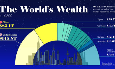
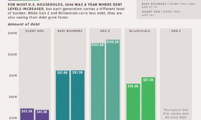
Money
How the Composition of Wealth Differs, from the Middle Class to the Top 1%
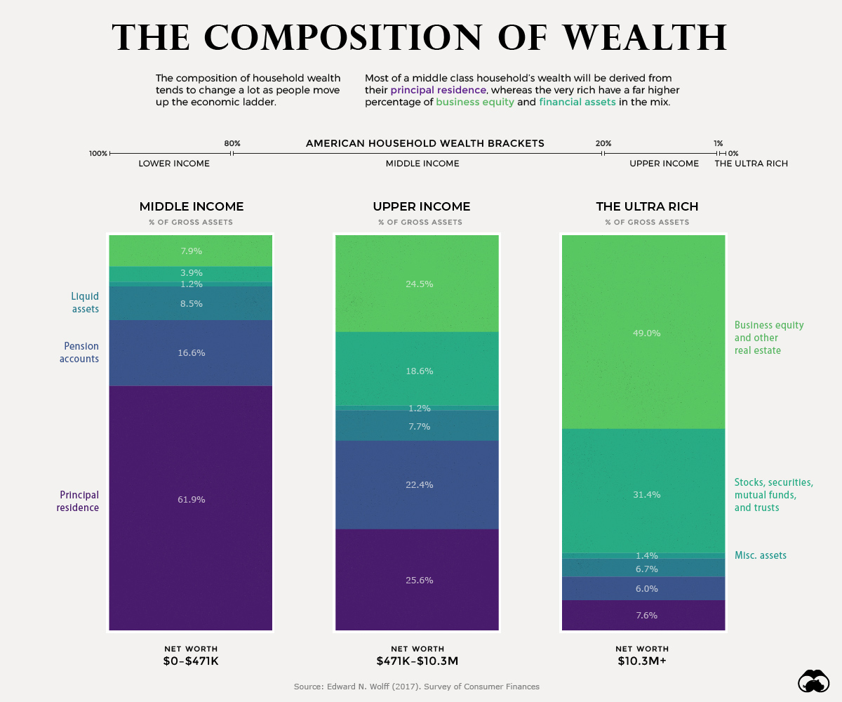
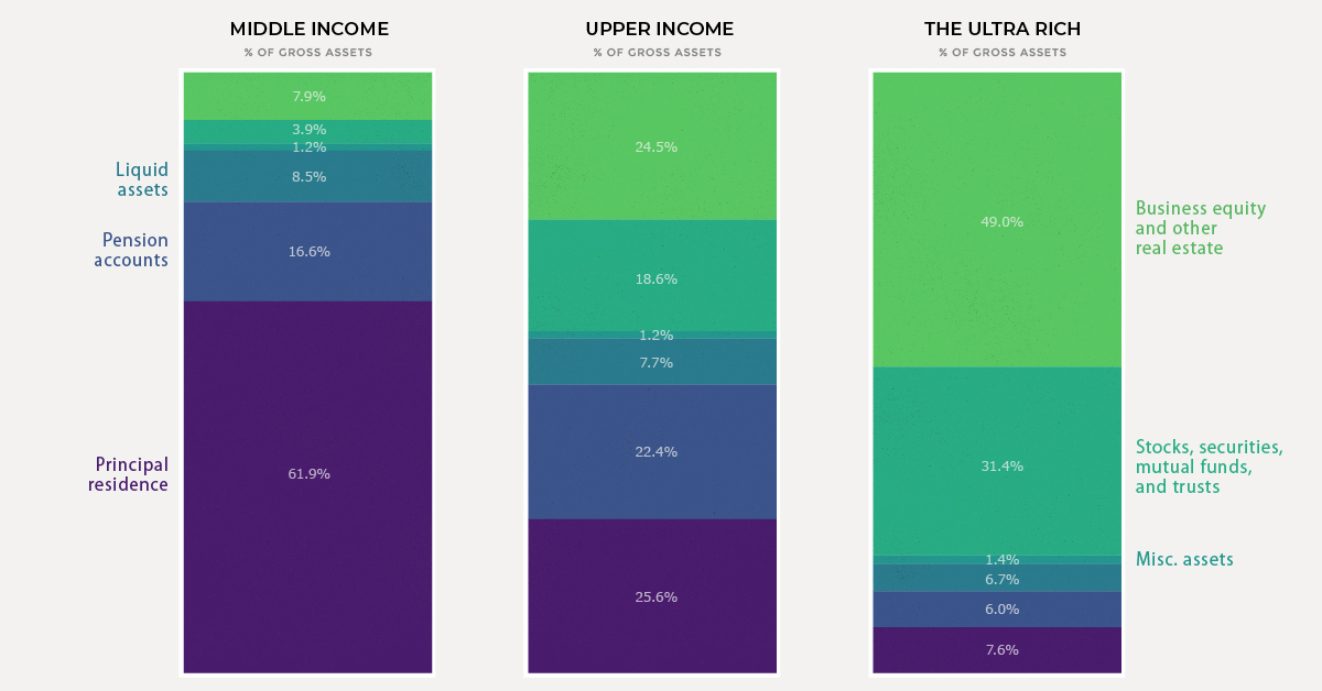
A Breakdown of Wealth, from Middle Class to the Top 1%
Just as household wealth varies greatly across the population, the composition of that wealth changes as well. Simply put, the person next to you at the grocery store will likely have a much different asset mix than, say, Warren Buffett.
Today’s chart breaks down the differences in the composition of wealth between middle income, upper income, and ultra wealthy (top 1%) of American households to help us better understand the building blocks that make up net worth. Let’s dive in.
Middle Income: Home is Where the Wealth is
It’s no surprise that the principal residence is the cornerstone of net worth for most Americans in the middle class. For households that fall in this wide range ($0 to $471k of net worth) the combination of housing and pension accounts make up nearly 80% of total wealth on average.
Assets like stocks and mutual funds only make up about 4% of wealth in this income bracket, partially mirroring the trend of lower stock market participation in recent years.
As we move up the income ladder, however, this situation changes quite a bit.
Upper Income: A Diversified Portfolio
If a household has a net worth that ranges between $471,000 and $10.2 million, it is considered to fall in the upper income band above. This represents the 20% richest households in the U.S., minus the top 1%, which are put in a separate bracket.
For this group, the principal residence makes up a smaller slice of the wealth pie. Instead, we see a higher mix of financial assets like stocks and mutual funds, as well as business equity and real estate. Almost half of households in this group own real estate in addition to their principal residence.
As households become wealthier, we tend to see a lower share of liquid assets as compared with the other components of net worth.
The Top 1%: The Business Equity Bulge
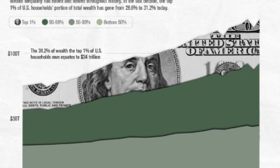
In the richest 1% of households, the principal residence makes up a mere 7.6% of assets. At this stage, almost half of assets fall under the category of business equity and real estate.
A prime example of this is Jeff Bezos. The lion’s share of the Amazon founder’s net worth is tied to the value of his company. Another example is President Trump, whose sprawling real estate empire comprises two-thirds of his estimated $3.1 billion net worth.
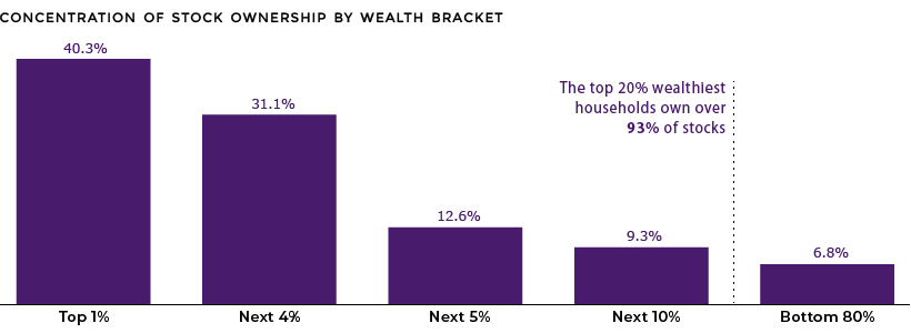
One of the more prominent features of the ultra rich wealth bracket is a much higher level of financial asset ownership. In fact, the top 1% of households own over 40% of stocks.
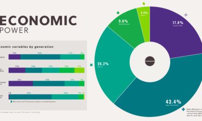
As well, this tiny group of ultra wealthy households earns 22% of total income, up from 8% in the 1970s.


Money
How Debt-to-GDP Ratios Have Changed Since 2000
See how much the debt-to-GDP ratios of advanced economies have grown (or shrank) since the year 2000.


How Debt-to-GDP Ratios Have Changed Since 2000
This was originally posted on our Voronoi app. Download the app for free on Apple or Android and discover incredible data-driven charts from a variety of trusted sources.
Government debt levels have grown in most parts of the world since the 2008 financial crisis, and even more so after the COVID-19 pandemic.
To gain perspective on this long-term trend, we’ve visualized the debt-to-GDP ratios of advanced economies, as of 2000 and 2024 (estimated). All figures were sourced from the IMF’s World Economic Outlook.
Data and Highlights
The data we used to create this graphic is listed in the table below. “Government gross debt” consists of all liabilities that require payment(s) of interest and/or principal in the future.
| Country | 2000 (%) | 2024 (%) | Change (pp) |
|---|---|---|---|
| 🇯🇵 Japan | 135.6 | 251.9 | +116.3 |
| 🇸🇬 Singapore | 82.3 | 168.3 | +86.0 |
| 🇺🇸 United States | 55.6 | 126.9 | +71.3 |
| 🇬🇧 United Kingdom | 36.6 | 105.9 | +69.3 |
| 🇬🇷 Greece | 104.9 | 160.2 | +55.3 |
| 🇫🇷 France | 58.9 | 110.5 | +51.6 |
| 🇵🇹 Portugal | 54.2 | 104.0 | +49.8 |
| 🇪🇸 Spain | 57.8 | 104.7 | +46.9 |
| 🇸🇮 Slovenia | 25.9 | 66.5 | +40.6 |
| 🇫🇮 Finland | 42.4 | 76.5 | +34.1 |
| 🇭🇷 Croatia | 35.4 | 61.8 | +26.4 |
| 🇨🇦 Canada | 80.4 | 103.3 | +22.9 |
| 🇨🇾 Cyprus | 56.0 | 70.9 | +14.9 |
| 🇦🇹 Austria | 65.7 | 74.0 | +8.3 |
| 🇸🇰 Slovak Republic | 50.5 | 56.5 | +6.0 |
| 🇩🇪 Germany | 59.3 | 64.0 | +4.7 |
| 🇧🇪 Belgium | 109.6 | 106.8 | -2.8 |
| 🇮🇱 Israel | 77.4 | 56.8 | -20.6 |
| 🇮🇸 Iceland | 75.8 | 54.6 | -21.2 |
The debt-to-GDP ratio indicates how much a country owes compared to the size of its economy, reflecting its ability to manage and repay debts. Percentage point (pp) changes shown above indicate the increase or decrease of these ratios.
Countries with the Biggest Increases
Japan (+116 pp), Singapore (+86 pp), and the U.S. (+71 pp) have grown their debt as a percentage of GDP the most since the year 2000.
All three of these countries have stable, well-developed economies, so it’s unlikely that any of them will default on their growing debts. With that said, higher government debt leads to increased interest payments, which in turn can diminish available funds for future government budgets.
This is a rising issue in the U.S., where annual interest payments on the national debt have surpassed $1 trillion for the first time ever.
Only 3 Countries Saw Declines
Among this list of advanced economies, Belgium (-2.8 pp), Iceland (-21.2 pp), and Israel (-20.6 pp) were the only countries that decreased their debt-to-GDP ratio since the year 2000.
According to Fitch Ratings, Iceland’s debt ratio has decreased due to strong GDP growth and the use of its cash deposits to pay down upcoming maturities.
See More Debt Graphics from Visual Capitalist
Curious to see which countries have the most government debt in dollars? Check out this graphic that breaks down $97 trillion in debt as of 2023.

-

 Real Estate2 weeks ago
Visualizing America’s Shortage of Affordable Homes
-

 Technology1 week ago
Ranked: Semiconductor Companies by Industry Revenue Share
-

 Money2 weeks ago
Which States Have the Highest Minimum Wage in America?
-

 Real Estate2 weeks ago
Ranked: The Most Valuable Housing Markets in America
-

 Business2 weeks ago
Charted: Big Four Market Share by S&P 500 Audits
-

 AI2 weeks ago
The Stock Performance of U.S. Chipmakers So Far in 2024
-

 Misc2 weeks ago
Almost Every EV Stock is Down After Q1 2024
-

 Money2 weeks ago
Where Does One U.S. Tax Dollar Go?