Best of
Best Visualizations of June on the Voronoi App
At the end of 2023, we publicly launched Voronoi, our free new data discovery app!
The initial response from both users and creators has been incredible. We now have millions of in-app views, and there are already more than 1,500 interesting visualizations to discover, many of which will never be published on Visual Capitalist.
For that reason, we’ve chosen to highlight some of the most popular visualizations and creators from June in this roundup. To see them and many others, make sure to download the app!
Let’s take a look at a popular creator worth highlighting, a top “Editor’s Pick” of the month, and also the most popular and most commented on visuals.
POPULAR CREATOR
Utility
Visual Capitalist isn’t the only creator on the Voronoi app.
Instead, it features incredible data-driven charts and stories from many of the world’s best creators, like Utility.

Utility has been one of the most followed and popular creators in the last two months, covering a wide range of topics like:
- Changes in millionaire populations over the last decade, by country
- Poll results on if U.S. consumers will buy Chinese cars
- The fast food brands that consumers see as the “fanciest”
- How many people in the U.S. live in walkable neighborhoods
Make sure to follow Utility on Voronoi today to see many charts, maps, and visualizations on a wide range of exciting topics.
![]() View all visuals from Utility on Voronoi today.
View all visuals from Utility on Voronoi today.
MOST VIEWED
Mapped: The Income Needed to be Comfortable, by U.S. State
How much money does one person need to take home each year, to feel “comfortable” financially?
This map from Visual Capitalist looks at numbers by U.S. state, taking into account household expenses, discretionary spending, saving and investing, and other factors.
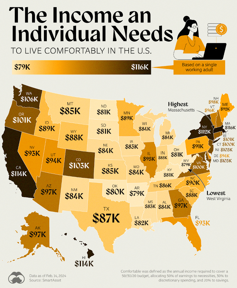
The state with the highest income needed to live comfortably is Massachusetts ($116k/year), while West Virginia was the cheapest ($79k/year). There are many little surprises in the data, however, that make this one interesting.
![]() Get the data behind this visual on Voronoi today.
Get the data behind this visual on Voronoi today.
EDITOR’S PICK
Internet Satellite Companies Compared
One of the recent picks in our Editor’s Pick feed on the app is from creator Made Visual, and it shows constellations of satellites providing internet access.

This visual really showcases SpaceX’s head start in the satellite internet business with Starlink. The company has close to 6,000 satellites, which means they make up at least half of all satellites orbiting Earth—an impressive feat for just one company.
![]() Get the data behind this visual on Voronoi today.
Get the data behind this visual on Voronoi today.
MOST DISCUSSED
Mapped: The 10 Hottest and Coldest Countries
With the summer heating up, we all know what it’s like when it’s so hot that things get uncomfortable.
Well, what if the weather were that toasty all the time? The most discussed graphic this month highlights the countries with the highest (and lowest) average temperatures.

This visualization by Visual Capitalist kicked off a debate on whether certain countries were missed in the rankings, however users were quick to point out that these are average temperatures only, and not local extremes.
For example, although the U.S. has some sweltering cities, it also has some states that get very cold especially during the winter, that bring the overall average down.
![]() To join the conversation, download Voronoi today.
To join the conversation, download Voronoi today.


Best of
Best Visualizations of May on the Voronoi App
We round up the most popular, most discussed, and most liked visualizations of the month on Voronoi, our new data storytelling platform.

At the end of 2023, we publicly launched Voronoi, our free new data discovery app!
The initial response from both users and creators has been incredible. We now have millions of in-app views, and there are already more than 1,000 interesting visualizations to discover, many of which will never be published on Visual Capitalist.
For that reason, we’ve chosen to highlight some of the most popular visualizations and creators from May in this roundup. To see them and many others, make sure to download the app!
Let’s take a look at a popular creator worth highlighting, as well as the most viewed, most discussed, and most liked posts of the month.
POPULAR CREATOR
USAFacts
Visual Capitalist isn’t the only creator on the Voronoi app.
Instead, it features incredible data-driven charts and stories from many of the world’s best data sources, like USAFacts.
USAFacts, which was founded by former Microsoft CEO Steve Ballmer, is a non-profit that aims to collate public sources of U.S. data in one place in a non-partisan way. And on Voronoi, you can see visualizations and the data behind them on an exciting range of topics:
- How the U.S. government spends tax dollars
- Graphing U.S. aid and assistance going to Ukraine and Israel
- How many encounters happen at U.S. borders each year
- The cost of major natural disasters in the U.S. by year
Make sure to follow USAFacts on Voronoi today to see many charts, maps, and visualizations on a wide range of U.S.-related topics.
![]() View all visuals from USAFacts on Voronoi today.
View all visuals from USAFacts on Voronoi today.
MOST VIEWED
Ranked: The 20 Countries With the Most Debt to China
Which countries are racking up the most external debt to China?
This visualization from Visual Capitalist was our most viewed of the month, using the latest available data from the World Bank.

Much of this debt was taken on to fund infrastructure projects as part of China’s “One Belt, One Road” initiative, and some countries are running into difficulties repaying these large sums of money.
It should also be noted that this visual focuses in on external debt (i.e. loans made directly to countries) and does not cover publicly-traded securities like U.S. Treasurys.
![]() Get the data behind this visual on Voronoi today.
Get the data behind this visual on Voronoi today.
MOST DISCUSSED
The Valuation of Nvidia in Perspective
Chipmaker Nvidia has been on a tear recently.
At this time last year, it became a $1 trillion company—and now it’s even bigger, dwarfing many well-known companies in the tech space (including other chipmakers like Intel and AMD) in market capitalization.

This visualization by Visual Capitalist surprised many viewers, making it the most commented post of the month on Voronoi.
![]() To join the conversation, download Voronoi today.
To join the conversation, download Voronoi today.
MOST LIKED
Mapped: Tax Burden by State in 2024
The most liked visual on Voronoi in May came from Visual Capitalist and it shows the average portion of income people pay towards state and local taxes in each U.S. state.

Combining state tax, property tax, and sales & excise taxes, it shows the relative tax burdens across the country.
![]() Get the data behind this visual on Voronoi today.
Get the data behind this visual on Voronoi today.
BONUS
May 2024: Developer Update for Voronoi
Lastly, we thought we’d share our latest developer update for Voronoi, which covers the newest features on the app and what’s coming down the pipe:

We’re pleased to announce that users can now respond directly to comments on the app, and mention other users or creators. We also have really exciting features in our near-term roadmap, including video and slideshow capabilities, customized feeds, and more.
-

 Money2 weeks ago
Visualizing the Wealth of Americans Under 40 (1989-2023)
-
 Sports1 week ago
Ranked: Which NHL Team Takes Home the Most Revenue?
-

 Maps1 week ago
Mapped: Highest and Lowest Doctor Density Around the World
-

 Money1 week ago
Ranked: The World’s Top 10 Billionaires in 2024
-

 Stocks1 week ago
All of the World’s Trillion-Dollar Companies in One Chart
-

 Markets1 week ago
The Growth of $100 Invested in Jim Simons’ Medallion Fund
-

 Stocks1 week ago
Charted: Four Decades of U.S. Tech IPOs
-

 Retail1 week ago
Ranked: The 20 Top Retailers Worldwide, by Revenue