Personal Finance
Visualizing American Income Levels by Age Group
Visualizing American Income Levels by Age Group
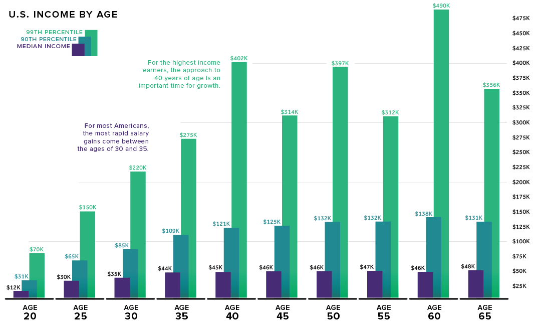
There are two commonly held beliefs around income and age:
1) Earning trajectory is largely determined by the time a person is 35-years-old
2) Income is positively correlated with age
How do these beliefs stand up to the actual income data? As it turns out, quite well.
Today’s data, from the IPUMS.org Current Population Survey, is a detailed look at income by age group.
The $50K Threshold
In the age of LinkedIn bragging it’s no surprise that two-thirds of people who are being paid the market rate believe they’re actually underpaid.
For people just starting out in the workforce, there can be a lot of pressure to earn a higher salary, but as the data shows, only a tiny percentage of workers under the age of 25 surpass a salary of $50K.
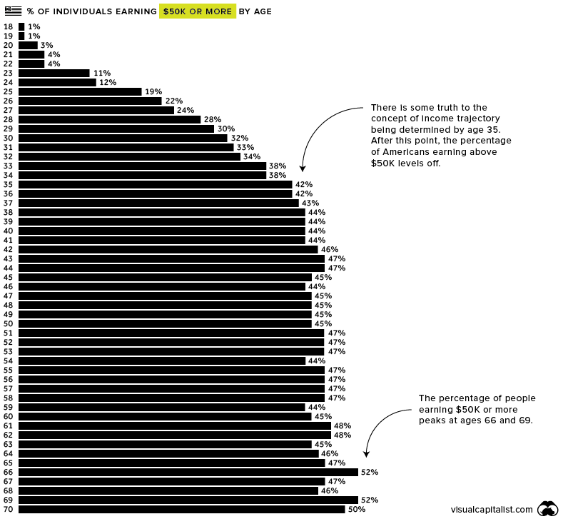
The majority of people in the work force make their greatest income strides between the ages of 30 and 35, with median income jumping by 26% during that short time-frame.
After the age of 35, the percentage of people earning $50K or more is surprisingly consistent until retirement age, hovering between 42% and 48%.
The $100K Threshold
Making $100K per year won’t put you in the top 1% – you’ll need to earn $300K to join that club – however, it’s still enough to live comfortably in most places in America.
Approximately 21 million people in the U.S. workforce earn over $100K. Here’s how they break down by age.
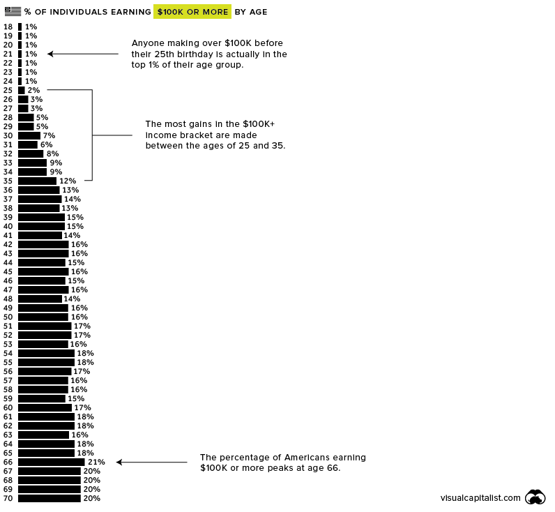
Interestingly, the percentage of Americans earning $100K or more jumps from 2% to 12%, and moves very little after that. Put another way, it’s rare for anyone in their 20s to earn over $100K, but many people who hit that threshold do so by the time they turn 40.
Much like those earning $50K or more, the percentage of $100K+ earners stays fairly consistent until retirement, peaking at age 66.
Individual salary situations will vary widely, of course, but it’s interesting to zoom out at the big picture of income in America.


Personal Finance
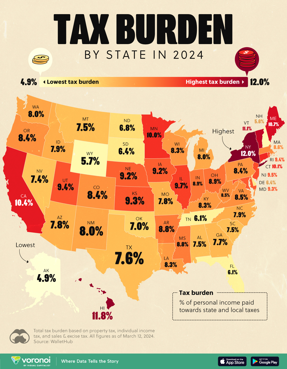
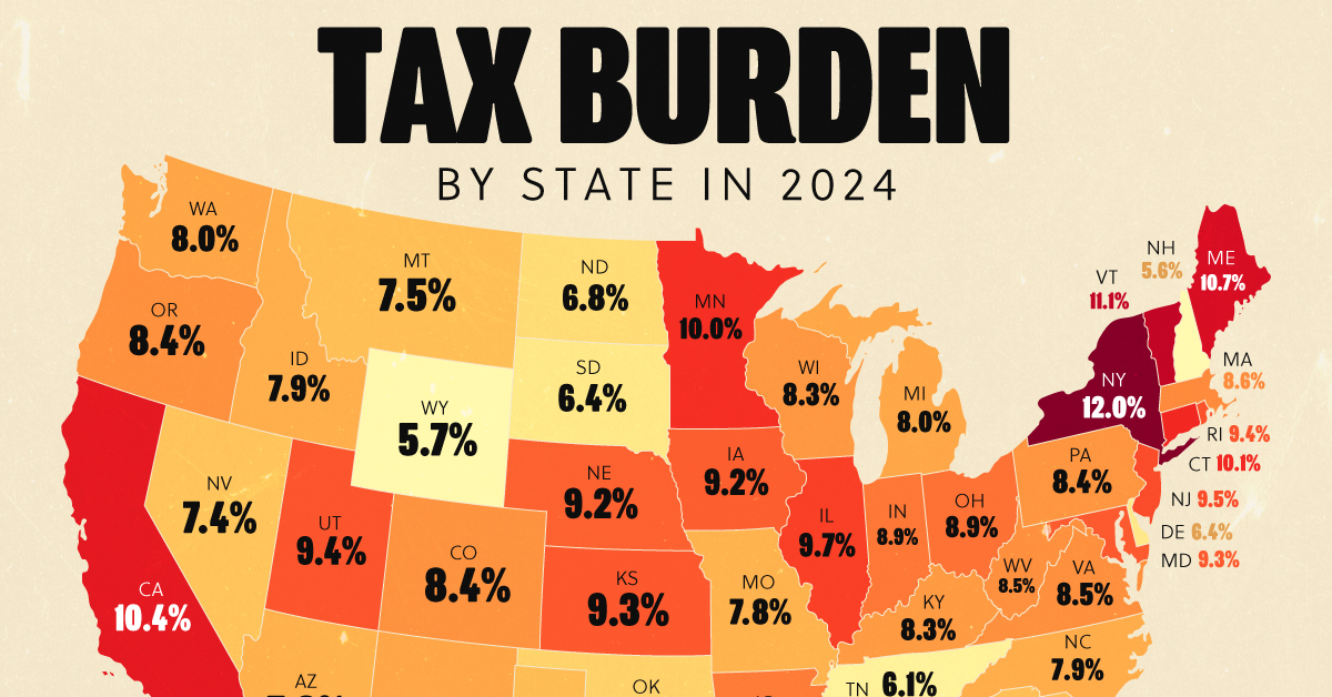
Visualizing the Tax Burden of Every U.S. State
Tax burden measures the percent of an individual’s income that is paid towards taxes. See where it’s the highest by state in this graphic.
Visualizing the Tax Burden of Every U.S. State
This was originally posted on our Voronoi app. Download the app for free on iOS or Android and discover incredible data-driven charts from a variety of trusted sources.
This map graphic visualizes the total tax burden in each U.S. state as of March 2024, based on figures compiled by WalletHub.
It’s important to understand that under this methodology, the tax burden measures the percent of an average person’s income that is paid towards state and local taxes. It considers property taxes, income taxes, and sales & excise tax.
Data and Methodology
The figures we used to create this graphic are listed in the table below.
| State | Total Tax Burden |
|---|---|
| New York | 12.0% |
| Hawaii | 11.8% |
| Vermont | 11.1% |
| Maine | 10.7% |
| California | 10.4% |
| Connecticut | 10.1% |
| Minnesota | 10.0% |
| Illinois | 9.7% |
| New Jersey | 9.5% |
| Rhode Island | 9.4% |
| Utah | 9.4% |
| Kansas | 9.3% |
| Maryland | 9.3% |
| Iowa | 9.2% |
| Nebraska | 9.2% |
| Ohio | 8.9% |
| Indiana | 8.9% |
| Arkansas | 8.8% |
| Mississippi | 8.8% |
| Massachusetts | 8.6% |
| Virginia | 8.5% |
| West Virginia | 8.5% |
| Oregon | 8.4% |
| Colorado | 8.4% |
| Pennsylvania | 8.4% |
| Wisconsin | 8.3% |
| Louisiana | 8.3% |
| Kentucky | 8.3% |
| Washington | 8.0% |
| New Mexico | 8.0% |
| Michigan | 8.0% |
| North Carolina | 7.9% |
| Idaho | 7.9% |
| Arizona | 7.8% |
| Missouri | 7.8% |
| Georgia | 7.7% |
| Texas | 7.6% |
| Alabama | 7.5% |
| Montana | 7.5% |
| South Carolina | 7.5% |
| Nevada | 7.4% |
| Oklahoma | 7.0% |
| North Dakota | 6.8% |
| South Dakota | 6.4% |
| Delaware | 6.4% |
| Tennessee | 6.1% |
| Florida | 6.1% |
| Wyoming | 5.7% |
| New Hampshire | 5.6% |
| Alaska | 4.9% |
From this data we can see that New York has the highest total tax burden. Residents in this state will pay, on average, 12% of their income to state and local governments.
Breaking this down into its three components, the average New Yorker pays 4.6% of their income on income taxes, 4.4% on property taxes, and 3% in sales & excise taxes.
At the other end of the spectrum, Alaska has the lowest tax burden of any state, equaling 4.9% of income. This is partly due to the fact that Alaskans do not pay state income tax.
Hate Paying Taxes?
In addition to Alaska, there are several other U.S. states that don’t charge income taxes. These are: Florida, Nevada, South Dakota, Tennessee, Texas, Washington, and Wyoming.
It’s also worth noting that New Hampshire does not have a regular income tax, but does charge a flat 4% on interest and dividend income according to the Tax Foundation.
Learn More About Taxation From Visual Capitalist
If you enjoyed this post, be sure to check out this graphic which ranks the countries with the lowest corporate tax rates, from 1980 to today.

-

 Personal Finance1 week ago
Visualizing the Tax Burden of Every U.S. State
-

 Misc6 days ago
Visualized: Aircraft Carriers by Country
-

 Culture7 days ago
How Popular Snack Brand Logos Have Changed
-

 Mining1 week ago
Visualizing Copper Production by Country in 2023
-

 Misc1 week ago
Charted: How Americans Feel About Federal Government Agencies
-
 Healthcare1 week ago
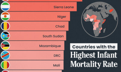
Which Countries Have the Highest Infant Mortality Rates?
-
 Demographics1 week ago
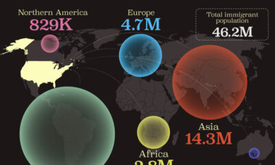
Mapped: U.S. Immigrants by Region
-
 Maps1 week ago
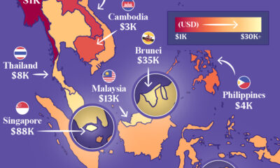
Mapped: Southeast Asia’s GDP Per Capita, by Country