Money
The Geography of America’s Distressed Communities
Despite a recent slump in the markets, the U.S. economy is still putting up strong numbers. Unemployment is at its lowest point since the 1960s, and the U.S. manufacturing sector is thriving.
Looking beyond these big picture gains, many communities in the United States are struggling. Check cashing stores outnumber McDonald’s locations, the opioid epidemic rages on, and tens of millions are living in poverty around the country. It’s becoming more clear that the recovery from the financial crisis has been highly uneven.
The Data Behind Distress
To understand the disconnect between struggling counties and a high-flying national economy, researchers at the Economic Innovation Group (EIG) created the Distressed Communities Index:
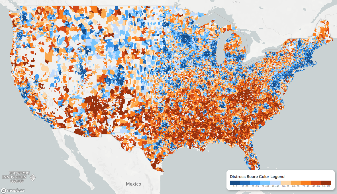
To calculate the “health” of communities around the country, the Economic Innovation Group (EIG) looked at everything from vacancy rates to median income ratios. When visualized, a picture emerges of an America divided into superstar regions and broad expanses of struggling communities.
Distressed and prosperous ZIP codes […] represent two almost diametrically opposed experiences of living in the United States.
– Distressed Communities Index Report (2018)
Community Quintiles
When communities are divided into quintiles, stark patterns emerge. In the most distressed zip codes, over 40% of “prime-age” adults are unemployed, one-in-five adults did not graduate high school, and the housing vacancy rate is nearly double the U.S. average.
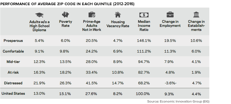
As well, deaths related to substance abuse and mental illness are 64% higher in distressed communities.
Struggling States and Cities
The DCI data reveals that those living in the lower half of the United States are more likely to call a distressed community home. In Alabama, Arkansas, Mississippi, and West Virginia, one-third or more of the population resides in the bottom quintile of zip codes.
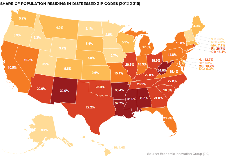
On the flip side, in Colorado, Minnesota, Massachusetts, New Hampshire, and Utah well over 40% of the population live in prosperous zip codes.
Zooming in beyond the state-level, a geographical trend becomes clear: many of the struggling communities in the index are classified as rural. Between 2007 and 2016, nearly a third of all rural zip codes were considered “downwardly mobile”, compared to only 16% of those in urban areas.
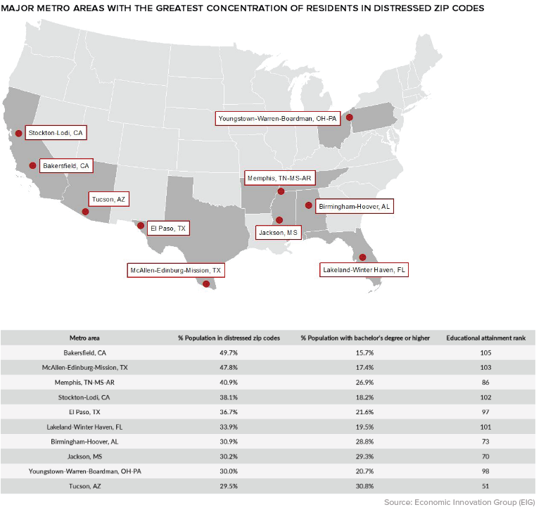
Though rural zip codes tend to fare worse than their more urban counterparts, there are exceptions to that trend. One example is Bakersfield, California, where almost half of the city’s population lives in a distressed community.


Money
How Debt-to-GDP Ratios Have Changed Since 2000
See how much the debt-to-GDP ratios of advanced economies have grown (or shrank) since the year 2000.


How Debt-to-GDP Ratios Have Changed Since 2000
This was originally posted on our Voronoi app. Download the app for free on Apple or Android and discover incredible data-driven charts from a variety of trusted sources.
Government debt levels have grown in most parts of the world since the 2008 financial crisis, and even more so after the COVID-19 pandemic.
To gain perspective on this long-term trend, we’ve visualized the debt-to-GDP ratios of advanced economies, as of 2000 and 2024 (estimated). All figures were sourced from the IMF’s World Economic Outlook.
Data and Highlights
The data we used to create this graphic is listed in the table below. “Government gross debt” consists of all liabilities that require payment(s) of interest and/or principal in the future.
| Country | 2000 (%) | 2024 (%) | Change (pp) |
|---|---|---|---|
| 🇯🇵 Japan | 135.6 | 251.9 | +116.3 |
| 🇸🇬 Singapore | 82.3 | 168.3 | +86.0 |
| 🇺🇸 United States | 55.6 | 126.9 | +71.3 |
| 🇬🇧 United Kingdom | 36.6 | 105.9 | +69.3 |
| 🇬🇷 Greece | 104.9 | 160.2 | +55.3 |
| 🇫🇷 France | 58.9 | 110.5 | +51.6 |
| 🇵🇹 Portugal | 54.2 | 104.0 | +49.8 |
| 🇪🇸 Spain | 57.8 | 104.7 | +46.9 |
| 🇸🇮 Slovenia | 25.9 | 66.5 | +40.6 |
| 🇫🇮 Finland | 42.4 | 76.5 | +34.1 |
| 🇭🇷 Croatia | 35.4 | 61.8 | +26.4 |
| 🇨🇦 Canada | 80.4 | 103.3 | +22.9 |
| 🇨🇾 Cyprus | 56.0 | 70.9 | +14.9 |
| 🇦🇹 Austria | 65.7 | 74.0 | +8.3 |
| 🇸🇰 Slovak Republic | 50.5 | 56.5 | +6.0 |
| 🇩🇪 Germany | 59.3 | 64.0 | +4.7 |
| 🇧🇪 Belgium | 109.6 | 106.8 | -2.8 |
| 🇮🇱 Israel | 77.4 | 56.8 | -20.6 |
| 🇮🇸 Iceland | 75.8 | 54.6 | -21.2 |
The debt-to-GDP ratio indicates how much a country owes compared to the size of its economy, reflecting its ability to manage and repay debts. Percentage point (pp) changes shown above indicate the increase or decrease of these ratios.
Countries with the Biggest Increases
Japan (+116 pp), Singapore (+86 pp), and the U.S. (+71 pp) have grown their debt as a percentage of GDP the most since the year 2000.
All three of these countries have stable, well-developed economies, so it’s unlikely that any of them will default on their growing debts. With that said, higher government debt leads to increased interest payments, which in turn can diminish available funds for future government budgets.
This is a rising issue in the U.S., where annual interest payments on the national debt have surpassed $1 trillion for the first time ever.
Only 3 Countries Saw Declines
Among this list of advanced economies, Belgium (-2.8 pp), Iceland (-21.2 pp), and Israel (-20.6 pp) were the only countries that decreased their debt-to-GDP ratio since the year 2000.
According to Fitch Ratings, Iceland’s debt ratio has decreased due to strong GDP growth and the use of its cash deposits to pay down upcoming maturities.
See More Debt Graphics from Visual Capitalist
Curious to see which countries have the most government debt in dollars? Check out this graphic that breaks down $97 trillion in debt as of 2023.

-

 Green2 weeks ago
Ranked: Top Countries by Total Forest Loss Since 2001
-

 Travel1 week ago
Ranked: The World’s Top Flight Routes, by Revenue
-

 Technology2 weeks ago
Ranked: Semiconductor Companies by Industry Revenue Share
-

 Money2 weeks ago
Which States Have the Highest Minimum Wage in America?
-

 Real Estate2 weeks ago
Ranked: The Most Valuable Housing Markets in America
-

 Markets2 weeks ago
Charted: Big Four Market Share by S&P 500 Audits
-

 AI2 weeks ago
The Stock Performance of U.S. Chipmakers So Far in 2024
-

 Automotive2 weeks ago
Almost Every EV Stock is Down After Q1 2024