Markets
5 Undeniable Long-Term Trends Shaping Society’s Future
We’re living in a world of rapid change, where disruption is the norm and innovation is the only way to stay relevant.
The dynamic nature of society makes it difficult to decipher. However, despite the world’s complexity, there are some long-term trends that have emerged among the chaos. These help us make sense of the world today, and can give us an idea of what to expect in years ahead.
Here’s a look at five long-term trends that are set to transform society as we know it.
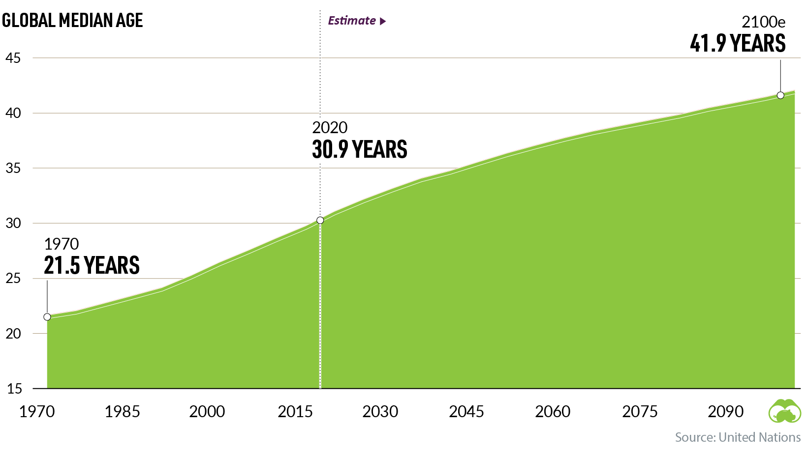
#1: Aging World
With every successive year, our global population is skewing older.
Since 1970, our worldwide median age has grown by almost a decade. By 2100, it’s projected to increase by another 10 years.
Of course, not all countries are aging at the same rate.
Using data from the UN, the graph below covers the old-age dependency ratios (OADR) of different regions, showing the proportion of working-age citizens versus the percentage of older people, who are less likely to remain in the workforce.
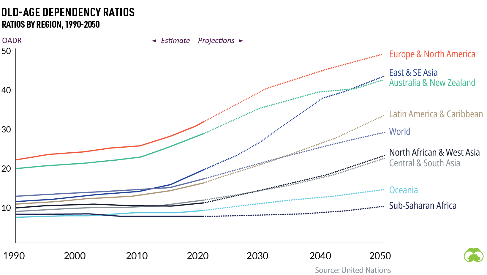
What’s the economic impact of an aging population? Some potential risks include rising healthcare costs, a shrinking workforce, and even economic slowdowns.
To mitigate some of these risks, it’s crucial that countries build solid pension systems to support their aging citizens. Other potential solutions include increasing the age of retirement, enforcing mandatory retirement plans, and limiting early access to benefits.
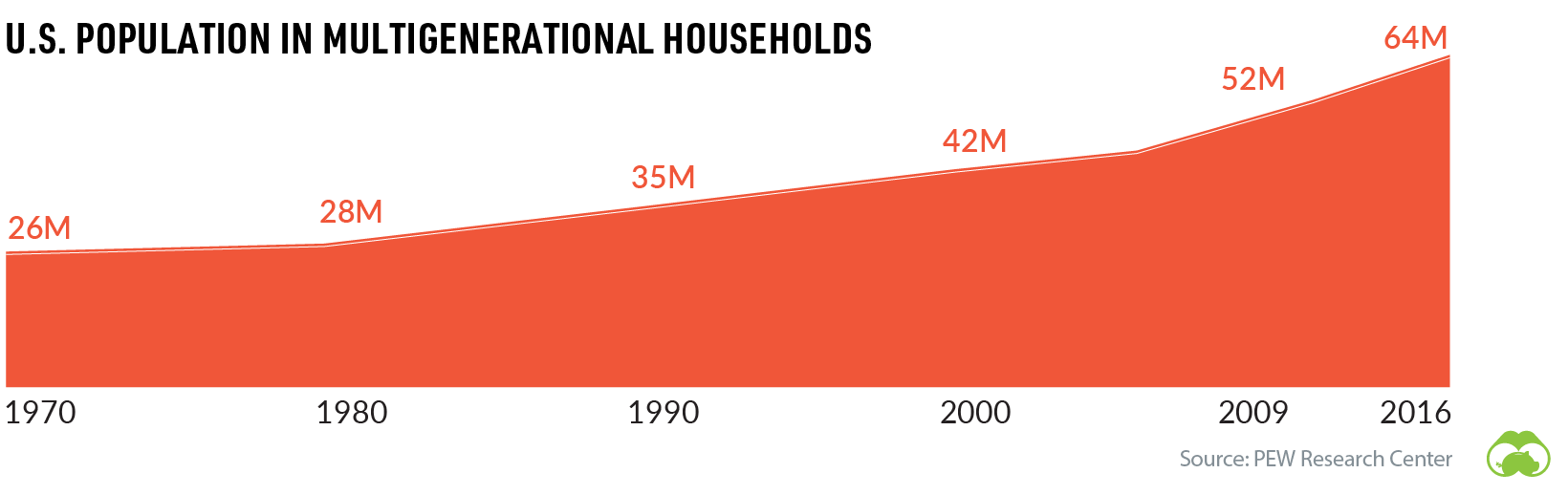
Aging populations are also influencing the make-up of households in many countries. In the U.S., the share of multigenerational family households has been rising steadily since the 1970s.
At a societal level, people in the oldest age groups often play a different role in society than working age people. Many seniors engage in volunteerism and play a pivotal role in childcare for their families–activities that fall outside traditional measures of economic activity.
#2: Urban Evolution
Another macro trend that’s set to transform many regions of the world is rapid urbanization.
Currently, more than half of the global population lives in urban areas, and this influx of city-dwellers is expected to grow even more in the years ahead.
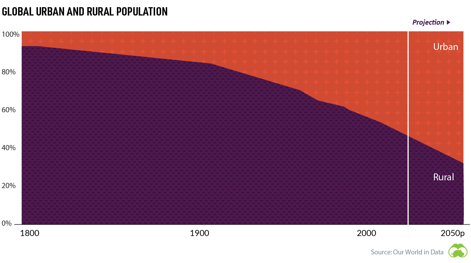
While urbanization may seem like an long-established phenomenon, it’s actually a relatively new trend, historically speaking.
Throughout human history, populations have typically lived in small villages. All the way up to the early 1800s, close to 90% of the global population still lived in rural areas. Urbanization didn’t take off on a widespread scale until the 20th century.
But once urban migration started, it snowballed, and since then it’s shown no signs of slowing down. By 2050, over two-thirds of the global population is expected to live in urban settings.
The Rise of Megacities
Even in developing countries, urban life is becoming the norm – a shift that is causing a boom in megacity growth.

The median population size of the world’s top 100 cities has been growing steadily too – from eight million in 2000 to a projected 12 million in 2035.
Why is this happening? People tend to migrate to urban areas for socioeconomic reasons, and these economic pull-factors are particular strong in the developing world. Over time, this migration and increase in the standard of living is lifting millions of people out of poverty. This brings us to our third trend.
If you like this post, find hundreds of charts
like this in our new book “Signals”:

#3: Rising Middle Class
While poverty is far from eradicated, the global middle class is growing, and fewer people are living in extreme poverty than ever before.
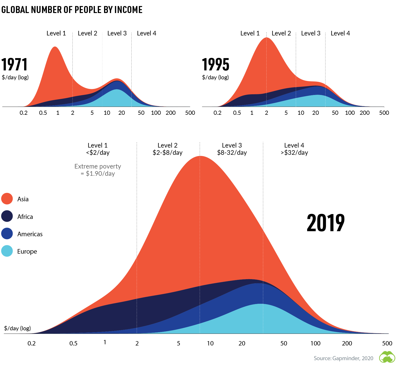
As the above graph shows, there was an overall increase in daily income from 1971 to 1995. By 2019, income levels had increased even further.
According to Brookings, an average of five people are entering the global middle class per second, and by 2030, the worldwide middle class population is expected to reach 5.3 billion.

As the global middle class grows, so does the market for products and services around the world. And as the middle class has more disposable income to spend, these developing markets can create new opportunities for companies and investors alike.
In fact, according to MSCI, although global equity markets are dominated by North American companies (61.5%) in terms of market capitalization, the vast majority of revenues (70.1%) come from outside North America. As the rest of the developing world gets richer, this trend is likely to accelerate.
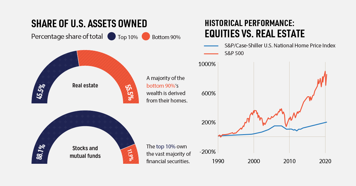
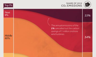
#4: Rising Wealth inequality
People in lower-income economies aren’t the only people generating more wealth—the richer are also increasing their net worth. By a lot.
Over the last few decades, the wealth of America’s top 10% has increased by billions of dollars, while the middle and bottom wealth groups have stayed relatively stagnant.

What’s driving this wealth inequality? One key factor is the different types of assets each wealth group owns. While the top 10% invest heavily in the stock market, other wealth groups rely on real estate as their main form of investment.

Historically, equities have had higher returns than real estate—making the rich richer and leaving the bottom 90% behind.
#5: Environmental Pressures
So far, we’ve touched on four demographic shifts that are transforming society as we know it. But these changes in our global population size, wealth, and consumption habits have had far-reaching consequences. This last trend touches on one of those consequences—increased environmental pressure.
Since the year 1850, the global average temperature of land areas has risen twice as fast as the global average.

Various factors have contributed to increasing temperatures, but one major source stems from human-produced greenhouse gas emissions.
What human activities contribute to global emissions the most? The biggest culprit is industrial activity—32% of total emissions, while energy use in buildings comes in second at 17%.
Our Warmer World
Why is this significant? Rising temperatures pose a risk to our ecosystems and livelihood by changing weather patterns and putting the global food supply at risk.

The past half-decade is likely to become the warmest five-year stretch in recorded history, underscoring the rapid pace of climate change. On a global scale, even a small increase in temperature can have a big impact on climate and our ecosystems.
For example, air can hold approximately 7% more moisture for every 1ºC increase, leading to an uptick in extreme rainfall events. These events can trigger landslides, increase the rate of soil erosion, and damage crops – just one example of how climate change can cause a chain reaction.
For the billions of people who live in “drylands”, climate change is serving up a completely different scenario of increased intensity and duration of drought. This is particularly worrisome as 90% of people in these arid or semiarid regions live in developing economies that are still very reliant on agriculture.
As a society, we will need to take a hard look at the way we consume in order to begin mitigating these risks. Will we rise to the challenge?
If you like this post, find hundreds of charts
like this in our new book “Signals”:


Markets
U.S. Debt Interest Payments Reach $1 Trillion
U.S. debt interest payments have surged past the $1 trillion dollar mark, amid high interest rates and an ever-expanding debt burden.


U.S. Debt Interest Payments Reach $1 Trillion
This was originally posted on our Voronoi app. Download the app for free on iOS or Android and discover incredible data-driven charts from a variety of trusted sources.
The cost of paying for America’s national debt crossed the $1 trillion dollar mark in 2023, driven by high interest rates and a record $34 trillion mountain of debt.
Over the last decade, U.S. debt interest payments have more than doubled amid vast government spending during the pandemic crisis. As debt payments continue to soar, the Congressional Budget Office (CBO) reported that debt servicing costs surpassed defense spending for the first time ever this year.
This graphic shows the sharp rise in U.S. debt payments, based on data from the Federal Reserve.
A $1 Trillion Interest Bill, and Growing
Below, we show how U.S. debt interest payments have risen at a faster pace than at another time in modern history:
| Date | Interest Payments | U.S. National Debt |
|---|---|---|
| 2023 | $1.0T | $34.0T |
| 2022 | $830B | $31.4T |
| 2021 | $612B | $29.6T |
| 2020 | $518B | $27.7T |
| 2019 | $564B | $23.2T |
| 2018 | $571B | $22.0T |
| 2017 | $493B | $20.5T |
| 2016 | $460B | $20.0T |
| 2015 | $435B | $18.9T |
| 2014 | $442B | $18.1T |
| 2013 | $425B | $17.2T |
| 2012 | $417B | $16.4T |
| 2011 | $433B | $15.2T |
| 2010 | $400B | $14.0T |
| 2009 | $354B | $12.3T |
| 2008 | $380B | $10.7T |
| 2007 | $414B | $9.2T |
| 2006 | $387B | $8.7T |
| 2005 | $355B | $8.2T |
| 2004 | $318B | $7.6T |
| 2003 | $294B | $7.0T |
| 2002 | $298B | $6.4T |
| 2001 | $318B | $5.9T |
| 2000 | $353B | $5.7T |
| 1999 | $353B | $5.8T |
| 1998 | $360B | $5.6T |
| 1997 | $368B | $5.5T |
| 1996 | $362B | $5.3T |
| 1995 | $357B | $5.0T |
| 1994 | $334B | $4.8T |
| 1993 | $311B | $4.5T |
| 1992 | $306B | $4.2T |
| 1991 | $308B | $3.8T |
| 1990 | $298B | $3.4T |
| 1989 | $275B | $3.0T |
| 1988 | $254B | $2.7T |
| 1987 | $240B | $2.4T |
| 1986 | $225B | $2.2T |
| 1985 | $219B | $1.9T |
| 1984 | $205B | $1.7T |
| 1983 | $176B | $1.4T |
| 1982 | $157B | $1.2T |
| 1981 | $142B | $1.0T |
| 1980 | $113B | $930.2B |
| 1979 | $96B | $845.1B |
| 1978 | $84B | $789.2B |
| 1977 | $69B | $718.9B |
| 1976 | $61B | $653.5B |
| 1975 | $55B | $576.6B |
| 1974 | $50B | $492.7B |
| 1973 | $45B | $469.1B |
| 1972 | $39B | $448.5B |
| 1971 | $36B | $424.1B |
| 1970 | $35B | $389.2B |
| 1969 | $30B | $368.2B |
| 1968 | $25B | $358.0B |
| 1967 | $23B | $344.7B |
| 1966 | $21B | $329.3B |
Interest payments represent seasonally adjusted annual rate at the end of Q4.
At current rates, the U.S. national debt is growing by a remarkable $1 trillion about every 100 days, equal to roughly $3.6 trillion per year.
As the national debt has ballooned, debt payments even exceeded Medicaid outlays in 2023—one of the government’s largest expenditures. On average, the U.S. spent more than $2 billion per day on interest costs last year. Going further, the U.S. government is projected to spend a historic $12.4 trillion on interest payments over the next decade, averaging about $37,100 per American.
Exacerbating matters is that the U.S. is running a steep deficit, which stood at $1.1 trillion for the first six months of fiscal 2024. This has accelerated due to the 43% increase in debt servicing costs along with a $31 billion dollar increase in defense spending from a year earlier. Additionally, a $30 billion increase in funding for the Federal Deposit Insurance Corporation in light of the regional banking crisis last year was a major contributor to the deficit increase.
Overall, the CBO forecasts that roughly 75% of the federal deficit’s increase will be due to interest costs by 2034.

-

 Real Estate2 weeks ago
Visualizing America’s Shortage of Affordable Homes
-

 Technology1 week ago
Ranked: Semiconductor Companies by Industry Revenue Share
-

 Money2 weeks ago
Which States Have the Highest Minimum Wage in America?
-

 Real Estate2 weeks ago
Ranked: The Most Valuable Housing Markets in America
-

 Business2 weeks ago
Charted: Big Four Market Share by S&P 500 Audits
-

 AI2 weeks ago
The Stock Performance of U.S. Chipmakers So Far in 2024
-

 Misc2 weeks ago
Almost Every EV Stock is Down After Q1 2024
-

 Money2 weeks ago
Where Does One U.S. Tax Dollar Go?