Markets
Visualizing 200 Years of U.S. Stock Market Sectors
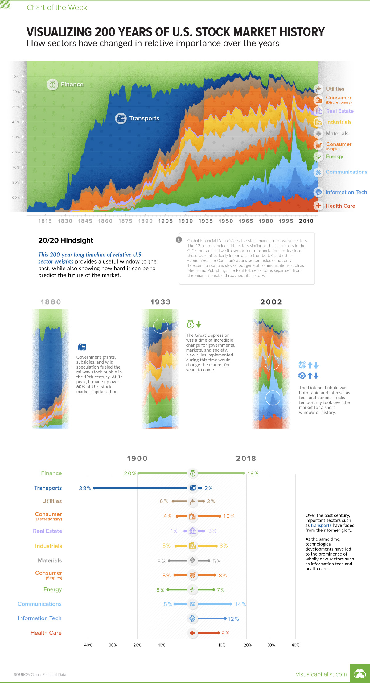


Visualizing 200 Years of U.S. Stock Market Sectors
If you could travel back in time to the 19th century, it would be very difficult to convince anyone that railroad investments were not the future of the stock market.
Governments were offering subsidies and land grants to stimulate rapid industry growth – and in the period of 1868-1873, just after the American Civil War, an astonishing 33,000 miles of new railroad track were laid.
Entrepreneurs and financiers started betting on ambitious enterprises like the Northern Pacific Railway – and as the transportation boom raged on, more than 60% of total U.S. stock market capitalization came from railroad related stocks.
20/20 Hindsight
We know today that the railroad boom didn’t live up to the expectations drawn out by speculators.
The valuations of all of those rail companies seem pretty absurd in hindsight, especially when looking at this week’s Chart of the Week on U.S. stock market history. It pulls numbers from Global Financial Data to contrast the relative sector weightings over 200 years.
While there are some obvious historical moments to be discovered on the chart, perhaps the most important lesson it demonstrates is the unpredictability of the market in general.
This is a reminder of why stock markets provide both risk and reward – as the speculators from 1869 found out, nobody knows for sure what the future holds.
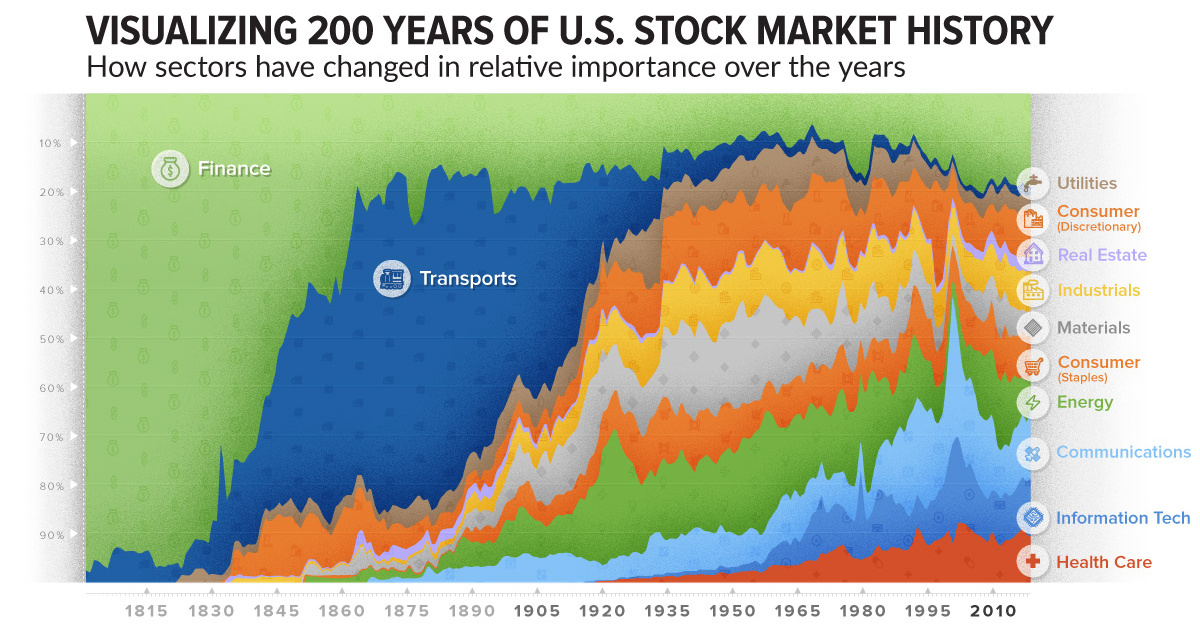
How Sector Composition Has Changed
When stock market indices were introduced in the 1800s, only two types of equities were tracked: railroads and industrials.
Even by the year 1900, markets were much more complex – while railroads were still a dominant force, investors were starting to put money into other types of companies like utilities, steel, and energy companies.
Here’s a look at the share of market capitalization of the U.S. stock market in both 1900 and 2018:
| Sector | U.S. Stock Market (1900 share) | U.S. Stock Market (2018 share) |
|---|---|---|
| Finance | 20% | 19% |
| Transports | 38% | 2% |
| Utilities | 6% | 3% |
| Consumer Discretionary | 4% | 10% |
| Real Estate | 1% | 3% |
| Industrials | 5% | 8% |
| Materials | 8% | 5% |
| Consumer Staples | 5% | 8% |
| Energy | 8% | 7% |
| Communications | 5% | 14% |
| Information Tech | 0% | 12% |
| Health Care | 0% | 9% |
As of 2018, the market is more varied than it’s ever been.
Information tech, communications, and healthcare stocks, which did not really exist at the turn of the 20th century, are now many of America’s biggest companies. The transition is incredible to look at in retrospect, and makes us wonder what the market will look like 100 years from now.


Markets
U.S. Debt Interest Payments Reach $1 Trillion
U.S. debt interest payments have surged past the $1 trillion dollar mark, amid high interest rates and an ever-expanding debt burden.


U.S. Debt Interest Payments Reach $1 Trillion
This was originally posted on our Voronoi app. Download the app for free on iOS or Android and discover incredible data-driven charts from a variety of trusted sources.
The cost of paying for America’s national debt crossed the $1 trillion dollar mark in 2023, driven by high interest rates and a record $34 trillion mountain of debt.
Over the last decade, U.S. debt interest payments have more than doubled amid vast government spending during the pandemic crisis. As debt payments continue to soar, the Congressional Budget Office (CBO) reported that debt servicing costs surpassed defense spending for the first time ever this year.
This graphic shows the sharp rise in U.S. debt payments, based on data from the Federal Reserve.
A $1 Trillion Interest Bill, and Growing
Below, we show how U.S. debt interest payments have risen at a faster pace than at another time in modern history:
| Date | Interest Payments | U.S. National Debt |
|---|---|---|
| 2023 | $1.0T | $34.0T |
| 2022 | $830B | $31.4T |
| 2021 | $612B | $29.6T |
| 2020 | $518B | $27.7T |
| 2019 | $564B | $23.2T |
| 2018 | $571B | $22.0T |
| 2017 | $493B | $20.5T |
| 2016 | $460B | $20.0T |
| 2015 | $435B | $18.9T |
| 2014 | $442B | $18.1T |
| 2013 | $425B | $17.2T |
| 2012 | $417B | $16.4T |
| 2011 | $433B | $15.2T |
| 2010 | $400B | $14.0T |
| 2009 | $354B | $12.3T |
| 2008 | $380B | $10.7T |
| 2007 | $414B | $9.2T |
| 2006 | $387B | $8.7T |
| 2005 | $355B | $8.2T |
| 2004 | $318B | $7.6T |
| 2003 | $294B | $7.0T |
| 2002 | $298B | $6.4T |
| 2001 | $318B | $5.9T |
| 2000 | $353B | $5.7T |
| 1999 | $353B | $5.8T |
| 1998 | $360B | $5.6T |
| 1997 | $368B | $5.5T |
| 1996 | $362B | $5.3T |
| 1995 | $357B | $5.0T |
| 1994 | $334B | $4.8T |
| 1993 | $311B | $4.5T |
| 1992 | $306B | $4.2T |
| 1991 | $308B | $3.8T |
| 1990 | $298B | $3.4T |
| 1989 | $275B | $3.0T |
| 1988 | $254B | $2.7T |
| 1987 | $240B | $2.4T |
| 1986 | $225B | $2.2T |
| 1985 | $219B | $1.9T |
| 1984 | $205B | $1.7T |
| 1983 | $176B | $1.4T |
| 1982 | $157B | $1.2T |
| 1981 | $142B | $1.0T |
| 1980 | $113B | $930.2B |
| 1979 | $96B | $845.1B |
| 1978 | $84B | $789.2B |
| 1977 | $69B | $718.9B |
| 1976 | $61B | $653.5B |
| 1975 | $55B | $576.6B |
| 1974 | $50B | $492.7B |
| 1973 | $45B | $469.1B |
| 1972 | $39B | $448.5B |
| 1971 | $36B | $424.1B |
| 1970 | $35B | $389.2B |
| 1969 | $30B | $368.2B |
| 1968 | $25B | $358.0B |
| 1967 | $23B | $344.7B |
| 1966 | $21B | $329.3B |
Interest payments represent seasonally adjusted annual rate at the end of Q4.
At current rates, the U.S. national debt is growing by a remarkable $1 trillion about every 100 days, equal to roughly $3.6 trillion per year.
As the national debt has ballooned, debt payments even exceeded Medicaid outlays in 2023—one of the government’s largest expenditures. On average, the U.S. spent more than $2 billion per day on interest costs last year. Going further, the U.S. government is projected to spend a historic $12.4 trillion on interest payments over the next decade, averaging about $37,100 per American.
Exacerbating matters is that the U.S. is running a steep deficit, which stood at $1.1 trillion for the first six months of fiscal 2024. This has accelerated due to the 43% increase in debt servicing costs along with a $31 billion dollar increase in defense spending from a year earlier. Additionally, a $30 billion increase in funding for the Federal Deposit Insurance Corporation in light of the regional banking crisis last year was a major contributor to the deficit increase.
Overall, the CBO forecasts that roughly 75% of the federal deficit’s increase will be due to interest costs by 2034.

-

 Green1 week ago
Ranked: The Countries With the Most Air Pollution in 2023
-

 AI2 weeks ago
The Stock Performance of U.S. Chipmakers So Far in 2024
-

 Markets2 weeks ago
Charted: Big Four Market Share by S&P 500 Audits
-

 Real Estate2 weeks ago
Ranked: The Most Valuable Housing Markets in America
-

 Money2 weeks ago
Which States Have the Highest Minimum Wage in America?
-

 AI2 weeks ago
Ranked: Semiconductor Companies by Industry Revenue Share
-

 Travel2 weeks ago
Ranked: The World’s Top Flight Routes, by Revenue
-

 Countries2 weeks ago
Population Projections: The World’s 6 Largest Countries in 2075