Technology
This Chart Reveals Google’s True Dominance Over the Web
This Chart Reveals Google’s True Dominance Over the Web
The Chart of the Week is a weekly Visual Capitalist feature on Fridays.
Yes, we all know that Google is dominant in the realm of search.
But at the same time, the internet is also a huge place – and building a decent searching algorithm can’t be that hard, right?
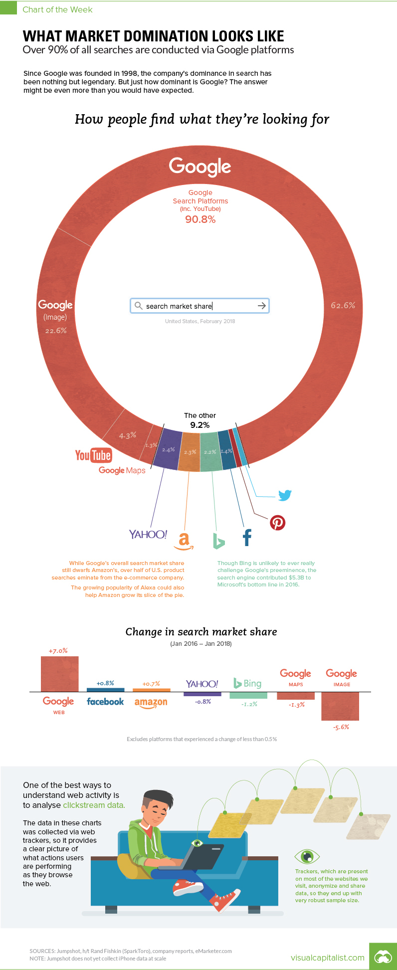
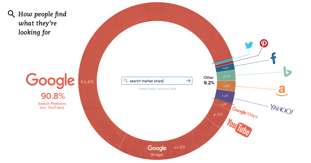
This week’s chart is a bit mind-boggling, because it makes the case that Google is even more dominant than you may have guessed. Between all Google features and the search giant’s YouTube subsidiary, more than 90% of all internet searches are taking place through the company.
The Hard Data
According to Jumpshot (via SparkToro), a marketing analytics firm that licenses anonymous ClickStream data from hundreds of millions of users, about 62.6% of all searches online are through Google’s core function.
But that’s just the beginning, as that number doesn’t include other Google functions like image search or Google Maps, or properties such as YouTube:
| Search Platform | % of Searches |
|---|---|
| 62.6% | |
| Google (image) | 22.6% |
| YouTube | 4.3% |
| Google Maps | 1.3% |
| Google Total | 90.8% |
Together, Google holds onto an impressive 90.8% market share of web, mobile, and in-app searches – though it should be noted that the above source does not include iPhone data at scale yet.
The Google-opoly
How does Google keep up such a massive market share, and why can’t a real competitor in search emerge?
The answer has to do with platforms and apps. Google’s strategy is to go where the users are, and to ensure that wherever they go, a Google search is not hard to do.
Over a decade ago, this meant being the home page on every internet browser – but more recently, it’s taken the form of internet browser market share (Chrome), mobile OS market share (Android), owning the dominant video platform (YouTube), and even venturing into your dwelling with Google Home.
As a result of these efforts, whenever users are searching, Google has never been far away.
Low Bids from Competition
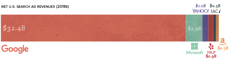
There are competitors that dare to pluck away at Google’s market share in search and ad revenue.
Microsoft’s Bing is the most known one, and it has the advantage of being integrated into Microsoft products all over the globe. Meanwhile, DuckDuckGo is another name worth mentioning – the privacy-focused search engine doesn’t have anywhere near the same kind of financial backing as Microsoft, but it does differentiate its product considerably.
Yet, here’s a picture of U.S. search ad revenues. Bing is small, but others are smaller. DuckDuckGo doesn’t even register.
Why can no one match Google?
Part of the reason lies in the math. Google operates at an insane level, processing 3.5 billion searches per day. To get millions of people to try a different search algorithm is expensive – and to get them to keep that behavior permanently is even more expensive.
The only way such change becomes feasible is if a product comes out that is 10x better than Google, and at this point, such an event seems unlikely – at least in the current ecosystem.


Brands
How Tech Logos Have Evolved Over Time
From complete overhauls to more subtle tweaks, these tech logos have had quite a journey. Featuring: Google, Apple, and more.


How Tech Logos Have Evolved Over Time
This was originally posted on our Voronoi app. Download the app for free on iOS or Android and discover incredible data-driven charts from a variety of trusted sources.
One would be hard-pressed to find a company that has never changed its logo. Granted, some brands—like Rolex, IBM, and Coca-Cola—tend to just have more minimalistic updates. But other companies undergo an entire identity change, thus necessitating a full overhaul.
In this graphic, we visualized the evolution of prominent tech companies’ logos over time. All of these brands ranked highly in a Q1 2024 YouGov study of America’s most famous tech brands. The logo changes are sourced from 1000logos.net.
How Many Times Has Google Changed Its Logo?
Google and Facebook share a 98% fame rating according to YouGov. But while Facebook’s rise was captured in The Social Network (2010), Google’s history tends to be a little less lionized in popular culture.
For example, Google was initially called “Backrub” because it analyzed “back links” to understand how important a website was. Since its founding, Google has undergone eight logo changes, finally settling on its current one in 2015.
| Company | Number of Logo Changes |
|---|---|
| 8 | |
| HP | 8 |
| Amazon | 6 |
| Microsoft | 6 |
| Samsung | 6 |
| Apple | 5* |
Note: *Includes color changes. Source: 1000Logos.net
Another fun origin story is Microsoft, which started off as Traf-O-Data, a traffic counter reading company that generated reports for traffic engineers. By 1975, the company was renamed. But it wasn’t until 2012 that Microsoft put the iconic Windows logo—still the most popular desktop operating system—alongside its name.
And then there’s Samsung, which started as a grocery trading store in 1938. Its pivot to electronics started in the 1970s with black and white television sets. For 55 years, the company kept some form of stars from its first logo, until 1993, when the iconic encircled blue Samsung logo debuted.
Finally, Apple’s first logo in 1976 featured Isaac Newton reading under a tree—moments before an apple fell on his head. Two years later, the iconic bitten apple logo would be designed at Steve Jobs’ behest, and it would take another two decades for it to go monochrome.

-

 Green1 week ago
Ranked: The Countries With the Most Air Pollution in 2023
-

 Automotive2 weeks ago
Almost Every EV Stock is Down After Q1 2024
-

 AI2 weeks ago
The Stock Performance of U.S. Chipmakers So Far in 2024
-

 Markets2 weeks ago
Charted: Big Four Market Share by S&P 500 Audits
-

 Real Estate2 weeks ago
Ranked: The Most Valuable Housing Markets in America
-

 Money2 weeks ago
Which States Have the Highest Minimum Wage in America?
-

 AI2 weeks ago
Ranked: Semiconductor Companies by Industry Revenue Share
-

 Travel2 weeks ago
Ranked: The World’s Top Flight Routes, by Revenue