Misc
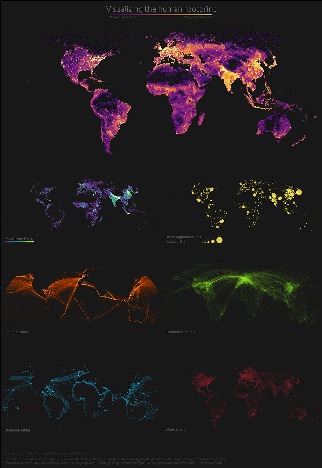
7 Striking Maps that Visualize the Human Footprint
View a high resolution version of this graphic
7 Striking Maps that Visualize the Human Footprint
View the high resolution version of today’s graphic by clicking here.
In a short amount of time, humans have changed the face of planet Earth.
Our impact has been so profound, in fact, that scientists have declared the dawn of the Anthropocene epoch, or the age of human influence.
Today’s ambitious graphic comes to us from Reldresal, and it looks at this human footprint from a number of different angles. Here are some of the ones we found most interesting.
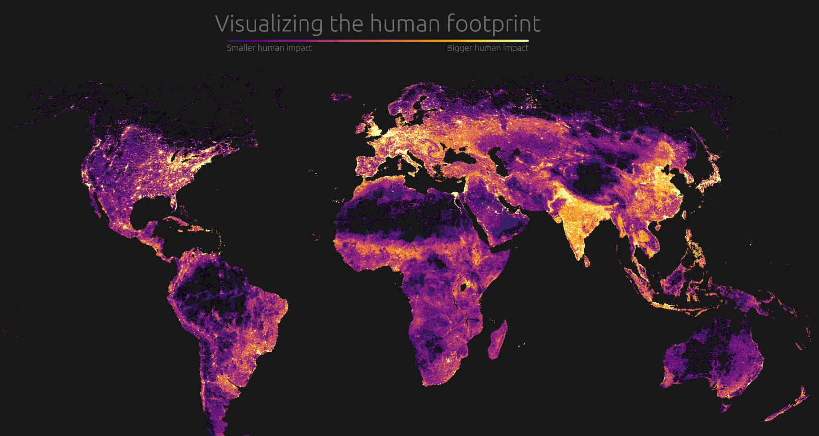
Population Density
While there are humans present in nearly every part of the world, the overall distribution of population is far from even. As the map above vividly demonstrates, humans cluster in specific places that have the right conditions to support a large population. Massive river deltas such as Ganges-Brahmaputra (Bangladesh) and the Nile (Egypt) are obvious bright spots on the map.
Not surprisingly, sparsely populated countries like Australia and Canada are nearly indistinguishable as most people cluster in more habitable places.
People and Products in Perpetual Motion
The band of industrialized countries running across the northern hemisphere is highlighted by a bright cluster of shipping and air traffic routes.
When visualized, it’s easy to see how the global flow of people and goods plugs into specific hubs. At the same time, other continents such as South America and Africa have very little connectivity in comparison.
Under the Sea
Since the first undersea cable dipped below the icy Atlantic waves in the mid-1800s, people have been instantaneously transmitting information across oceans. Fiber optic cables form the backbone of the internet, transmitting about 99% of all data.
Without the 400+ submarine cables in service today, our ability to transmit data would be severely restricted.
End of the Road
Paved roads have made some of the most remote swaths of land accessible by vehicle, but there are a few places on Earth that remain poorly connected due to difficult terrain.
The most dramatic example – one of the most obvious “holes” on the road network map – is the Sahara desert. The desert is so inhospitable that building a reliable, fully-paved highway has proved impossible up until this point. For this reason, economic data on Africa is often divided between North and Sub-Saharan.
There is a similar situation in the Amazon, where the Trans-Amazonian highway is the one lonely route connecting the interior of the rainforest. Brazil has rapidly expanded the footprint of their road network in recent years in an effort to open up economic opportunities in the interior of the continent.
For better or worse, this map could look a lot different in future years.


VC+
VC+: Get Our Key Takeaways From the IMF’s World Economic Outlook
A sneak preview of the exclusive VC+ Special Dispatch—your shortcut to understanding IMF’s World Economic Outlook report.

Have you read IMF’s latest World Economic Outlook yet? At a daunting 202 pages, we don’t blame you if it’s still on your to-do list.
But don’t worry, you don’t need to read the whole April release, because we’ve already done the hard work for you.
To save you time and effort, the Visual Capitalist team has compiled a visual analysis of everything you need to know from the report—and our upcoming VC+ Special Dispatch will be available exclusively to VC+ members on Thursday, April 25th.
If you’re not already subscribed to VC+, make sure you sign up now to receive the full analysis of the IMF report, and more (we release similar deep dives every week).
For now, here’s what VC+ members can expect to receive.
Your Shortcut to Understanding IMF’s World Economic Outlook
With long and short-term growth prospects declining for many countries around the world, this Special Dispatch offers a visual analysis of the key figures and takeaways from the IMF’s report including:
- The global decline in economic growth forecasts
- Real GDP growth and inflation forecasts for major nations in 2024
- When interest rate cuts will happen and interest rate forecasts
- How debt-to-GDP ratios have changed since 2000
- And much more!

Get the Full Breakdown in the Next VC+ Special Dispatch
VC+ members will receive the full Special Dispatch on Thursday, April 25th.
Make sure you join VC+ now to receive exclusive charts and the full analysis of key takeaways from IMF’s World Economic Outlook.
Don’t miss out. Become a VC+ member today.
What You Get When You Become a VC+ Member
VC+ is Visual Capitalist’s premium subscription. As a member, you’ll get the following:
- Special Dispatches: Deep dive visual briefings on crucial reports and global trends
- Markets This Month: A snappy summary of the state of the markets and what to look out for
- The Trendline: Weekly curation of the best visualizations from across the globe
- Global Forecast Series: Our flagship annual report that covers everything you need to know related to the economy, markets, geopolitics, and the latest tech trends
- VC+ Archive: Hundreds of previously released VC+ briefings and reports that you’ve been missing out on, all in one dedicated hub
You can get all of the above, and more, by joining VC+ today.

-

 Maps1 week ago
The Largest Earthquakes in the New York Area (1970-2024)
-

 Money2 weeks ago
Where Does One U.S. Tax Dollar Go?
-

 Automotive2 weeks ago
Almost Every EV Stock is Down After Q1 2024
-

 AI2 weeks ago
The Stock Performance of U.S. Chipmakers So Far in 2024
-

 Markets2 weeks ago
Charted: Big Four Market Share by S&P 500 Audits
-

 Real Estate2 weeks ago
Ranked: The Most Valuable Housing Markets in America
-

 Money2 weeks ago
Which States Have the Highest Minimum Wage in America?
-

 AI2 weeks ago
Ranked: Semiconductor Companies by Industry Revenue Share