Best of
Best Visualizations of April on the Voronoi App
At the end of 2023, we publicly launched Voronoi, our free new data discovery app!
The initial response from both users and creators has been incredible. We now have millions of in-app views, and there are already more than 1,000 interesting visualizations to discover, many of which will never be published on Visual Capitalist.
For that reason, we’ve chosen to highlight some of the most popular visualizations and creators from April in this roundup. To see them and many others, make sure to download the app!
Let’s take a look at a popular creator worth highlighting, as well as the most viewed, most discussed, and most liked posts of the month.
POPULAR CREATOR
Our World in Data
Visual Capitalist isn’t the only creator on the Voronoi app.
Instead, it features incredible data-driven charts and stories from many of the world’s best data sources, like Our World in Data.
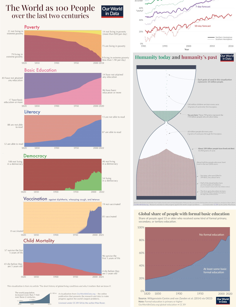
Our World in Data is one of the world’s most important public repositories of data online, covering a wide range of subjects on economics, demographics, history, health, and more.
On Voronoi, you can find a growing collection of visuals from Our World in Data, showing:
- Why weather forecasts are getting better over time
- Expected growth of the global population until the year 2100
- All of the humans that have ever lived, quantified
- Global poverty charted from 1977 until today
We highly recommend following Our World in Data on the app!
![]() View all of Our World in Data’s visuals on Voronoi today.
View all of Our World in Data’s visuals on Voronoi today.
MOST VIEWED
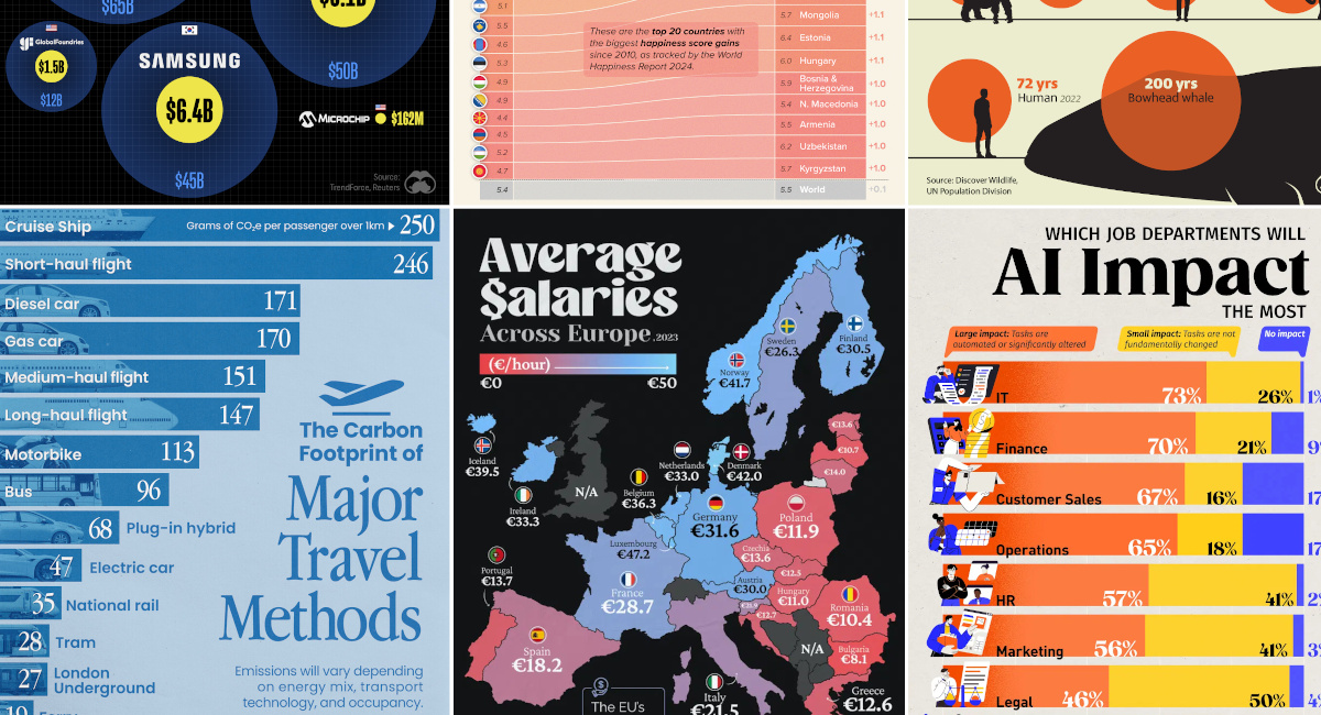
Mapped: Average Salaries in Europe
Europe is economically diverse.
Yes, the cost of living can be cheaper or more expensive depending where you go, but so are average wages:
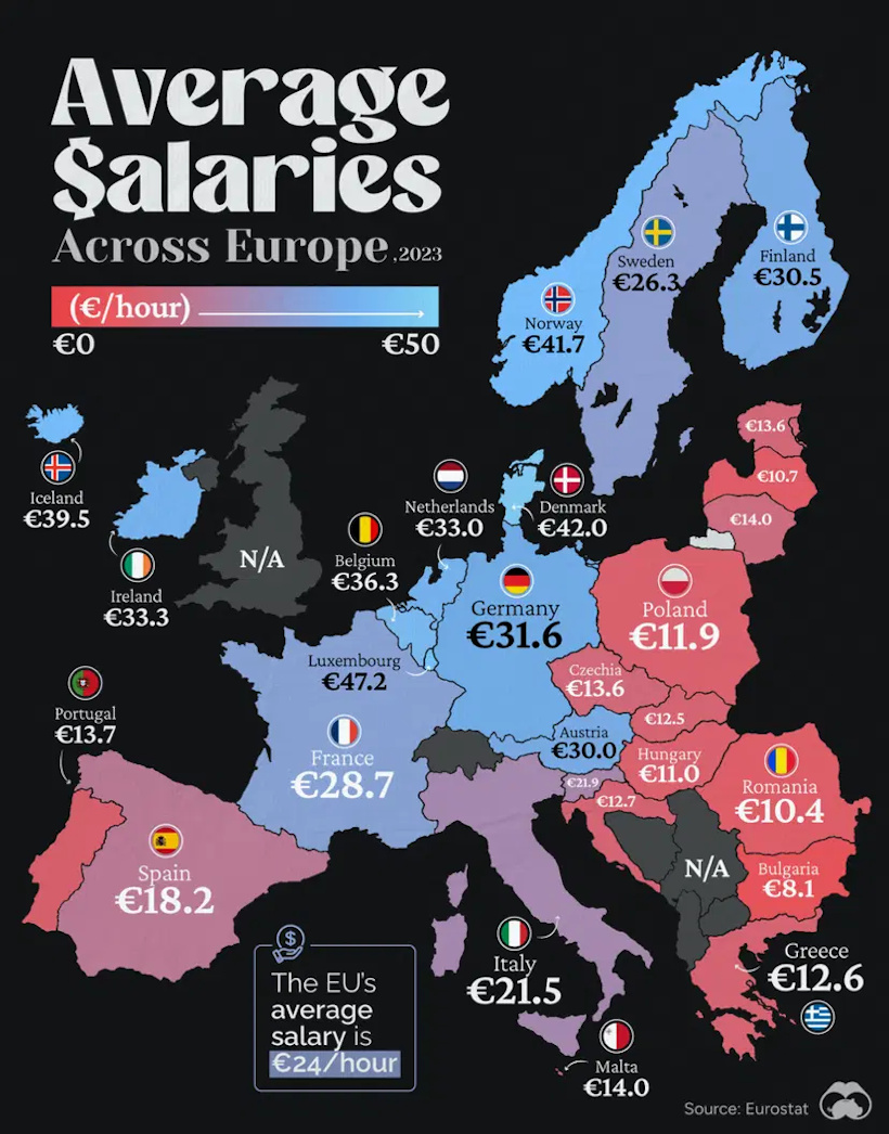
This visualization from Visual Capitalist resonated with our viewership this past month, garnering more views than any other visual published in April.
![]() Get the data behind this visual on Voronoi today.
Get the data behind this visual on Voronoi today.
MOST DISCUSSED
The Carbon Footprint of Travel
The most commented on visualization from Visual Capitalist showed the carbon footprints of many different common travel options.
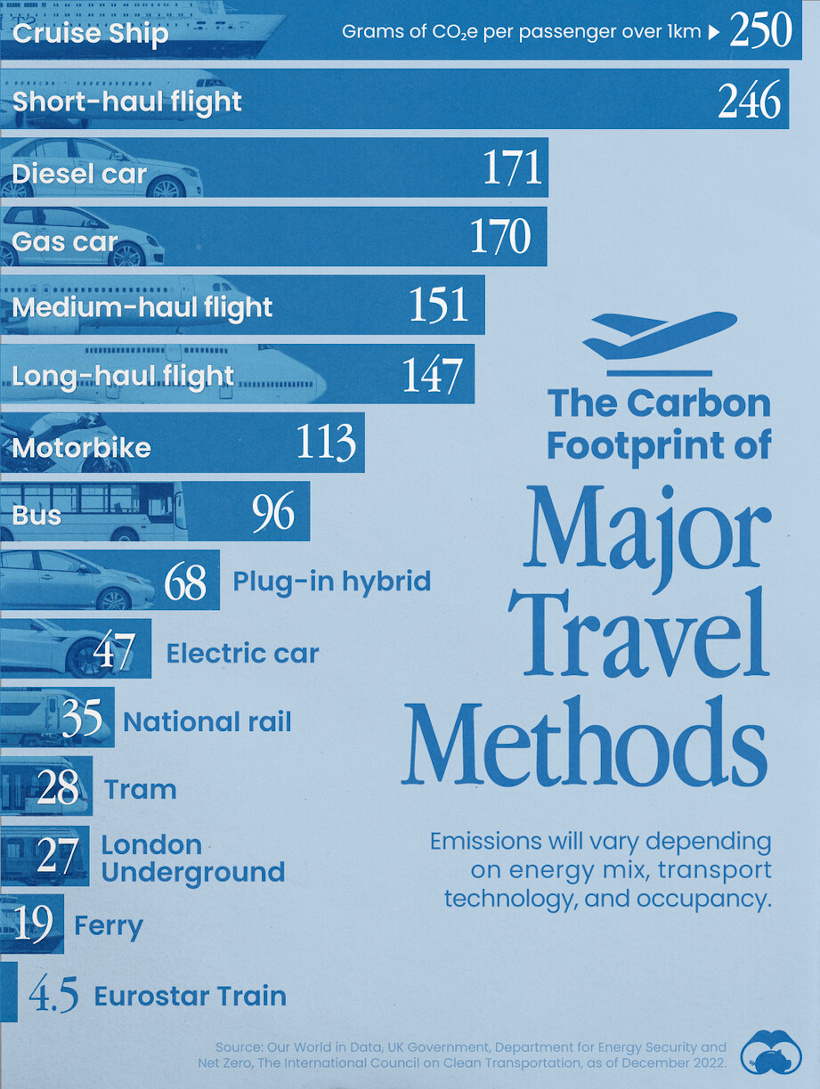
Interestingly, the most carbon-intensive form of transportation is cruise ships, and after that falls short-haul flights, gas-powered cars, and other options.
Commenting users wondered about ethanol-powered vehicles, which were not in the data set. They also asked how adding (or subtracting) passengers would affect the data.
![]() To join the conversation, download Voronoi today.
To join the conversation, download Voronoi today.
MOST LIKED
The Jobs Most Impacted by Artificial Intelligence
The most liked visual on Voronoi in April came from Visual Capitalist, showing the job departments that are most likely to be impacted by AI.
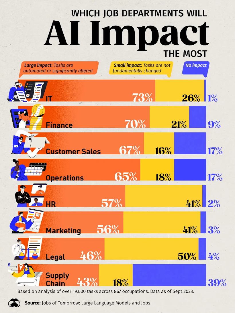
The data comes from an analysis of over 19,000 tasks across 867 occupations, and has IT and finance as the occupation areas most likely to be affected.
![]() Get the data behind this visual on Voronoi today.
Get the data behind this visual on Voronoi today.


Best of
Best Visualizations of March on the Voronoi App
We round up the most popular, most discussed, and most liked visualizations of the month on Voronoi, our new data storytelling platform.
At the end of 2023, we publicly launched Voronoi, our free new data discovery app!
The initial response from both users and creators has been incredible. We now have millions of in-app views, and there are already more than 700 interesting visualizations to discover, many of which will never be published on Visual Capitalist.
For that reason, we’ve chosen to highlight some of the most popular visualizations and creators from March in this roundup. To see them and many others, make sure to download the app!
Let’s take a look at a popular creator worth highlighting, as well as the most viewed, most discussed, and most liked posts of the month.
POPULAR CREATOR
Ehsan Soltani
Visual Capitalist isn’t the only creator on the Voronoi app.
Instead, it features incredible data-driven charts and stories from many of the world’s best creators, like Ehsan Soltani.
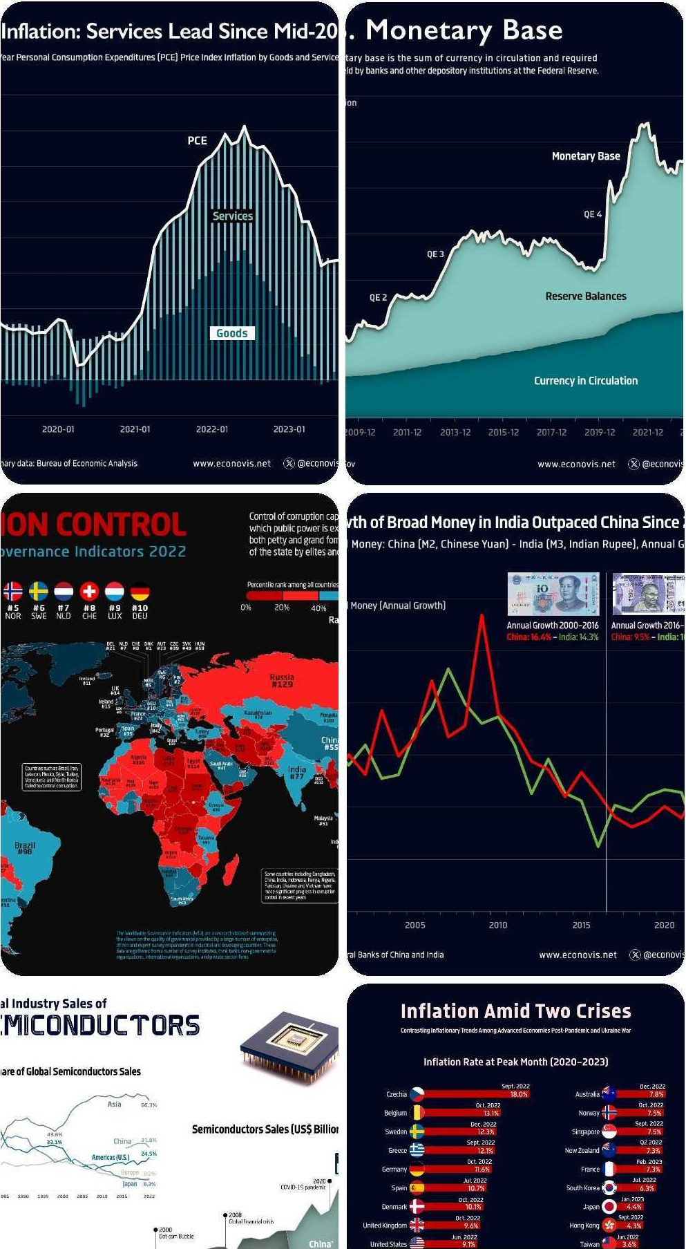
Ehsan is an economist, and one of the most prolific creators on Voronoi so far. He’s published 41 visualizations on wide-ranging subjects such as:
- The world’s biggest “money printer” economies
- Global commodity returns
- Corruption by country
- Inflation rates in advanced economies
For those interested in what’s happening with the global economy, Ehsan Soltani is definitely worth a follow!
![]() View all of Ehsan’s visuals on Voronoi today.
View all of Ehsan’s visuals on Voronoi today.
MOST VIEWED
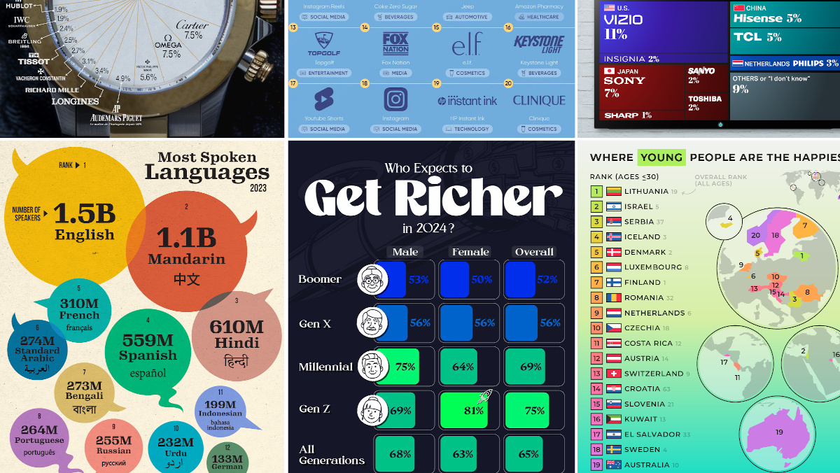
The 12 Most Spoken Languages in 2023
Which languages are most commonly spoken around the world by native speakers?
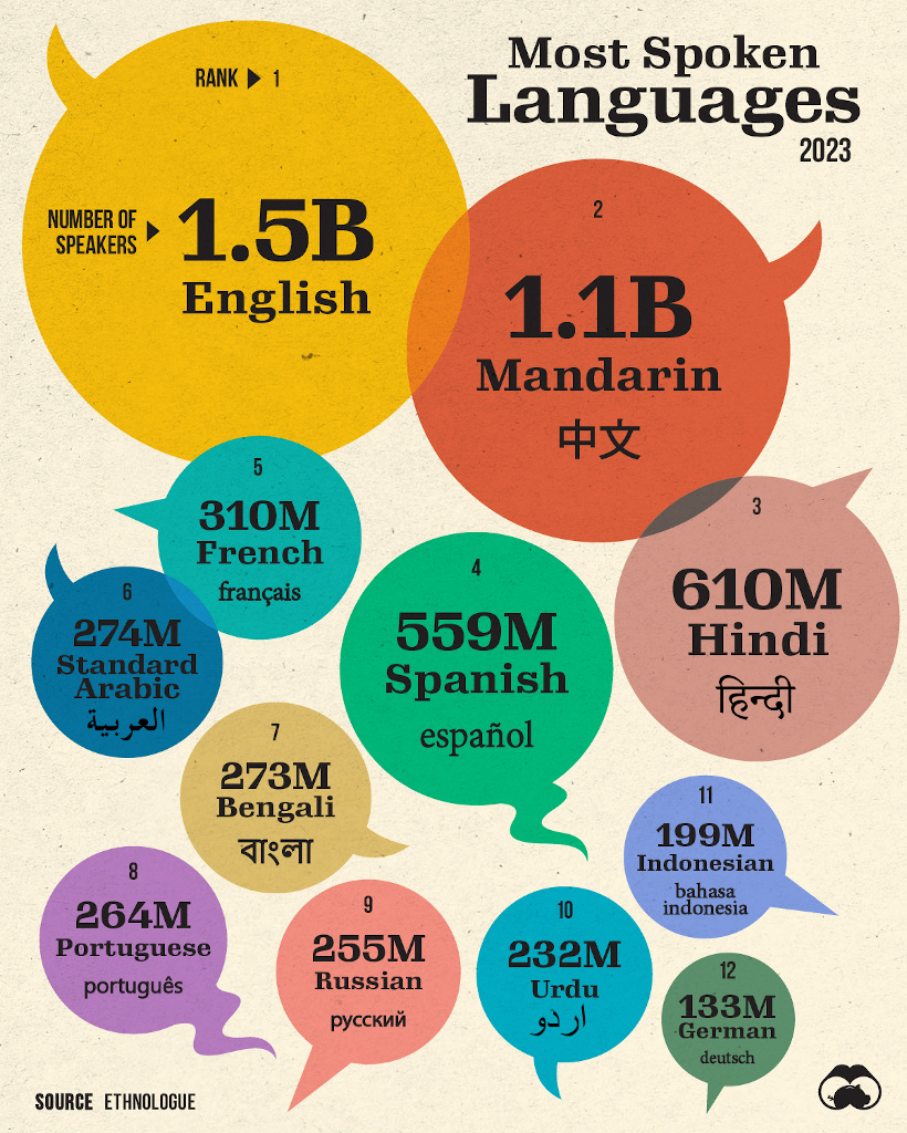
This visualization from Visual Capitalist was one of the most viewed by users, and it highlights the top languages spoken around the world.
Data here comes from the Ethnologue database, the most rigorous and comprehensive language database globally. It’s worth noting that it highlights languages spoken by native speakers only, so second languages are not counted here.
![]() Get the data behind this visual on Voronoi today.
Get the data behind this visual on Voronoi today.
MOST DISCUSSED
Where Young People are Happiest
The most commented on visualization from Visual Capitalist showed the countries with the happiest young people (under 30 years old).
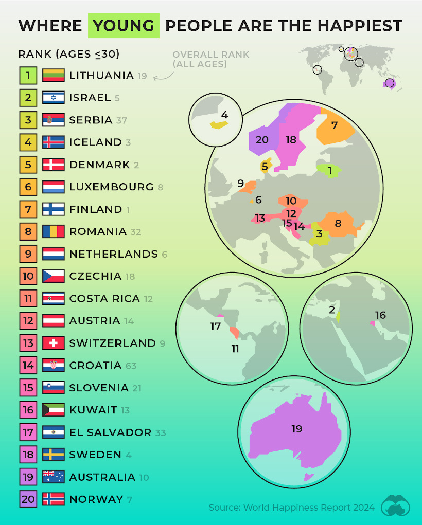
This comes from the World Happiness Report, which Visual Capitalist covers extensively every year.
In this year’s edition, one particularly interesting feature focused on happiness discrepancies between age groups. For example, in some countries, younger people were much happier than the average population—in others, older populations were far happier.
![]() To join the conversation, download Voronoi today.
To join the conversation, download Voronoi today.
MOST LIKED
The Fastest Growing Brands in the U.S.
The most liked visual on Voronoi in March came from Visual Capitalist, showing the brands that are growing the fastest in the United States.
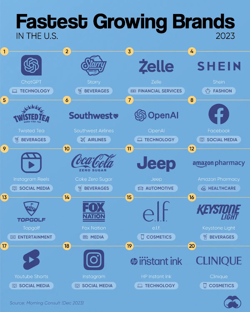
The data here comes from Morning Consult, and shows the share of customers that were considering purchasing a brand in October 1-24, 2023, and subtracted the share of those who said the same between Jan 1-31, 2023.
![]() Get the data behind this visual on Voronoi today.
Get the data behind this visual on Voronoi today.
-

 Technology5 days ago
Mapped: The Number of AI Startups By Country
-

 Markets2 weeks ago
The Best U.S. Companies to Work for According to LinkedIn
-

 Economy2 weeks ago
Ranked: The Top 20 Countries in Debt to China
-

 Politics2 weeks ago
Charted: Trust in Government Institutions by G7 Countries
-

 Energy2 weeks ago
Mapped: The Age of Energy Projects in Interconnection Queues, by State
-

 Mining2 weeks ago
Visualizing Global Gold Production in 2023
-

 Markets1 week ago
Visualized: Interest Rate Forecasts for Advanced Economies
-
 Economy1 week ago
The Most Valuable Companies in Major EU Economies