Green
All the World’s Carbon Emissions in One Chart
Get this infographic as a poster (and save 15% by being a VC+ member)
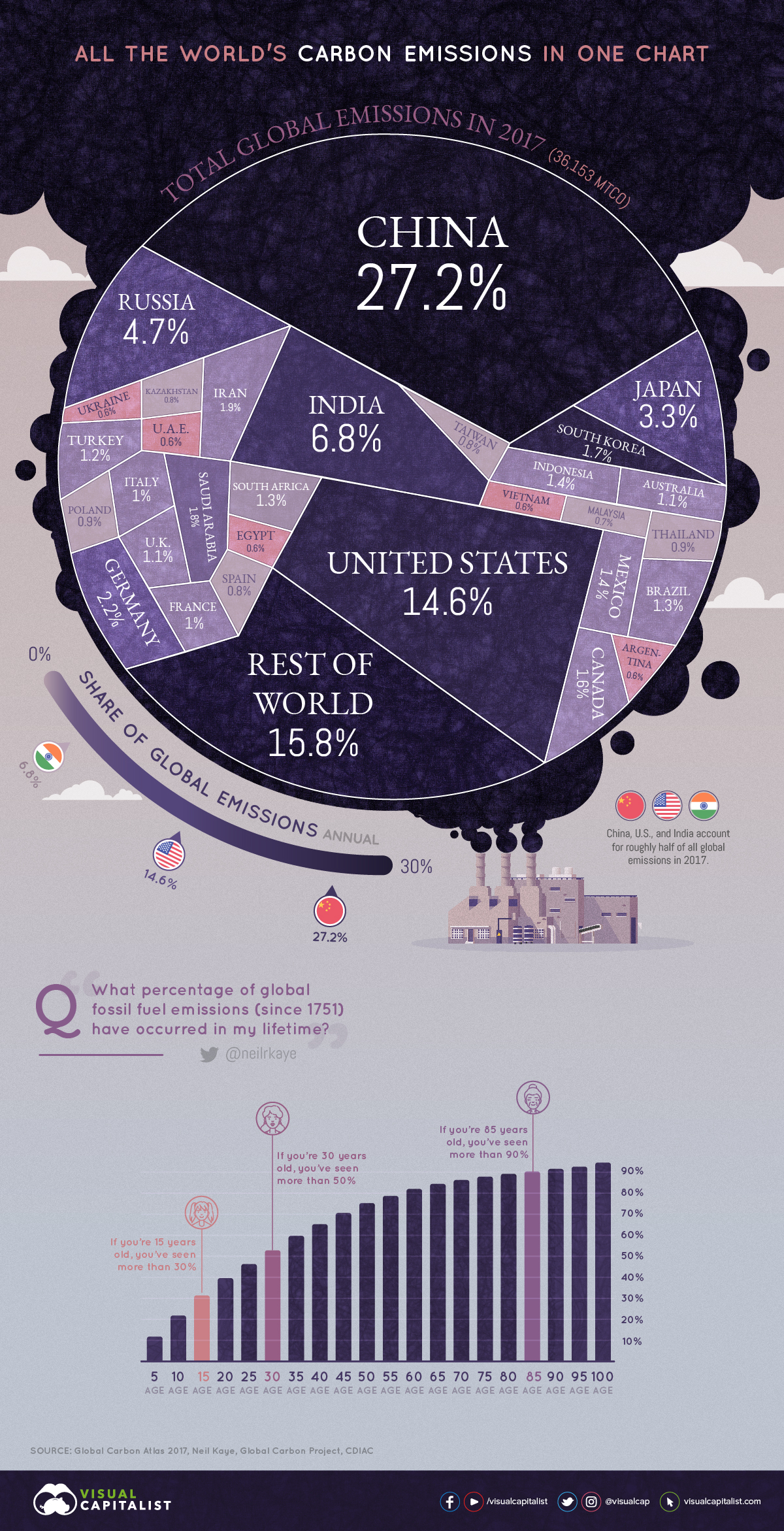


All the World’s Carbon Emissions in One Chart
Two degrees Celsius may not seem like much, but on our planet, it could be the difference between thriving life and a disastrous climate.
Over two centuries of burning fossil fuels have added up, and global decision-makers and business leaders are focusing in on carbon emissions as a key issue.
Emissions by Country
This week’s chart uses the most recent data from Global Carbon Atlas to demonstrate where most of the world’s CO₂ emissions come from, sorted by country.
| Rank | Country | Emissions in 2017 (MtCO₂) | % of Global Emissions |
|---|---|---|---|
| #1 | 🇨🇳 China | 9,839 | 27.2% |
| #2 | 🇺🇸 United States | 5,269 | 14.6% |
| #3 | 🇮🇳 India | 2,467 | 6.8% |
| #4 | 🇷🇺 Russia | 1,693 | 4.7% |
| #5 | 🇯🇵 Japan | 1,205 | 3.3% |
| #6 | 🇩🇪 Germany | 799 | 2.2% |
| #7 | 🇮🇷 Iran | 672 | 1.9% |
| #8 | 🇸🇦 Saudi Arabia | 635 | 1.8% |
| #9 | 🇰🇷 South Korea | 616 | 1.7% |
| #10 | 🇨🇦 Canada | 573 | 1.6% |
| #11 | 🇲🇽 Mexico | 490 | 1.4% |
| #12 | 🇮🇩 Indonesia | 487 | 1.3% |
| #13 | 🇧🇷 Brazil | 476 | 1.3% |
| #14 | 🇿🇦 South Africa | 456 | 1.3% |
| #15 | 🇹🇷 Turkey | 448 | 1.2% |
| 🌐 Top 15 | 26,125 | 72.2% | |
| 🌐 Rest of World | 10,028 | 27.7% |
In terms of absolute emissions, the heavy hitters are immediately obvious. Large economies such as China, the United States, and India alone account for almost half the world’s emissions. Zoom out a little further, and it’s even clearer that just a handful of countries are responsible for the majority of emissions.
Of course, absolute emissions don’t tell the full story. The world is home to over 7.5 billion people, but they aren’t distributed evenly across the globe. How do these carbon emissions shake out on a per capita basis?
Here are the 20 countries with the highest emissions per capita:
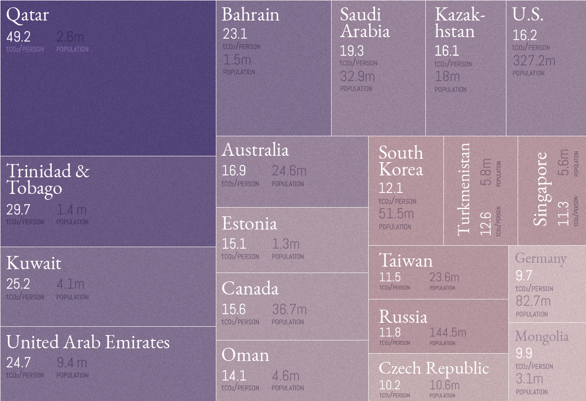
Source: Global Carbon Atlas. Note: We’ve only included places with a population above one million, which excludes islands and areas such as Curaçao, Brunei, Luxembourg, Iceland, Greenland, and Bermuda.
Out of the original 30 countries in the main visualization, six countries show up again as top CO₂ emitters when adjusted for population count: Saudi Arabia, the United States, Canada, South Korea, Russia, and Germany.
The CO₂ Conundrum
We know that rapid urbanization and industrialization have had an impact on carbon emissions entering the atmosphere, but at what rate?
Climate data scientist Neil Kaye answers the question from a different perspective, by mapping what percentage of emissions have been created during your lifetime since the Industrial Revolution:
| Your Age | % of Total Global Emissions |
|---|---|
| 15 years old | You've been alive for more than 30% of emissions |
| 30 years old | You've been alive for more than 50% of emissions |
| 85 years old | You've been alive for more than 90% of emissions |
Put another way, the running total of emissions is growing at an accelerating rate. This is best seen in the dramatic shortening between the time periods taken for 400 billion tonnes of CO₂ to enter the atmosphere:
- First period: 217 years (1751 to 1967)
- Second period: 23 years (1968 to 1990)
- Third period: 16 years (1991 to 2006)
- Fourth period: 11 years (2007 to 2018)
In order to be a decarbonised economy by 2050, we have to bend the (emissions) curve by 2020… Not only is it urgent and necessary, but actually we are very nicely on our way to achieving it.
— Christiana Figueres, Convenor of Mission 2020


Automotive
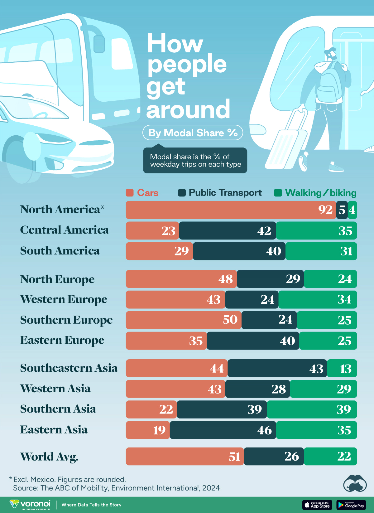
How People Get Around in America, Europe, and Asia
Examining how people get around using cars, public transit, and walking or biking, and the regional differences in usage.
How People Get Around in America, Europe, and Asia
This was originally posted on our Voronoi app. Download the app for free on iOS or Android and discover incredible data-driven charts from a variety of trusted sources.
This chart highlights the popularity of different transportation types in the Americas, Europe, and Asia, calculated by modal share.
Data for this article and visualization is sourced from ‘The ABC of Mobility’, a research paper by Rafael Prieto-Curiel (Complexity Science Hub) and Juan P. Ospina (EAFIT University), accessed through ScienceDirect.
The authors gathered their modal share data through travel surveys, which focused on the primary mode of transportation a person employs for each weekday trip. Information from 800 cities across 61 countries was collected for this study.
North American Car Culture Contrasts with the Rest of the World
In the U.S. and Canada, people heavily rely on cars to get around, no matter the size of the city. There are a few exceptions of course, such as New York, Toronto, and smaller college towns across the United States.
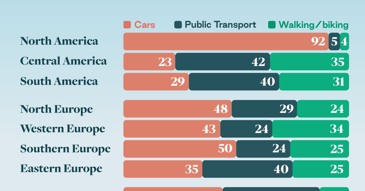
| Region | 🚗 Cars | 🚌 Public Transport | 🚶 Walking/Biking |
|---|---|---|---|
| North America* | 92% | 5% | 4% |
| Central America | 23% | 42% | 35% |
| South America | 29% | 40% | 31% |
| Northern Europe | 48% | 29% | 24% |
| Western Europe | 43% | 24% | 34% |
| Southern Europe | 50% | 24% | 25% |
| Eastern Europe | 35% | 40% | 25% |
| Southeastern Asia | 44% | 43% | 13% |
| Western Asia | 43% | 28% | 29% |
| Southern Asia | 22% | 39% | 39% |
| Eastern Asia | 19% | 46% | 35% |
| World | 51% | 26% | 22% |
Note: *Excluding Mexico. Percentages are rounded.
As a result, North America’s share of public transport and active mobility (walking and biking) is the lowest amongst all surveyed regions by a significant amount.
On the other hand, public transport reigns supreme in South and Central America as well as Southern and Eastern Asia. It ties with cars in Southeastern Asia, and is eclipsed by cars in Western Asia.
As outlined in the paper, Europe sees more city-level differences in transport popularity.
For example, Utrecht, Netherlands prefers walking and biking. People in Paris and London like using their extensive transit systems. And in Manchester and Rome, roughly two out of three journeys are by car.

-

 Healthcare4 days ago
What Causes Preventable Child Deaths?
-

 voronoi2 weeks ago
Best Visualizations of April on the Voronoi App
-

 Wealth2 weeks ago
Charted: Which Country Has the Most Billionaires in 2024?
-

 Markets1 week ago
The Top Private Equity Firms by Country
-

 Jobs1 week ago
The Best U.S. Companies to Work for According to LinkedIn
-

 Economy1 week ago
Ranked: The Top 20 Countries in Debt to China
-

 Politics1 week ago
Charted: Trust in Government Institutions by G7 Countries
-

 Energy1 week ago
Mapped: The Age of Energy Projects in Interconnection Queues, by State